Criterion & Eclipse Cover Art & Packaging Babble-on Vol.5
-
colinr0380

- Joined: Mon Nov 08, 2004 8:30 pm
- Location: Chapel-en-le-Frith, Derbyshire, UK
Re: Criterion & Eclipse Cover Art & Packaging Babble-on Vol.
I love all three of the new covers - it's the foreground/background contrasting focus month!
Last edited by colinr0380 on Fri Jan 14, 2011 10:17 pm, edited 2 times in total.
-
Finch

- Joined: Mon Jul 07, 2008 9:09 pm
- Location: United States
Re: Criterion & Eclipse Cover Art & Packaging Babble-on Vol.
Ditto. Also keen on the Fear & Loathing cover if not the film. Disappointed that Criterion didn't revamp the Melville cover, the Studio Canal Blu artwork is much better.matrixschmatrix wrote:It would be wrong to have a Blow Out cover where it was easy to decipher, I think it's pretty excellent.
-
Cold Bishop

- Joined: Wed May 31, 2006 1:45 am
- Location: Portland, OR
Re: Criterion & Eclipse Cover Art & Packaging Babble-on Vol.
I don't know. I think of Blow-Out as much more colorful than what that cover depicts.
-
Alan Smithee
- Joined: Mon Dec 06, 2010 3:49 pm
- Location: brooklyn
Re: Criterion & Eclipse Cover Art & Packaging Babble-on Vol.
I'm not a fan of the type but the Blow Out cover is brilliant in my opinion. Perfectly appropriate to the films subject and reminds you that there was a time when filmmakers weren't afraid of frames that allowed the eye to wander and select.
-
oldsheperd

- Joined: Thu Nov 11, 2004 9:18 pm
- Location: Rio Rancho/Albuquerque
Re: Criterion & Eclipse Cover Art & Packaging Babble-on Vol.
I dig the covers to the new releases. The cover for Blow Out nearly motivates me to buy it.
-
TheGodfather

- Joined: Sun Sep 17, 2006 8:39 pm
- Location: The Netherlands
Re: Criterion & Eclipse Cover Art & Packaging Babble-on Vol.
Nice covers. Again, a cheap month for me. Not that that`s a bad thing though: february will be expensive enough.
-
Tom Hagen
- Joined: Mon Apr 14, 2008 4:35 pm
- Location: Salt Lake City, Utah
Re: Criterion & Eclipse Cover Art & Packaging Babble-on Vol.
The "JOHN TRAVOLTA NANCY ALLEN BLOW OUT" equal font sizes line is a little different.
-
colinr0380
- Joined: Mon Nov 08, 2004 8:30 pm
- Location: Chapel-en-le-Frith, Derbyshire, UK
Re: Criterion & Eclipse Cover Art & Packaging Babble-on Vol.
I like the way that the line of the cast and title in Blow Out feels similar to the lines of the unspooled tapes - a simple, straight line of information through a tangled and convoluted mass of dead ends, leading straight into the viewer.
It's also nice that the title and director credit neatly fits into the only black space on the cover!
It's also nice that the title and director credit neatly fits into the only black space on the cover!
-
Cinephrenic

- Joined: Tue Nov 02, 2004 6:58 pm
- Location: Paris, Texas
Re: Criterion & Eclipse Cover Art & Packaging Babble-on Vol.
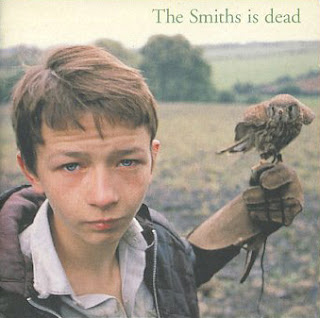
Blow Out nice cover. Kes is horrible.
-
Crab Society North
- Joined: Fri Oct 22, 2010 12:08 pm
Re: Criterion & Eclipse Cover Art & Packaging Babble-on Vol.
This is the first in a very long time that I like every cover of every new release in one month. Blow Out is perfect, KES makes wonderful use (for once) of the simple close up on a main character that Criterion likes to use a lot these days and I haven't seen White Material but I like the simple composition of the cover
-
movielocke

- Joined: Fri Jan 18, 2008 4:44 am
Re: Criterion & Eclipse Cover Art & Packaging Babble-on Vol.
Huh, when I scanned the new release page and only saw the small versions of the covers, I glanced at Blow Out and though the picture was a birds-eye-view of a City. Funny how different it actually is.
-
HistoryProf

- Joined: Mon Mar 13, 2006 7:48 am
- Location: KCK
-
Duncan Hopper

- Joined: Mon Dec 21, 2009 9:16 am
- Location: http://www.eldiabolik.com
- Contact:
Re: Criterion & Eclipse Cover Art & Packaging Babble-on Vol.
I really like the 'Blow Out' sleeve, but 'Kes' is awful. They shoud have looked at the original quad.

-
Noiretirc

- Joined: Tue Dec 09, 2008 10:04 pm
- Location: VanIsle
- Contact:
Re: Criterion & Eclipse Cover Art & Packaging Babble-on Vol.
Um, please help me out here. You bought the Criterion DVD of this film, not because of the film itself?Murdoch wrote:It's weird but the only reason I own the dvd is because of the packaging, didn't care for the film.
Or, you could just keep the DVD and watch it on an old tv like me and still be blown away by the enigmatic masterpiece that this film is.domino harvey wrote:More like it means I have to keep my DVD copy AND upgrade
Hahahaha.....just kidding. We must all have the very latest technological upgrades. Carry on.
-
matrixschmatrix

- Joined: Wed May 26, 2010 3:26 am
Re: Criterion & Eclipse Cover Art & Packaging Babble-on Vol.
I only watch movies on third generation vhs copies. Screw you, technocrats! I want to enjoy the movie, not look at it!
-
Noiretirc
- Joined: Tue Dec 09, 2008 10:04 pm
- Location: VanIsle
- Contact:
Re: Criterion & Eclipse Cover Art & Packaging Babble-on Vol.
I see what you did there.matrixschmatrix wrote:I only watch movies on third generation vhs copies. Screw you, technocrats! I want to enjoy the movie, not look at it!
-
Matt

- Joined: Tue Nov 02, 2004 4:58 pm
Re: Criterion & Eclipse Cover Art & Packaging Babble-on Vol.
A couple of fan covers I came across:


I really like the type treatment.
I really like the type treatment.
-
Jeff

- Joined: Wed Nov 03, 2004 1:49 am
- Location: Denver, CO
Re: Criterion & Eclipse Cover Art & Packaging Babble-on Vol.
^ I think the "two-finger salute" image has run its course for Kes and been used more than enough, but I love the one on the right, especially the type treatment. I don't really have any major problems with Criterion's cover, but I love this one.
-
domino harvey

- Dot Com Dom
- Joined: Wed Jan 11, 2006 6:42 pm
Re: Criterion & Eclipse Cover Art & Packaging Babble-on Vol.
Wow, that last one rules. Scrolling quickly I thought Criterion actually changed it!
-
zedz

- Joined: Sun Nov 07, 2004 11:24 pm
Re: Criterion & Eclipse Cover Art & Packaging Babble-on Vol.
The second one is nice, but that (or one of its close variants) is probably the next-most iconic Kes shot, so it could attract the same criticism as the first (not to mention the obvious 'why wouldn't you put a kestrel on the cover' one).
-
dwk

- Joined: Sat Jun 12, 2010 10:10 pm
-
domino harvey
- Dot Com Dom
- Joined: Wed Jan 11, 2006 6:42 pm
Re: Criterion & Eclipse Cover Art & Packaging Babble-on Vol.
The variation with the sister in the foreground would have been great, too bad contractual BS prevented it from proceeding on
-
Murdoch

- Joined: Mon Apr 21, 2008 3:59 am
- Location: Upstate NY
Re: Criterion & Eclipse Cover Art & Packaging Babble-on Vol.
Seriously, reminds me of a pulpy Edward Hopper, but maybe they're incorporating it into the interior. The current cover is a wait-and-see deal, I don't particularly like it but it might look better once I get it in hand.
-
Jeff
- Joined: Wed Nov 03, 2004 1:49 am
- Location: Denver, CO
Re: Criterion & Eclipse Cover Art & Packaging Babble-on Vol.
I feel fairly certain that there is a contractual requirement that Travolta and Allen's names appear in the same font and type size as the film title. Many of the other MGM-licensed titles have had similar requirements (as Eric Skillman pointed out in his post about Sweet Smell of Success). The original Filmways poster and MGM DVD appeared to be attempting to satisfy this requirement:Tom Hagen wrote:The "JOHN TRAVOLTA NANCY ALLEN BLOW OUT" equal font sizes line is a little different.


Interestingly, the image used for the Criterion cover has been altered to create the black space on the Moviola for the title and DePalma credit. It helps to set them off from the Travolta and Allen credits (which I'm sure the Criterion designer would have preferred not to use).


-
hammock

- Joined: Wed Nov 03, 2004 5:52 pm
- Location: www.criteriondungeon.com
- Contact:
Re: Criterion & Eclipse Cover Art & Packaging Babble-on Vol.
They should have used the same yellow for the title they used in the Italian poster.