Criterion & Eclipse Cover Art & Packaging Babble-on Vol.5
-
cdnchris

- Site Admin
- Joined: Tue Nov 02, 2004 6:45 pm
- Location: Washington
- Contact:
-
matrixschmatrix

- Joined: Wed May 26, 2010 3:26 am
Re: Criterion & Eclipse Cover Art & Packaging Babble-on Vol.
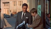
That is a really interesting re-purposing- by cropping the image, the designer also made it look more crowded (to my eye) and changed the focus from the Moviola to Travolta in the background.Jeff wrote:Interestingly, the image used for the Criterion cover has been altered to create the black space on the Moviola for the title and DePalma credit. It helps to set them off from the Travolta and Allen credits (which I'm sure the Criterion designer would have preferred not to use).


I wonder if the change from Travolta looking at the viewer to him staring off to the side was deliberate or just a consequence of some wanting a different frame for some other reason- it's hard for me to say what effect that has.
-
HistoryProf

- Joined: Mon Mar 13, 2006 7:48 am
- Location: KCK
Re: Criterion & Eclipse Cover Art & Packaging Babble-on Vol.
no comments on this tidbit? Was this previously confirmed as a digipack? Seems strange they'd do it for a single disc blu ray - and if it's on the DVD but not the blu, heads are gonna roll. Personally, I love the plastic cases for their blus....but I know others are equally in love with the dented and creased digis....could be interesting.
Eric Skillman wrote:I should say also that I was pretty happy with the way the rest of the package played out… sometimes when we start with an illustrated cover it's difficult to make the transition into menu or booklet design, but in this case I thought it worked well. First and foremost, Sean was able to paint two additional paintings for us, including this gorgeous wraparound for the digipak

-
Murdoch

- Joined: Mon Apr 21, 2008 3:59 am
- Location: Upstate NY
Re: Criterion & Eclipse Cover Art & Packaging Babble-on Vol.
I want a digi just so that painting will be incorporated.
-
mfunk9786

- Under Chris' Protection
- Joined: Fri May 16, 2008 8:43 pm
- Location: Miami, FL
Re: Criterion & Eclipse Cover Art & Packaging Babble-on Vol.
Especially because mine won't be dented or creased. You know, because they rarely are.
-
domino harvey

- Dot Com Dom
- Joined: Wed Jan 11, 2006 6:42 pm
Re: Criterion & Eclipse Cover Art & Packaging Babble-on Vol.
I'm pretty sure Criterion posted a stack of the unfolded sleeves with that pic on 'em, which is how we knew it was a digipak. Gorgeous, especially compared to the cover that still doesn't work
-
bnowalk

- Joined: Wed Oct 14, 2009 6:27 pm
-
Jeff

- Joined: Wed Nov 03, 2004 1:49 am
- Location: Denver, CO
Re: 4 Amarcord
Beaver describes the Amarcord Blu-ray packaging as "cardboard case with open digipak slipcase and booklet." It sounds like another single-disc digipak done to accommodate a larger booklet, so maybe they aren't abbreviating the booklet after all. It's a shame that they aren't doing this for Veronique. It sounds like Sweet Smell of Success will be the next title to get the treatment. Since they're including the Lehman stories, that book should be pretty hefty.
-
Cash Flagg
- Joined: Fri Jan 25, 2008 3:15 am
Re: 4 Amarcord
The booklet is also 66 pages, which sounds pretty substantial.Jeff wrote:Beaver describes the Amarcord Blu-ray packaging as "cardboard case with open digipak slipcase and booklet." It sounds like another single-disc digipak done to accommodate a larger booklet, so maybe they aren't abbreviating the booklet after all.
-
mfunk9786
- Under Chris' Protection
- Joined: Fri May 16, 2008 8:43 pm
- Location: Miami, FL
Re: Criterion & Eclipse Cover Art & Packaging Babble-on Vol.
Beaver sez the Sweet Smell of Success Blu is in a transparent keepcase. Sorry everyone.
-
domino harvey
- Dot Com Dom
- Joined: Wed Jan 11, 2006 6:42 pm
Re: Criterion & Eclipse Cover Art & Packaging Babble-on Vol.
How does one explain this, then?
mteller wrote:Posted on Facebook:

-
movielocke

- Joined: Fri Jan 18, 2008 4:44 am
Re: Criterion & Eclipse Cover Art & Packaging Babble-on Vol.
slipcover for the keepcase?
digi for the dvd version?
digi for the dvd version?
-
spocker

- Joined: Fri Jun 04, 2010 12:07 am
- Location: Forsheda, Sweden
Re: Criterion & Eclipse Cover Art & Packaging Babble-on Vol.
It seems like it is a slipcover. A bit further up on the sheet is the keepcase sleeve, with the woman leaning over the balcony.
-
mfunk9786
- Under Chris' Protection
- Joined: Fri May 16, 2008 8:43 pm
- Location: Miami, FL
Re: Criterion & Eclipse Cover Art & Packaging Babble-on Vol.
Ah! Then I love it!
-
Jeff
- Joined: Wed Nov 03, 2004 1:49 am
- Location: Denver, CO
Re: Criterion & Eclipse Cover Art & Packaging Babble-on Vol.
I think the picture of the digis being printed is just for the standard DVD version. Beaver doesn't mention a slipcover, and Eric Skillman described the shot of the sister as a "gorgeous wraparound for the digipak." So the standard DVD version has a digipak with the balcony picture, which is in an outer sleeve featuring the posted cover art.
-
HistoryProf
- Joined: Mon Mar 13, 2006 7:48 am
- Location: KCK
Re: Criterion & Eclipse Cover Art & Packaging Babble-on Vol.
looks like it'll be what they did for the videodrome blu - a slipcover over the regular clear plastic blu case with that painting of the woman on the balcony as the cover in that.
-
thatobscurecharm

- Joined: Tue Aug 24, 2010 5:19 pm
- Location: Northern California
-
matrixschmatrix
- Joined: Wed May 26, 2010 3:26 am
Re: Criterion & Eclipse Cover Art & Packaging Babble-on Vol.
Kind of wish they'd stuck with the sillier devil horns one, honestly
-
colinr0380

- Joined: Mon Nov 08, 2004 8:30 pm
- Location: Chapel-en-le-Frith, Derbyshire, UK
Re: Criterion & Eclipse Cover Art & Packaging Babble-on Vol.
The devil horns were amusing, but I really liked this more sober one (particularly the title, cast and director credits fitting into a 'ticker' line in the middle of the cover with a slight italicisation of the text to suggest movement):

The covers below it, and the final one to some extent, are trying much too hard to get everything to fit into the available space, resulting in the whole cover looking a bit overcrowded. It seems like the classic situation of not wanting to let go of a particular good idea for a cover, rushing past the best design in enthusiasm for the possibilities, and then eventually having to bend over backwards to try and get the final result to fit the concept.
The shot/counter shot cover seems to express the whole concept much more elegantly, if not as 'amusingly'. Though a criticism of that cover (along with favouring the actor's ears too much) could be that it is falling into a recent trend of foreground/background contrasting images - see March's Blow Out, White Material and Kes covers. While I really like that concept I guess it could, like the half cropped faces of the early Criterion DVD covers, become a too obvious motif regularly reached for on 'tricky' covers.
Last edited by colinr0380 on Fri Feb 04, 2011 8:50 pm, edited 1 time in total.
-
movielocke
- Joined: Fri Jan 18, 2008 4:44 am
Re: Criterion & Eclipse Cover Art & Packaging Babble-on Vol.
the cover they chose is clearly the best of what Skillman showed, it gets in the feel of the studio, the love triangle bit, I love the way Holly Hunter is superimposed above everything, but is still just a reflection.
I think the cover colin posted is the booklet cover, it's a terrible dvd cover, "OMG! this film is about LISTENING!" but a nice way to conceptualize the film for those who already know it well.
I think the cover colin posted is the booklet cover, it's a terrible dvd cover, "OMG! this film is about LISTENING!" but a nice way to conceptualize the film for those who already know it well.
-
cdnchris
- Site Admin
- Joined: Tue Nov 02, 2004 6:45 pm
- Location: Washington
- Contact:
Re: Criterion & Eclipse Cover Art & Packaging Babble-on Vol.
Sorry so late, but here's The Double Life of Veronique
-
felipe
- Joined: Thu May 06, 2010 3:06 am
Re: Criterion & Eclipse Cover Art & Packaging Babble-on Vol.
I can't believe Criterion released Veronique in a regular case. It was such a beautiful digipack. Why did they have to do it?
-
Napier

- Joined: Wed Nov 03, 2004 1:48 pm
- Location: The Shire
Re: Criterion & Eclipse Cover Art & Packaging Babble-on Vol.
Yes, it was a beautiful digi, but I for one welcome the extra shelf space the BD cases afford me.felipe wrote:I can't believe Criterion released Veronique in a regular case. It was such a beautiful digipack. Why did they have to do it?
-
felipe
- Joined: Thu May 06, 2010 3:06 am
Re: Criterion & Eclipse Cover Art & Packaging Babble-on Vol.
At the expense of the thicker booklet.
-
Elmyr
- Joined: Wed May 14, 2008 11:30 pm
Re: Criterion & Eclipse Cover Art & Packaging Babble-on Vol.
And they put the two essays that were cut up on the website. All is well.Napier wrote:Yes, it was a beautiful digi, but I for one welcome the extra shelf space the BD cases afford me.felipe wrote:I can't believe Criterion released Veronique in a regular case. It was such a beautiful digipack. Why did they have to do it?