I think Kiss Me Deadly is the result of not being able to decide whether they liked the life magazine look or the pulp novel look better. Could have came out worse though.
Zazie looks more like Zazie dans Bluffington.
Criterion & Eclipse Cover Art & Packaging Babble-on Vol.5
-
Alphonse Doinel

- Joined: Sun Dec 06, 2009 4:42 pm
-
swo17

- Bloodthirsty Butcher
- Joined: Tue Apr 15, 2008 2:25 pm
- Location: SLC, UT


-
matrixschmatrix

- Joined: Wed May 26, 2010 3:26 am
Re: Criterion & Eclipse Cover Art & Packaging Babble-on Vol.
That's a shame- I much prefer the one large screencap style they used on Basil Dearden and Naruse, and I was kind of hoping they would stick to it indefinitely.
-
TheGodfather

- Joined: Sun Sep 17, 2006 8:39 pm
- Location: The Netherlands
Re: Criterion & Eclipse Cover Art & Packaging Babble-on Vol.
Great to finally see Kiss Me Deadly in the collection but what the hell is going on with this month`s covers? The Kiss Me Deadly and Zazie covers are ugly as hell, especially the black background on the wacky C.
The other Malle cover is gorgeous.
The other Malle cover is gorgeous.
-
Jeff

- Joined: Wed Nov 03, 2004 1:49 am
- Location: Denver, CO
Re: Criterion & Eclipse Cover Art & Packaging Babble-on Vol.
Kiss Me Deadly really works, I think. I don't even mind the little box around the Wacky C, though I wished it had been style into more of a ribbon shape. Here's a couple of lurid detective novels in the same style.


People on Sunday is great, and Insignificance is fine too, though I wish they had used the iconic key art:

I'll agree with whoever said last week that Black Moon could be vastly improved by a black border, and poor Zazie does look awfully homely. The book cover would have been wonderful if they could get the rights.

The Makioka Sisters is just absurdly pathetic and awful, and seems to indicate Criterion's overall approach to the release.
People on Sunday is great, and Insignificance is fine too, though I wish they had used the iconic key art:
I'll agree with whoever said last week that Black Moon could be vastly improved by a black border, and poor Zazie does look awfully homely. The book cover would have been wonderful if they could get the rights.
The Makioka Sisters is just absurdly pathetic and awful, and seems to indicate Criterion's overall approach to the release.
-
Tom Hagen
- Joined: Mon Apr 14, 2008 4:35 pm
- Location: Salt Lake City, Utah
Re: Criterion & Eclipse Cover Art & Packaging Babble-on Vol.
I think The Makioka Sisters may be the worst post-Wacky C era cover art. I have a special disdain for the laziness of The Spy Who Came In From the Cold, and The Great Dictator is pretty inexplicable, but this is the first one that I swear someone at Criterion pulled out of a forgotten swimminghorses thread.
-
Feego

- Joined: Thu Aug 16, 2007 11:30 pm
- Location: Texas
Re: Criterion & Eclipse Cover Art & Packaging Babble-on Vol.
I immediately thought of Life Magazine when I saw that cover. I love the luridness of those covers that Jeff just posted, but the Kiss Me Deadly cover just doesn't capture that. Perhaps if they had copied the photo as a painting in the style of those old covers. Criterion seems to have a really bad grasp of pulp imagery. From the Fuller covers to this, they just don't seem to know what to do with them. Too bad they couldn't give us something along the lines of Blast of Silence, or even something as simple and effective as The Killers.Alphonse Doinel wrote:I think Kiss Me Deadly is the result of not being able to decide whether they liked the life magazine look or the pulp novel look better. Could have came out worse though.
That said, I actually kinda like the Zazie cover. I've never seen the film, but the cover is rather striking and piques my interest. The Makioka Sisters is terrible. Black Moon is OK, but unmemorable. I hate the avocado color on the Eclipse set. Insignificance and People on Sunday are fantastic.
-
Murdoch

- Joined: Mon Apr 21, 2008 3:59 am
- Location: Upstate NY
Re: Criterion & Eclipse Cover Art & Packaging Babble-on Vol.
For KMD I think the design would have worked better if it had been an illustration rather than a still, it looks like a quick cut-and-paste job. Although if they did do an illustration it might have come out like the Fullers, so maybe this is the lesser of two evils.
-
HistoryProf

- Joined: Mon Mar 13, 2006 7:48 am
- Location: KCK
Re: Criterion & Eclipse Cover Art & Packaging Babble-on Vol.
Word. pure awesomeness.domino harvey wrote:Insignificance is the best cover in yearsss
I like Kiss Me Deadly....but I like pulpy old stuff a lot too, so it's right up my alley. I think it'll look great in person. People on Sunday is also an A. Not sure on the Malle's, and Makioka Sisters is awful. I dig the off beat Eclipse colors too....so 4 out of 7 ain't bad, considering 1 is one of the best covers they've ever done!
Pretty sure that's copying the exact format of the old ballantine, Gold Key, and other smaller press paperbacks, where the price or series title would have been in that black spot on the top.Tribe wrote:I agree...that black square with the wacky C does indeed ruin what is otherwise a quite nice noirish cover.Finch wrote:Yes, the Kiss Me Deadly cover would have been better without the black background on the wacky C and the film's title on the Red.
-
matrixschmatrix
- Joined: Wed May 26, 2010 3:26 am
Re: Criterion & Eclipse Cover Art & Packaging Babble-on Vol.
I like the cover as is, but I do agree with you on this. I sort of wish they'd stuck closer to the All Tomorrow's Parties poster:Murdoch wrote:For KMD I think the design would have worked better if it had been an illustration rather than a still, it looks like a quick cut-and-paste job. Although if they did do an illustration it might have come out like the Fullers, so maybe this is the lesser of two evils.

-
HistoryProf
- Joined: Mon Mar 13, 2006 7:48 am
- Location: KCK
Re: Criterion & Eclipse Cover Art & Packaging Babble-on Vol.
That's exactly what I was thinking of in terms of layout. I know my dad has boxes of these from the 50s and I knew exactly what the black bar was when I saw it as I've seen it a hundred times before on his collection of old detective and sci fi novels.Jeff wrote:Kiss Me Deadly really works, I think. I don't even mind the little box around the Wacky C, though I wished it had been style into more of a ribbon shape. Here's a couple of lurid detective novels in the same style.
-
swo17
- Bloodthirsty Butcher
- Joined: Tue Apr 15, 2008 2:25 pm
- Location: SLC, UT
Re: Criterion & Eclipse Cover Art & Packaging Babble-on Vol.
People on Sunday is lovely of course but it looks remarkably like the cover to an album (from the past few years?) that I can't place and it's going to bug me forever unless I remember it.
Makioka makes me think of an hourglass, with the sands from the eye part of that girl's face slowly sifting through the fissure as offering to the gods that live inside of the snow volcano below. Is this description in any way accurate? I haven't seen the film.
I'm more or less with domino on Insignificance.
-
Cosmic Bus

- Joined: Tue Sep 12, 2006 2:12 am
- Location: Seattle, WA
- Contact:
Re: Criterion & Eclipse Cover Art & Packaging Babble-on Vol.
domino harvey wrote:Omgggg can never unsee Alfred E now

Blargh.
-
HistoryProf
- Joined: Mon Mar 13, 2006 7:48 am
- Location: KCK
Re: Criterion & Eclipse Cover Art & Packaging Babble-on Vol.
you bastard. you go to hell. you go to hell and you die.
-
Murdoch
- Joined: Mon Apr 21, 2008 3:59 am
- Location: Upstate NY
Re: Criterion & Eclipse Cover Art & Packaging Babble-on Vol.
Post of the year.
-
John Edmond

- Joined: Tue Jan 19, 2010 12:35 am
Re: Criterion & Eclipse Cover Art & Packaging Babble-on Vol.
A bit of me just broke then. gah
-
domino harvey

- Dot Com Dom
- Joined: Wed Jan 11, 2006 6:42 pm
Re: Criterion & Eclipse Cover Art & Packaging Babble-on Vol.
You know where this can go!

-
domino harvey
- Dot Com Dom
- Joined: Wed Jan 11, 2006 6:42 pm
Re: Criterion & Eclipse Cover Art & Packaging Babble-on Vol.
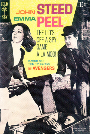
Also, why shy away from the iconic smile still from the film? It worked well here:

And while this handbill's a little busy, at least it gives a sense of the fun of the film
And while this handbill's a little busy, at least it gives a sense of the fun of the film
-
Cosmic Bus
- Joined: Tue Sep 12, 2006 2:12 am
- Location: Seattle, WA
- Contact:
Re: Criterion & Eclipse Cover Art & Packaging Babble-on Vol.
Really, I just miss the fake covers thread.
-
Highway 61

- Joined: Mon Nov 08, 2004 8:40 pm
Re: Criterion & Eclipse Cover Art & Packaging Babble-on Vol.
Seconded. I'll risk more backlash and say that it's a better fitting cover than what we're getting.Murdoch wrote:Post of the year.
-
HistoryProf
- Joined: Mon Mar 13, 2006 7:48 am
- Location: KCK
Re: Criterion & Eclipse Cover Art & Packaging Babble-on Vol.
This is what I was thinking of...swo17 wrote:

Last edited by HistoryProf on Wed Mar 16, 2011 12:50 am, edited 1 time in total.
-
domino harvey
- Dot Com Dom
- Joined: Wed Jan 11, 2006 6:42 pm
Re: Criterion & Eclipse Cover Art & Packaging Babble-on Vol.
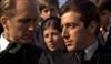
One really great aspect of the Kiss Me Deadly cover is it highlights the lead's toxic treatment of women in the film
-
Cinephrenic

- Joined: Tue Nov 02, 2004 6:58 pm
- Location: Paris, Texas
Re: Criterion & Eclipse Cover Art & Packaging Babble-on Vol.
Zazie looks like a gorilla in the cover.
-
Tribe

- The Bastard Spawn of Hank Williams
- Joined: Tue Nov 02, 2004 11:59 pm
- Location: Toledo, Ohio
- Contact:
Re: Criterion & Eclipse Cover Art & Packaging Babble-on Vol.
Under other circumstances, I wouldn't have minded something along the lines of the ATP poster...but, to be honest, I'm getting rather sick with CC's use of comix style for covers. At this point, it's become over-used (notwithstanding that I tend to be a fan of all the comix artists who have covers so far) and more often that style of art is very difficult to capture the sense and theme of a movie.matrixschmatrix wrote: I like the cover as is, but I do agree with you on this. I sort of wish they'd stuck closer to the All Tomorrow's Parties poster:
-
Tribe
- The Bastard Spawn of Hank Williams
- Joined: Tue Nov 02, 2004 11:59 pm
- Location: Toledo, Ohio
- Contact:
Re: Criterion & Eclipse Cover Art & Packaging Babble-on Vol.
Either a Smiths album cover or a Belle & Sebastian album cover?swo17 wrote:People on Sunday is lovely of course but it looks remarkably like the cover to an album (from the past few years?) that I can't place and it's going to bug me forever unless I remember it.