Criterion & Eclipse Cover Art & Packaging Babble-on Vol.5
-
HistoryProf

- Joined: Mon Mar 13, 2006 7:48 am
- Location: KCK
Re: Criterion & Eclipse Cover Art & Packaging Babble-on Vol.
Big fan of Phantom Carriage and Carlos, but the Chabrols are pretty lame. whoever discovered triangles a few months ago needs to be banned from using them.
-
felipe
- Joined: Thu May 06, 2010 3:06 am
Re: Criterion & Eclipse Cover Art & Packaging Babble-on Vol.
I just don't see any difference in the color scheme:swo17 wrote:You can compare the new and old art on each film's page. 3 Women's color scheme looks a little more dynamic, but basically hasn't changed.movielocke wrote:did the my life as a dog and 3 women art change?


-
SpiderBaby

- Joined: Wed Dec 15, 2010 10:34 pm
Re: Criterion & Eclipse Cover Art & Packaging Babble-on Vol.
It's lighter, but that's it (prob can't tell in person holding them side by side).
-
Tom Hagen

- Joined: Mon Apr 14, 2008 4:35 pm
- Location: Salt Lake City, Utah
Re: Criterion & Eclipse Cover Art & Packaging Babble-on Vol.
Salon interviews the Fake Criterions Tumblr guy.
-
MyNameCriterionForum

- Joined: Sat Jun 21, 2008 9:27 am
Re: Criterion & Eclipse Cover Art & Packaging Babble-on Vol.
HistoryProf wrote: the Chabrols are pretty lame. whoever discovered triangles a few months ago needs to be banned from using them.

"But I was one of the first!"
-
mfunk9786

- Under Chris' Protection
- Joined: Fri May 16, 2008 8:43 pm
- Location: Miami, FL
Re: Criterion & Eclipse Cover Art & Packaging Babble-on Vol.
YES! Art School Confidential gets no respect.
-
LQ

- Joined: Thu Jun 19, 2008 11:51 am
- Contact:
Re: Criterion & Eclipse Cover Art & Packaging Babble-on Vol.
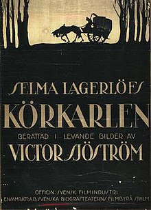
The Phantom Carriage cover is amazing. I'm now extremely interested in a movie that I had never even considered before (and even more so after reading the synopsis!) because of the cover's strength.
-
TheGodfather

- Joined: Sun Sep 17, 2006 8:39 pm
- Location: The Netherlands
Re: Criterion & Eclipse Cover Art & Packaging Babble-on Vol.
Phantom Carriage cover is gorgeous. And excited to see 3 Women come to blu!
-
NABOB OF NOWHERE

- Joined: Thu Sep 01, 2005 4:30 pm
- Location: Brandywine River
Re: Criterion & Eclipse Cover Art & Packaging Babble-on Vol.
To paraphrase Bunuel-"Sod the geometry"HistoryProf wrote:Chabrols are pretty lame. whoever discovered triangles a few months ago needs to be banned from using them.
-
Der Spieler

- Joined: Fri Oct 16, 2009 3:05 pm
Re: Criterion & Eclipse Cover Art & Packaging Babble-on Vol.
The Chabrol look like a cheap job from an amateur Photoshop artist. They'd maybe look a bit better if they lost the triangles...
-
RyanGallagher

- Joined: Fri Jan 01, 2010 8:03 pm
- Location: Portland, OR
- Contact:
Re: Criterion & Eclipse Cover Art & Packaging Babble-on Vol.
They've slightly modified the Jean Vigo art. Brightened up areas, scrubbed the grain down.

-
tarpilot

- Joined: Thu Jan 20, 2011 2:48 pm
Re: Criterion & Eclipse Cover Art & Packaging Babble-on Vol.
Yeah, the Chabrols are atrocious. I kinda get mad just looking at them. I should probably see a doctor about that.
-
Guido
- Joined: Sun Jun 01, 2008 3:31 am
Re: Criterion & Eclipse Cover Art & Packaging Babble-on Vol.
Don't want to be sole dissenting voice here, but I'm kind of getting tired of the recent trend in covers that Phantom Carriage exemplifies: the kind of slightly juvenile, cutesy illustrations that have been found not only on various Criterion editions, but books as well (I'm thinking of the recent Penguin Classics - Austen, Melville, etc.) I feel, in many cases, that they either devalue the work at hand or cloak them in something that isn't exactly representative of their style of maturity. But christ - they are just covers after all.
-
matrixschmatrix

- Joined: Wed May 26, 2010 3:26 am
Re: Criterion & Eclipse Cover Art & Packaging Babble-on Vol.
I believe the Phantom Carriage one is based on a vintage poster, so it's not slapping a new style on top of something where it's not a good fit.
-
knives

- Joined: Sat Sep 06, 2008 10:49 pm
Re: Criterion & Eclipse Cover Art & Packaging Babble-on Vol.
While it's tweaked slightly, mostly in colours, you are correct. Here's one of the classic posters to this marvelous film.
-
Guido
- Joined: Sun Jun 01, 2008 3:31 am
Re: Criterion & Eclipse Cover Art & Packaging Babble-on Vol.
Thanks for pointing that out. There's still something that doesn't sit too well for me with the upgrade, and perhaps it's the new color scheme.
-
knives
- Joined: Sat Sep 06, 2008 10:49 pm
Re: Criterion & Eclipse Cover Art & Packaging Babble-on Vol.
Personally I love how small the original poster makes death which seems appropriate for the film. It's understandable why they made it so big for the DVD though.
-
Gary Gnu

- Joined: Mon Jun 13, 2011 9:50 pm
Re: Criterion & Eclipse Cover Art & Packaging Babble-on Vol.
I agree. I think the DVD version's color scheme is a bit too vibrant. The poster's amazing, so it's a mystery to me as to why they didn't just lift the art directly from the poster. (Also, why change the scythe direction?)knives wrote:Personally I love how small the original poster makes death which seems appropriate for the film. It's understandable why they made it so big for the DVD though.
-
kaujot

- Joined: Mon May 08, 2006 10:28 pm
- Location: Austin
- Contact:
Re: Criterion & Eclipse Cover Art & Packaging Babble-on Vol.
Sam Smith.Gary Gnu wrote: The poster's amazing, so it's a mystery to me as to why they didn't just lift the art directly from the poster. (Also, why change the scythe direction?)
-
cdnchris

- Site Admin
- Joined: Tue Nov 02, 2004 6:45 pm
- Location: Washington
- Contact:
-
thatobscurecharm

- Joined: Tue Aug 24, 2010 5:19 pm
- Location: Northern California
Re: Criterion & Eclipse Cover Art & Packaging Babble-on Vol.
I'm quite in love with the inside design for Zazie...! Black Moon is surprisingly simplistic, while People on Sunday is just ok.
-
cdnchris
- Site Admin
- Joined: Tue Nov 02, 2004 6:45 pm
- Location: Washington
- Contact:
-
Anhedionisiac

- the Displeasure Principle
- Joined: Thu Feb 28, 2008 6:25 pm
Re: Criterion & Eclipse Cover Art & Packaging Babble-on Vol.
Beauty & the Beast looks amazing but I really miss the previous version of Naked
-
Tom Hagen
- Joined: Mon Apr 14, 2008 4:35 pm
- Location: Salt Lake City, Utah
Re: Criterion & Eclipse Cover Art & Packaging Babble-on Vol.
Agreed, not really sure why a redesign was necessary.
-
Guido
- Joined: Sun Jun 01, 2008 3:31 am
Re: Criterion & Eclipse Cover Art & Packaging Babble-on Vol.
And like Zazie (and so many other editions), the booklet cover is far superior in my opinion (Thewlis holding the "chaos" newspaper).