Criterion Cover Art & Packaging Babble-on Vol.2
-
The Digital McGuffin

- Joined: Wed Nov 03, 2004 12:27 pm
- Location: CGILand, London
-
jcelwin
- Joined: Tue Nov 02, 2004 6:09 pm
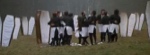
While the samurai covers are not 'bad', I hate that the covers are all 'linked' though, since they really don't have a reason to be. They may have similar themes, and made around the same time, but they are not made to be a collection, nor are they directed by the same director.
I'm also beginning to think that maybe Criterion are letting the interns do the cover art. They seem to just watch the movie and pick out a nice screen-shot. The covers for 'The Wages of Fear' just looks boring, as does 'The Man Who Fell to Earth'. And, 'Naked' looks like it took 2 minutes to cut-paste-text; it seems people are just appreciating it because it is a little less slack then the mock one they did.
I'm also beginning to think that maybe Criterion are letting the interns do the cover art. They seem to just watch the movie and pick out a nice screen-shot. The covers for 'The Wages of Fear' just looks boring, as does 'The Man Who Fell to Earth'. And, 'Naked' looks like it took 2 minutes to cut-paste-text; it seems people are just appreciating it because it is a little less slack then the mock one they did.
-
peerpee
- not perpee
- Joined: Tue Nov 02, 2004 7:41 pm
Excellent logic. I agree. The box set cover is okay, but there's no reason why each film couldn't have it's own (preferably original poster art style) cover. They'd be more historically faithful instead of all looking vaguely "1990s".jcelwin wrote:While the samurai covers are not 'bad', I hate that the covers are all 'linked' though, since they really don't have a reason to be. They may have similar themes, and made around the same time, but they are not made to be a collection, nor are they directed by the same director.
-
criterionsnob

- Joined: Wed Nov 03, 2004 5:23 am
- Location: Canada
There's been a change to the Masculin Feminin cover:
-
godardslave

- Joined: Tue Nov 02, 2004 8:44 pm
- Location: Confusing and open ended = high art.

-
analoguezombie
I agree. I think it's symptomatic of the new trend in graphic design, i.e. simple, uncluttered. I'm not entirely opposed to it, especially since most dvd covers cram so much junk on them it's difficult to even tell what is going on. The single, iconic image is a good use of the size of the dvd box though. And their style is quite refreshing from what else is being done, which is why it's probably so appealing initially. I love the new covers, but mainly due to these factors. Man, I want to work for Criterion though. I mean, I have photoshop too. Can I get a couple thousand bucks for a screen cap overlaid with bold text?jcelwin wrote:I'm also beginning to think that maybe Criterion are letting the interns do the cover art. They seem to just watch the movie and pick out a nice screen-shot. The covers for 'The Wages of Fear' just looks boring, as does 'The Man Who Fell to Earth'. And, 'Naked' looks like it took 2 minutes to cut-paste-text; it seems people are just appreciating it because it is a little less slack then the mock one they did.
The covers for A Woman is A Woman, Throne of Blood, and the Antoine Doniel Series and far superior IMO to the screen cap style of Masculin/Feminin, Ikiru, and the Cassavetes Collection, if only b/c they display an artist's interpretation of the overall feeling the film is in imbued with. They are much more creative and will stand the test of time a lot better than this new style. Still the simplistic nature of the Rebel Samurai set is quite appealing.
-
Hrossa
- Joined: Wed Nov 03, 2004 11:11 pm
- Location: Prince Edward Island
- Contact:
-
Cinephrenic

- Joined: Tue Nov 02, 2004 6:58 pm
- Location: Paris, Texas
-
Alonzo the Armless

- Joined: Thu Nov 04, 2004 12:57 am
-
What A Disgrace

- Joined: Mon Nov 08, 2004 2:34 am
- Contact:
-
godardslave
- Joined: Tue Nov 02, 2004 8:44 pm
- Location: Confusing and open ended = high art.
-
Cinesimilitude
- Joined: Tue Jul 09, 2013 4:43 am
-
ben d banana

- Joined: Wed Nov 03, 2004 12:53 am
- Location: Oh Where, Oh Where?
Or Costello-esque.godardslave wrote:RAN is very bold and stylish.

-
Alonzo the Armless
- Joined: Thu Nov 04, 2004 12:57 am
-
Cinesimilitude
- Joined: Tue Jul 09, 2013 4:43 am
-
Cinephrenic
- Joined: Tue Nov 02, 2004 6:58 pm
- Location: Paris, Texas
-
Lino

- Joined: Wed Nov 03, 2004 10:18 am
- Location: Sitting End
- Contact:


-
Anonymous