The Three Colors art is terrible. I mean, couldn't you just do a French flag? That's obvious, but at least it isn't hideous and it adheres to the thematic through-line of the films.
I'm not big on the Rules cover art either. It captures only a fraction of the film. It overlooks the tragedy of the film, which is as important as the farce. And yeah, it's a bit New Yorkerish.
Criterion & Eclipse Cover Art & Packaging Babble-on Vol.5
-
karmajuice
- Joined: Tue Jun 10, 2008 2:02 pm
-
Finch

- Joined: Mon Jul 07, 2008 9:09 pm
- Location: United States
Re: Criterion & Eclipse Cover Art & Packaging Babble-on Vol.
Rules of the Game is one of their finest covers and what makes the release even sweeter is that's it's coming out on payday (yay). Really pleased about the F&A announcement (digipack to accommodate the 3 Blu discs?). Not all that keen on 12 Angry Men (film, not the cover) but I've got plenty of November purchases as it is.
I don't understand the vitriol against the Colours boxset cover - it's far more appealing than the boring artwork that AE had for their DVD and probably their own forthcoming Colours Blu. I do however agree on the choice for the Blue still - so many beautiful/striking images in the film and they went with the TV bungee jumper?
I don't understand the vitriol against the Colours boxset cover - it's far more appealing than the boring artwork that AE had for their DVD and probably their own forthcoming Colours Blu. I do however agree on the choice for the Blue still - so many beautiful/striking images in the film and they went with the TV bungee jumper?
-
Brian C

- I hate to be That Pedantic Guy but...
- Joined: Wed Sep 16, 2009 3:58 pm
- Location: Northwest US
Re: Criterion & Eclipse Cover Art & Packaging Babble-on Vol.
I like both RULES and MEN, although I wonder if my opinion on RULES won't change after I've seen it in person. I haven't seen the trilogy, but the covers don't look too heinous to me taken on their own. I'm worried that I'll never know what year RUSHMORE was released in or the full name of the company releasing the Blu-ray.
-
swo17

- Bloodthirsty Butcher
- Joined: Tue Apr 15, 2008 2:25 pm
- Location: SLC, UT
Re: Criterion & Eclipse Cover Art & Packaging Babble-on Vol.
They're fixing Rushmore as we speak. You can see it with the sidebar on their front page.
-
Tom Hagen

- Joined: Mon Apr 14, 2008 4:35 pm
- Location: Salt Lake City, Utah
Re: Criterion & Eclipse Cover Art & Packaging Babble-on Vol.
It's entirely inexplicable. The only explanation I've heard is that all three covers are taken from stills, pictures, or screens contained within the films themselves. Which leads to the obvious question of, well, okay, but why that theme?Finch wrote:I do however agree on the choice for the Blue still - so many beautiful/striking images in the film and they went with the TV bungee jumper?
-
gcgiles1dollarbin

- Joined: Sun Sep 19, 2010 7:38 am
Re: Criterion & Eclipse Cover Art & Packaging Babble-on Vol.
Good call, but I think it's Edward Sorel, judging by the last name on the right side of the illustration.scotty2 wrote:Rules cover looks to be by one of the more prolific cover illustrators for The New Yorker, Barry Blitt.
EDIT: On that note, perhaps there is some level of reflexive irony in the choice of a New Yorker style cover; the film and the magazine are both deceptively bourgeois markers of taste. But I'm still not a fan of that style. I would have preferred the skeletons and ghosts being used somehow, like the images on the luminescent book cover of Perez's Material Ghost. Then again, I'm always pleased when either a dog, ghost, or skeleton makes an appearance on covers. So I'm biased.
Last edited by gcgiles1dollarbin on Mon Aug 15, 2011 8:52 pm, edited 2 times in total.
-
karmajuice
- Joined: Tue Jun 10, 2008 2:02 pm
Re: Criterion & Eclipse Cover Art & Packaging Babble-on Vol.
To be clear, I don't have much issue with the individual covers, even Blue, which are passable if not remarkable. It's the box cover that I hate.
-
Brian C
- I hate to be That Pedantic Guy but...
- Joined: Wed Sep 16, 2009 3:58 pm
- Location: Northwest US
Re: Criterion & Eclipse Cover Art & Packaging Babble-on Vol.
Oh thank goodness. After the disposable back cover of DARJEELING, I don't think I could have survived another Wes Anderson Blu with non-standard branding.swo17 wrote:They're fixing Rushmore as we speak. You can see it with the sidebar on their front page.
-
ellipsis7

- Joined: Tue Nov 02, 2004 5:56 pm
- Location: Dublin
Re: 216 The Rules of the Game
Yes, it is clearly reaching out to the unconverted, although I prefer the previous version, privileging the modernist over the conventional elements... But your analysis above is very salient and sharp, and I don't have any difficulties with that, clearly converted and conversant as you are...Tom Amolad wrote:Well sure, but I'm not so certain the new cover does that. One of the film does so spectacularly is to convey tragedy through comedy, and vice versa, and I can certainly read this cover as doing something of the same thing.
It's certainly a different approach from the old packaging, which showed a modernist film made up of conventional elements. It was a stunning package, but not the only way of approaching the film -- and probably not the best way to give those unfamiliar with it a sense of what it's like. This one emphasizes the conventional elements from which it is made up, but it doesn't preclude the transformations with which the film invests them.
-
HistoryProf

- Joined: Mon Mar 13, 2006 7:48 am
- Location: KCK
Re: Criterion & Eclipse Cover Art & Packaging Babble-on Vol.
Three Colors is truly atrocious. I absolutely astounded that they could fuck something so great up so horribly.
On the other hand, Rules of the Game and 12 Angry Men are absolutely beautiful - and F&A is timeless and simply perfect. The Sabu are good for Eclipse as well. But Three Colors is Pink Viridiana bad. Maybe worse.
What happened to Rushmore? what are they "fixing" with the cover? just the whacky C? I was kind of hopeful that we'd get a new cover for the blu...They did for Naked after all.
-
felipe
- Joined: Thu May 06, 2010 3:06 am
Re: Criterion & Eclipse Cover Art & Packaging Babble-on Vol.
That brown side bar doesn't really match the color scheme of the cover, and this bother me a little.swo17 wrote:

Anyway, Rules of the game and 12 angry men are amazing. Three colors is atrocious.
-
swo17
- Bloodthirsty Butcher
- Joined: Tue Apr 15, 2008 2:25 pm
- Location: SLC, UT
Re: Criterion & Eclipse Cover Art & Packaging Babble-on Vol.
Behold, fixed cover art:

-
TheGodfather

- Joined: Sun Sep 17, 2006 8:39 pm
- Location: The Netherlands
Re: Criterion & Eclipse Cover Art & Packaging Babble-on Vol.
Didn't expect 12 Angry Men yet so that`s a great surprise. Like the cover as well, simple but nice.
The Three Colors trilogy covers are great as well, not too fond on the Rules Of The Game cover...
The Three Colors trilogy covers are great as well, not too fond on the Rules Of The Game cover...
Last edited by TheGodfather on Mon Aug 15, 2011 9:22 pm, edited 1 time in total.
-
Feego

- Joined: Thu Aug 16, 2007 11:30 pm
- Location: Texas
Re: Criterion & Eclipse Cover Art & Packaging Babble-on Vol.
I must say, I'm not really digging that 12 Angry Men cover. It's not terrible by any means, but somehow I expect to see a large credit that reads "And Henry Fonda as Alice." The Rules of the Game cover is okay by me, and like everyone else, I hate the Three Colors covers. The best cover of the month is Fanny and Alexander, which was and still is one of the best in the collection.
-
jbeall

- Joined: Sat Aug 12, 2006 1:22 pm
- Location: Atlanta-ish
Re: Criterion & Eclipse Cover Art & Packaging Babble-on Vol.
The 12 Angry Men cover is fantastic, but the rest are "meh" at best. I'm not a fan of Criterion's recent policy of having cartoonists illustrate their covers (the best of that lot is easily R. Crumb's work, while Tomine's is just okay, and the Clowes covers are godawful), and indeed, the new-yorker-ish cover for Rules of the Game is too glib and flippant for the film overall.
And I'll chime in with the loathing for the Three Colors covers. Lazy work.
And I'll chime in with the loathing for the Three Colors covers. Lazy work.
-
matrixschmatrix

- Joined: Wed May 26, 2010 3:26 am
Re: Criterion & Eclipse Cover Art & Packaging Babble-on Vol.
I actually have no issue with the individual covers for Three Colors, though the boxset looks like a programming textbook. The Rules of the Game looks awful to me, maybe my least favorite re-release cover ever. Sabu! looks great- they've really been improving the Eclipse box art lately- and 12 Angry Men looks so-so, but the kind that might look great in person.
-
Foam

- Joined: Sat Apr 04, 2009 4:47 am
Re: Criterion & Eclipse Cover Art & Packaging Babble-on Vol.
I think the Three Colors packaging is nothing compared to this Rules disaster. I was in love with the old packaging, my favorite design in the collection perfectly suited for my favorite film in the collection. A jumble of inexplicable fractured faces adding up to a monochromatic blue perfectly captures both the mood and method of the film which ultimately creates such melancholy from the slow accumulation of subtle facial expressions, gestures, etc. This new one steamrolls all of that down into being like any other comedy of manners, "stating" that this is one of those films where a bunch of characters are intertwined without really capturing how this one in particular feels. Ugly.
-
Professor Wagstaff

- Joined: Wed Aug 25, 2010 3:27 am
Re: Criterion & Eclipse Cover Art & Packaging Babble-on Vol.
Wow, I've had Darjeeling for almost a year now and this is the first time I've noticed that disposable back cover. Yikes.Brian C wrote:Oh thank goodness. After the disposable back cover of DARJEELING, I don't think I could have survived another Wes Anderson Blu with non-standard branding.
-
thatobscurecharm

- Joined: Tue Aug 24, 2010 5:19 pm
- Location: Northern California
Re: Criterion & Eclipse Cover Art & Packaging Babble-on Vol.
I don't know guys...I think the faces of 12 Angry Men need more sweat ;]
Sabu!'s colour scheme reminds of Gatorade, but I do love the individual covers. Uh, no comment on Three Colours, but Rules is my fave!
Sabu!'s colour scheme reminds of Gatorade, but I do love the individual covers. Uh, no comment on Three Colours, but Rules is my fave!
-
ianungstad
- Joined: Thu Mar 17, 2005 1:20 am
Re: Criterion & Eclipse Cover Art & Packaging Babble-on Vol.
Does anyone recognize the artist for The Rules of The Game? Kind of reminds me of Kevin O'Neill.
-
domino harvey

- Dot Com Dom
- Joined: Wed Jan 11, 2006 6:42 pm
Re: Criterion & Eclipse Cover Art & Packaging Babble-on Vol.
It's Edward Sorel
-
thatobscurecharm
- Joined: Tue Aug 24, 2010 5:19 pm
- Location: Northern California
Re: Criterion & Eclipse Cover Art & Packaging Babble-on Vol.
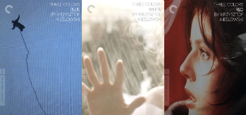
On second thought, Three Colors kinda looks nice assembled as the French flag.
-
zedz

- Joined: Sun Nov 07, 2004 11:24 pm
Re: Criterion & Eclipse Cover Art & Packaging Babble-on Vol.
I really don't mind the Three Colours covers. They don't stand up that well on their own, of course, but they don't have to inside their box, and I like the box cover, being a film image that actually works thematically for the entire trilogy.
-
rwaits
- Joined: Tue Dec 21, 2004 4:24 pm
Re: Criterion & Eclipse Cover Art & Packaging Babble-on Vol.
Agree, Zedz. I'm not in love with the box cover, but did find it rather clever.
-
mfunk9786

- Under Chris' Protection
- Joined: Fri May 16, 2008 8:43 pm
- Location: Miami, FL
Re: Criterion & Eclipse Cover Art & Packaging Babble-on Vol.
I like the idea of doing something different, but as soon as someone saw the finished product, they should have just decided against doing something different and moved on.