Criterion & Eclipse Cover Art & Packaging Babble-on Vol.5
-
Cinephrenic

- Joined: Tue Nov 02, 2004 6:58 pm
- Location: Paris, Texas
Re: Criterion & Eclipse Cover Art & Packaging Babble-on Vol.
Sure Delon is marketable, but doesn't really say much about the film.
-
Dragoon En Regalia

- Joined: Wed Aug 08, 2012 8:52 pm
- Location: Art Theatre Shinjuku Bunka
- Contact:
Re: Criterion & Eclipse Cover Art & Packaging Babble-on Vol.
Great covers for the Qatsi cases. I can see why some might not prefer the main box art, but it works within the concept of the films the way it should. Following's got a good one too.
-
matrixschmatrix

- Joined: Wed May 26, 2010 3:26 am
Re: Criterion & Eclipse Cover Art & Packaging Babble-on Vol.
I miss the slipcover effect, though not so badly as the ones for Videodrome and Fear and Loathing. I can't help but feel that they haven't been quite as creative with the packaging in the blu era.captveg wrote:The Brazil cover is a classic. No need to mess with it.
-
knives

- Joined: Sat Sep 06, 2008 10:49 pm
Re: Criterion & Eclipse Cover Art & Packaging Babble-on Vol.
I thought it was cute considering the themes of the film.Finch wrote:"By Christopher Nolan Following A Film"
-
pzadvance

- Joined: Mon Nov 21, 2011 11:24 pm
- Location: Vienna, Austria
Re: Criterion & Eclipse Cover Art & Packaging Babble-on Vol.
Yeah! Come on, it's a completely appropriate and relatively subtle means of graphically communicating a key aspect of the film's narrative. Good on ya, Criterion.knives wrote:I thought it was cute considering the themes of the film.Finch wrote:"By Christopher Nolan Following A Film"
-
Matt

- Joined: Tue Nov 02, 2004 4:58 pm
Re: Criterion & Eclipse Cover Art & Packaging Babble-on Vol.
The beauty of Delon is pretty much the film in toto.Cinephrenic wrote:Sure Delon is marketable, but doesn't really say much about the film.
-
Feego

- Joined: Thu Aug 16, 2007 11:30 pm
- Location: Texas
Re: Criterion & Eclipse Cover Art & Packaging Babble-on Vol.
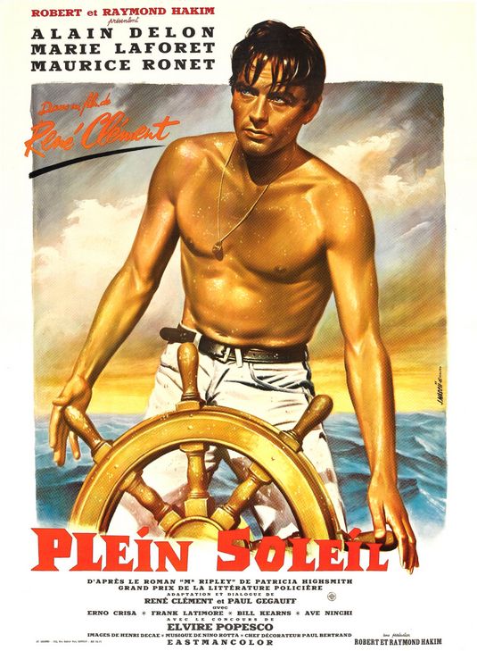
I like the idea of the Purple Noon cover (the projected image of Maurice Ronet and his signature captures a key moment in the film), but the image is just sort of bland and generic. It's a little too reminiscent of this box set from Lionsgate. Too bad they couldn't use something similar to this original poster, either a new painting or a still photo.
-
barryconvex

- billy..biff..scooter....tommy
- Joined: Sat Aug 25, 2012 2:08 am
- Location: NYC
Re: Criterion & Eclipse Cover Art & Packaging Babble-on Vol.
I second that emotion-if ever there was a beautiful person acting in front of a beautiful background it's Delon and southern Italy in this movie...Matt wrote:The beauty of Delon is pretty much the film in toto.Cinephrenic wrote:Sure Delon is marketable, but doesn't really say much about the film.
-
felipe
- Joined: Thu May 06, 2010 3:06 am
Re: Criterion & Eclipse Cover Art & Packaging Babble-on Vol.
I don't think it's a matter of being creative, it just seems to me they're trying to spend less. They could've easily put a slipcover on the upgrade for Fear and Loathing (one of their best-selling releases) but they chose not to. They could do Brazil in a digipack with the transparent slipcover, but I don't think they will.matrixschmatrix wrote:I miss the slipcover effect, though not so badly as the ones for Videodrome and Fear and Loathing. I can't help but feel that they haven't been quite as creative with the packaging in the blu era.captveg wrote:The Brazil cover is a classic. No need to mess with it.
I think they're just being cheaper. That's why we don't see as many digipacks as before. That's why they've released the Samurai trilogy in a single regular blu case.
-
TheGodfather

- Joined: Sun Sep 17, 2006 8:39 pm
- Location: The Netherlands
Re: Criterion & Eclipse Cover Art & Packaging Babble-on Vol.
Which I think is a shame. I`d love it if they`d release more digipacks, like they used to in the dvd erafelipe wrote:I don't think it's a matter of being creative, it just seems to me they're trying to spend less. They could've easily put a slipcover on the upgrade for Fear and Loathing (one of their best-selling releases) but they chose not to. They could do Brazil in a digipack with the transparent slipcover, but I don't think they will.matrixschmatrix wrote:I miss the slipcover effect, though not so badly as the ones for Videodrome and Fear and Loathing. I can't help but feel that they haven't been quite as creative with the packaging in the blu era.captveg wrote:The Brazil cover is a classic. No need to mess with it.
I think they're just being cheaper. That's why we don't see as many digipacks as before. That's why they've released the Samurai trilogy in a single regular blu case.
-
Minkin

- Joined: Fri Aug 07, 2009 3:13 am
Re: Criterion & Eclipse Cover Art & Packaging Babble-on Vol.
The Tin Drum is touring from Janus now, with a new poster - which given the recent track record, I can only assume will eventually be the new Criterion Blu/DVD cover:

-
Cinephrenic
- Joined: Tue Nov 02, 2004 6:58 pm
- Location: Paris, Texas
-
zedz

- Joined: Sun Nov 07, 2004 11:24 pm
Re: Criterion & Eclipse Cover Art & Packaging Babble-on Vol.
They've even left a nice space for the wacky C.
-
rspaight

- Joined: Tue Jun 05, 2012 2:18 pm
Re: Criterion & Eclipse Cover Art & Packaging Babble-on Vol.
I don't see much of a difference between the DVD and BD packaging for Videodrome, except for the thickness. Which sort of ruined the illusion. (I took the DVD to a film group once and the guy running it pulled the case out of the slipcover and started to tell me he couldn't play it until he realized what was going on.)matrixschmatrix wrote:I miss the slipcover effect, though not so badly as the ones for Videodrome and Fear and Loathing. I can't help but feel that they haven't been quite as creative with the packaging in the blu era.captveg wrote:The Brazil cover is a classic. No need to mess with it.
-
matrixschmatrix
- Joined: Wed May 26, 2010 3:26 am
Re: Criterion & Eclipse Cover Art & Packaging Babble-on Vol.
Yeah, that's one where it's specifically an issue of not rethinking it for blu rather than of going cheap. I just can't think of any blu sets they've put out where it had an effect with the cover that made me think 'oh, neat'- though the pop-up Gozilla is pretty close.
-
Feego
- Joined: Thu Aug 16, 2007 11:30 pm
- Location: Texas
Re: Criterion & Eclipse Cover Art & Packaging Babble-on Vol.
Concerning the Tin Drum poster, why do his arms look like little sperms?
-
CSM126

- Joined: Thu Nov 04, 2004 12:22 pm
- Location: The Room
- Contact:
Re: Criterion & Eclipse Cover Art & Packaging Babble-on Vol.
Granted I've never seen Tin Drum, but I seem to remember discussion of some sexual content?
-
Feego
- Joined: Thu Aug 16, 2007 11:30 pm
- Location: Texas
Re: Criterion & Eclipse Cover Art & Packaging Babble-on Vol.
I've never seen it either, so it's entirely possible I'm missing something.
-
kuzine

- Joined: Tue Dec 13, 2005 1:37 pm
Re: Criterion & Eclipse Cover Art & Packaging Babble-on Vol.
Drumsticks, no?
-
jorencain

- Joined: Wed Nov 03, 2004 5:45 am
Re: Criterion & Eclipse Cover Art & Packaging Babble-on Vol.
Re: two sperms....He has two fathers, and he is never sure which one actually impregnated his mom.
-
cdnchris

- Site Admin
- Joined: Tue Nov 02, 2004 6:45 pm
- Location: Washington
- Contact:
-
knives
- Joined: Sat Sep 06, 2008 10:49 pm
Re: Criterion & Eclipse Cover Art & Packaging Babble-on Vol.
Cute on the Eating Raoul insert even if I would prefer a meatier booklet.
-
mfunk9786

- Under Chris' Protection
- Joined: Fri May 16, 2008 8:43 pm
- Location: Miami, FL
Re: Criterion & Eclipse Cover Art & Packaging Babble-on Vol.
Awesome awesome insert though. Really cool.
Les visiteurs du soir looks absolutely lovely too. It's completely enveloped by excellent artwork inside and out - I love the way it wraps around the spine. Same story with Children of Paradise to a lesser effect (so busy!)
Les visiteurs du soir looks absolutely lovely too. It's completely enveloped by excellent artwork inside and out - I love the way it wraps around the spine. Same story with Children of Paradise to a lesser effect (so busy!)
Last edited by mfunk9786 on Thu Sep 20, 2012 9:12 pm, edited 1 time in total.
-
Matt
- Joined: Tue Nov 02, 2004 4:58 pm
Re: Criterion & Eclipse Cover Art & Packaging Babble-on Vol.
Did everyone see the feature on Criterion's web site that shows that all the art for the Carné packages comes from Alexandre Trauner's set designs?
-
felipe
- Joined: Thu May 06, 2010 3:06 am
Re: Criterion & Eclipse Cover Art & Packaging Babble-on Vol.
Too bad Criterion found out how to do 2-disc plastic blu cases. Children of paradise would have made a great digipack.