Criterion & Eclipse Cover Art & Packaging Babble-on Vol. 6
-
cdnchris

- Site Admin
- Joined: Tue Nov 02, 2004 6:45 pm
- Location: Washington
- Contact:
Re: Criterion & Eclipse Cover Art & Packaging Babble-on Vol.
I'll get pics up soon but On the Waterfron is a Digipak.
-
TheGodfather

- Joined: Sun Sep 17, 2006 8:39 pm
- Location: The Netherlands
Re: Criterion & Eclipse Cover Art & Packaging Babble-on Vol.
That`s great news! been too long since they`ve released a digipack (not including sets  )
)
-
cdnchris
- Site Admin
- Joined: Tue Nov 02, 2004 6:45 pm
- Location: Washington
- Contact:
-
TheGodfather
- Joined: Sun Sep 17, 2006 8:39 pm
- Location: The Netherlands
-
swo17

- Bloodthirsty Butcher
- Joined: Tue Apr 15, 2008 2:25 pm
- Location: SLC, UT
-
The Narrator Returns

- Joined: Tue Nov 15, 2011 10:35 pm


-
lacritfan

- Life is one big kevyip
- Joined: Wed Dec 05, 2007 10:39 pm
- Location: Los Angeles
Re: Criterion & Eclipse Cover Art & Packaging Babble-on Vol.
Jubal? Medium Cool looks like a sci-fi movie until you look up close. I get Life Is Sweet but I would've preferred something with the cast maybe even the final scene
Spoiler
with the sisters sitting on the back porch.
-
The Narrator Returns
- Joined: Tue Nov 15, 2011 10:35 pm
Re: Criterion & Eclipse Cover Art & Packaging Babble-on Vol.
Medium Cool looks like it was designed by swimminghorses.
-
matrixschmatrix

- Joined: Wed May 26, 2010 3:26 am
Re: Criterion & Eclipse Cover Art & Packaging Babble-on Vol.
I actually like Medium Cool, but Jubal and to a lesser degree 3:10 to Yuma look at first glance like someone just took a screenshot, cropped it, and slapped that Photoshop watercolor filter on it
-
Murdoch

- Joined: Mon Apr 21, 2008 3:59 am
- Location: Upstate NY
Re: Criterion & Eclipse Cover Art & Packaging Babble-on Vol.
Wow, Medium Cool may be one of my favorite covers in the collection. Well done.
-
zedz

- Joined: Sun Nov 07, 2004 11:24 pm
Re: Criterion & Eclipse Cover Art & Packaging Babble-on Vol.
I like the Medium Cool cover. Some people need a refresher course in the clip art nightmare that was swimminghorses. Whether you like that cover or not, it's nothing like his work. (Repo Man, on the other hand. . .)
-
med

- Joined: Tue Mar 17, 2009 9:58 pm
Re: Criterion & Eclipse Cover Art & Packaging Babble-on Vol.
"swimminghorses" has become annoying board-shorthand for when someone doesn't like a cover but is unable to explain why.
-
Feego

- Joined: Thu Aug 16, 2007 11:30 pm
- Location: Texas
Re: Criterion & Eclipse Cover Art & Packaging Babble-on Vol.
I think all of the covers this month are pretty great. I like the vintage feel of Medium Cool, and the Daves covers remind me of the paintings you often see hanging over the bars in Western films. My one issue with the 3:10 cover is that it sort of looks like Van Heflin just shot Glenn Ford in the back (I had a similar issue with the Belle de Jour cover where the red material Deneuve is lying on looks like blood spilling from her chest).
-
The Narrator Returns
- Joined: Tue Nov 15, 2011 10:35 pm
Re: Criterion & Eclipse Cover Art & Packaging Babble-on Vol.
My issue with the 3:10 cover is that my brain, for some reason, thinks it looks like similar to the Carlos cover. Maybe it's the placement of the title.
-
movielocke

- Joined: Fri Jan 18, 2008 4:44 am
Re: Criterion & Eclipse Cover Art & Packaging Babble-on Vol.
Yeah and every month if there is a cover that is not a lazy screengrab like Life is Sweet, someone will compare that cover to swimminghorses.med wrote:"swimminghorses" has become annoying board-shorthand for when someone doesn't like a cover but is unable to explain why.
-
TheGodfather
- Joined: Sun Sep 17, 2006 8:39 pm
- Location: The Netherlands
Re: Criterion & Eclipse Cover Art & Packaging Babble-on Vol.
Pretty OK month, title and cover-wise.
Great to see another Godard on blu-ray!
Great to see another Godard on blu-ray!
-
Buttercream

- Joined: Wed Nov 16, 2011 2:27 am
- Location: Chicago, IL
Re: Criterion & Eclipse Cover Art & Packaging Babble-on Vol.
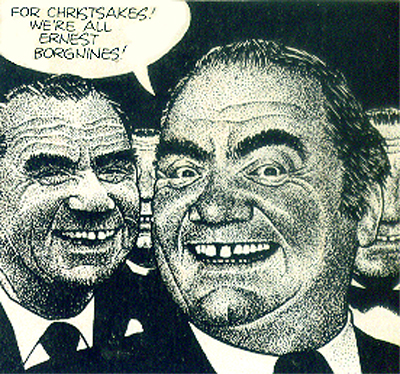
I'm glad that Ernest Borgnine's disgusting face has joined the collection. Though I wish the cover would have been his blown up, distorted face a la Tiny Furniture.
Love the Medium Cool, though it does evoke 2001 at a glance.
Love the Medium Cool, though it does evoke 2001 at a glance.
-
Gregory

- Joined: Tue Nov 02, 2004 8:07 pm
Re: Criterion & Eclipse Cover Art & Packaging Babble-on Vol.
They should have had Drew Friedman do the cover:
-
HistoryProf

- Joined: Mon Mar 13, 2006 7:48 am
- Location: KCK
Re: Criterion & Eclipse Cover Art & Packaging Babble-on Vol.
not a terribly impressive front - cover art and release wise. hopefully they're gearing up for some major summer releases.
-
Steven H

- Joined: Tue Nov 02, 2004 7:30 pm
- Location: NC
Re: Criterion & Eclipse Cover Art & Packaging Babble-on Vol.
Good to see Jack Black enter the collection with Jubal.
-
cdnchris
- Site Admin
- Joined: Tue Nov 02, 2004 6:45 pm
- Location: Washington
- Contact:
-
fdm

- Joined: Fri Apr 21, 2006 5:25 pm
Re: Criterion & Eclipse Cover Art & Packaging Babble-on Vol.
Just love the look of crunched cardboard in the morning.cdnchris wrote:Sansho the Bailiff
-
vsski

- Joined: Thu Oct 13, 2011 7:47 pm
Re: Criterion & Eclipse Cover Art & Packaging Babble-on Vol.
Great - first Waterfront and now this one again in a digipack version (I know the DVD was the same). I'm looking forward to buying ten of them until I finally get one where the cardboard or insert isn't dinged or dented ](*,) . If I ever stop collecting CCs the main reason will be that I'm tired of tracking down discs without damaged packaging!cdnchris wrote:Sansho the Bailiff
-
The Narrator Returns
- Joined: Tue Nov 15, 2011 10:35 pm
Re: Criterion & Eclipse Cover Art & Packaging Babble-on Vol.
My collection is unclean, I tell you! Unclean!!!
-
swo17
- Bloodthirsty Butcher
- Joined: Tue Apr 15, 2008 2:25 pm
- Location: SLC, UT
Re: Criterion & Eclipse Cover Art & Packaging Babble-on Vol.
Your best bet with digipaks if you get a banged up one is probably just to ask Criterion directly for a replacement. They tend to come with the sleeve collapsed in a thick cardboard envelope, which usually fares well in the mail. They may or may not charge you $5 per item for this service.
You guys aren't paying close attention though if you think that digipaks are the only things susceptible to damage. I'm constantly finding dings, tears, and crinkles in the booklets and cover sleeves for releases in plastic cases, which likely originated at the pressing plant.
You guys aren't paying close attention though if you think that digipaks are the only things susceptible to damage. I'm constantly finding dings, tears, and crinkles in the booklets and cover sleeves for releases in plastic cases, which likely originated at the pressing plant.