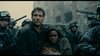
I dunno, I always thought Cassavetes looks like he's sneezing in that picture. I like the titling however.
La Notte is just awful.
Criterion & Eclipse Cover Art & Packaging Babble-on Vol. 6
-
Zot!
- Joined: Wed Jan 20, 2010 4:09 am
-
Anthony

- Joined: Mon Feb 14, 2005 5:38 pm
- Location: Berkeley, CA
Re: Criterion & Eclipse Cover Art & Packaging Babble-on Vol.
I really like the I Married a Witch and The Uninvited covers.
-
movielocke

- Joined: Fri Jan 18, 2008 4:44 am
Re: Criterion & Eclipse Cover Art & Packaging Babble-on Vol.
That I Married a Witch artwork makes me think that Sullivan's travels upgrade got bumped last minute--look at how similar the art is--I bet we see Sullivan's Travels and maybe the Lady Eve in November or december.


-
The Narrator Returns

- Joined: Tue Nov 15, 2011 10:35 pm
Re: Criterion & Eclipse Cover Art & Packaging Babble-on Vol.
The first thing I thought of too. Of course, the Sullivan's cover pretty much just emphasizes everything wrong with Witch's cover.
-
knives

- Joined: Sat Sep 06, 2008 10:49 pm
Re: Criterion & Eclipse Cover Art & Packaging Babble-on Vol.
Stupid eyebrow, right? Had they just chosen a more autumn like color and turned down the MS paintness it could have been a very good cover easily.
-
Moe Dickstein

- Joined: Sat Aug 25, 2012 3:19 am
Re: Criterion & Eclipse Cover Art & Packaging Babble-on Vol.
Really? The old set is ass-uglyLuke M wrote:Not to further the DVD-to-Blu cover debate, but I am happy to see they didn't change the cover art for the Cassavetes set.
-
Luke M
- Joined: Fri Jul 13, 2007 1:21 am
Re: Criterion & Eclipse Cover Art & Packaging Babble-on Vol.
I always thought the graphics on the white backgrounds on the digipacks gave the set a prestigious look. Could've been the extraordinary price tag coloring my judgement though.Moe Dickstein wrote:Really? The old set is ass-uglyLuke M wrote:Not to further the DVD-to-Blu cover debate, but I am happy to see they didn't change the cover art for the Cassavetes set.
-
Randall Maysin

- Joined: Tue Apr 02, 2013 4:26 pm
Re: Criterion & Eclipse Cover Art & Packaging Babble-on Vol.
both of those Veronica Lake images are from the original posters, so i'm not so sure it means anything is forthcoming.
criterion can be so wrong-headed at times. I mean the original amarcord poster is, like, one of the most beloved poster designs ever, isn't it? the newer cover is just so not fellini-esque, everyone looks so awkward and sweaty. but the last criterion-designed cover I like was for Kind Hearts and Coronets. and that was a cover that somehow succeeded by emulating the Ealing poster designs, which were crappy to begin with!
cough cough...Amarcord...Amarcord!...cough, cough cough... >dies<FakeBonanza wrote:Solaris and The Red Shoes may be the only updated covers in the collection that aren't superior to the originals.
criterion can be so wrong-headed at times. I mean the original amarcord poster is, like, one of the most beloved poster designs ever, isn't it? the newer cover is just so not fellini-esque, everyone looks so awkward and sweaty. but the last criterion-designed cover I like was for Kind Hearts and Coronets. and that was a cover that somehow succeeded by emulating the Ealing poster designs, which were crappy to begin with!
-
med

- Joined: Tue Mar 17, 2009 9:58 pm
Re: Criterion & Eclipse Cover Art & Packaging Babble-on Vol.
Did anyone ever get to the bottom of the weird pattern on Cassavetes's neck?
-
jindianajonz

- Jindiana Jonz Abrams
- Joined: Thu Oct 13, 2011 12:11 am
Re: Criterion & Eclipse Cover Art & Packaging Babble-on Vol.
It looks like a shirt collar to me. The high contrast just makes the white part of the collar blend in with his neck.med wrote:Did anyone ever get to the bottom of the weird pattern on Cassavetes's neck?
-
med
- Joined: Tue Mar 17, 2009 9:58 pm
Re: Criterion & Eclipse Cover Art & Packaging Babble-on Vol.
It isn't. I've seen the same pic elsewhere (possibly in the set itself? I don't remember) without the pattern.
-
Minkin

- Joined: Fri Aug 07, 2009 3:13 am
Re: Criterion & Eclipse Cover Art & Packaging Babble-on Vol.
I always thought it looked like he had been run over by a car/bike, thus leaving some sort of tire tread on his neck (Looney Tunes style).jindianajonz wrote:It looks like a shirt collar to me. The high contrast just makes the white part of the collar blend in with his neck.med wrote:Did anyone ever get to the bottom of the weird pattern on Cassavetes's neck?
-
Gregory

- Joined: Tue Nov 02, 2004 8:07 pm
Re: Criterion & Eclipse Cover Art & Packaging Babble-on Vol.
Sick neck tat, bro.
-
Feego

- Joined: Thu Aug 16, 2007 11:30 pm
- Location: Texas
Re: Criterion & Eclipse Cover Art & Packaging Babble-on Vol.
The I Married a Witch cover would have been ace if they had just used THIS.
-
domino harvey

- Dot Com Dom
- Joined: Wed Jan 11, 2006 6:42 pm
Re: Criterion & Eclipse Cover Art & Packaging Babble-on Vol.

They could've also just slapped some text on this publicity photo and it would've made a great cover (for I Married a Witch, not the Cassavetes box)
-
jindianajonz
- Jindiana Jonz Abrams
- Joined: Thu Oct 13, 2011 12:11 am
Re: Criterion & Eclipse Cover Art & Packaging Babble-on Vol.
Nope, definitely a shirt collar. You can see it more clearly on the booklet cover.med wrote:It isn't. I've seen the same pic elsewhere (possibly in the set itself? I don't remember) without the pattern.
EDIT: Check the bottom pic here
-
Gregory
- Joined: Tue Nov 02, 2004 8:07 pm
Re: Criterion & Eclipse Cover Art & Packaging Babble-on Vol.
Now that that's solved, what the hell is that blurry "m" in Veronica Lake's hair? That's cover shows one of the most inept attempts at adding texture and shading I've seen in a while.
Where do they find these people?
Where do they find these people?
-
matrixschmatrix

- Joined: Wed May 26, 2010 3:26 am
Re: Criterion & Eclipse Cover Art & Packaging Babble-on Vol.
Well now you're just being closed mindeddomino harvey wrote:(for I Married a Witch, not the Cassavetes box)
-
jindianajonz
- Jindiana Jonz Abrams
- Joined: Thu Oct 13, 2011 12:11 am
Re: Criterion & Eclipse Cover Art & Packaging Babble-on Vol.
Not sure, but looking at it gives me an uncontrollable urge to go get some chicken mcnuggets.Gregory wrote:Now that that's solved, what the hell is that blurry "m" in Veronica Lake's hair? That's cover shows one of the most inept attempts at adding texture and shading I've seen in a while.
Where do they find these people?
-
zedz

- Joined: Sun Nov 07, 2004 11:24 pm
Re: Criterion & Eclipse Cover Art & Packaging Babble-on Vol.
This really exposes the problem. The stylized Lake cartoon on Sullivan's Travels works because it's an actual stylized cartoon of Veronica Lake - same with the original posters domino posted. This new cover is a fussy digital approximation of those cartoons, and it looks as third-hand and amateurish as that implies. The same basic design, in an actual period, brush-stroke style would have been unadventurous but much more palatable.movielocke wrote:That I Married a Witch artwork makes me think that Sullivan's travels upgrade got bumped last minute--look at how similar the art is--I bet we see Sullivan's Travels and maybe the Lady Eve in November or december.
-
vsski

- Joined: Thu Oct 13, 2011 7:47 pm
Re: Criterion & Eclipse Cover Art & Packaging Babble-on Vol.
Maybe I'm missing something or the fees are just exorbitant, but why does CC feels it is necessary to hire designers for their covers when in many cases the original poster art would be so much better?
-
domino harvey
- Dot Com Dom
- Joined: Wed Jan 11, 2006 6:42 pm
Re: Criterion & Eclipse Cover Art & Packaging Babble-on Vol.
Because having a "Criterion cover" has eclipsed, pun intended, the desire to have "Criterion extras"
-
Jeff

- Joined: Wed Nov 03, 2004 1:49 am
- Location: Denver, CO
Re: Criterion & Eclipse Cover Art & Packaging Babble-on Vol.
Their in-house guy, Eric Skillman, designed that, so I'm sure it was indeed cheaper than licensing the original poster art. There are also sometimes limitations on how much you can modify the original art, and those posters have a lot more text than Criterion typically includes.vsski wrote:Maybe I'm missing something or the fees are just exorbitant, but why does CC feels it is necessary to hire designers for their covers when in many cases the original poster art would be so much better?
-
domino harvey
- Dot Com Dom
- Joined: Wed Jan 11, 2006 6:42 pm
Re: Criterion & Eclipse Cover Art & Packaging Babble-on Vol.
That's a Skillman cover? Wow, what's happened?
-
Moe Dickstein
- Joined: Sat Aug 25, 2012 3:19 am
Re: Criterion & Eclipse Cover Art & Packaging Babble-on Vol.
I gotta say I really like the Witch cover.
I'd be pretty disappointed in a Criterion release that just used the original poster at this point.
I'd be pretty disappointed in a Criterion release that just used the original poster at this point.