Criterion & Eclipse Cover Art & Packaging Babble-on Vol. 6

News on Criterion and Janus Films
Locked
Message
Author
User avatar
domino harvey
Dot Com Dom
Joined: Wed Jan 11, 2006 6:42 pm

Re: Criterion & Eclipse Cover Art & Packaging Babble-on Vol.

#401 Post by domino harvey »

Moe Dickstein wrote:I gotta say I really like the Witch cover.

I'd be pretty disappointed in a Criterion release that just used the original poster at this point.
Image

Yeah, GROSS!!!
User avatar
Moe Dickstein
Joined: Sat Aug 25, 2012 3:19 am

Re: Criterion & Eclipse Cover Art & Packaging Babble-on Vol.

#402 Post by Moe Dickstein »

There's still design work going on there.
User avatar
domino harvey
Dot Com Dom
Joined: Wed Jan 11, 2006 6:42 pm

Re: Criterion & Eclipse Cover Art & Packaging Babble-on Vol.

#403 Post by domino harvey »

Yeah, for the worse

Image
User avatar
Gregory
Joined: Tue Nov 02, 2004 8:07 pm

Re: Criterion & Eclipse Cover Art & Packaging Babble-on Vol.

#404 Post by Gregory »

Wouldn't a better example be the Sullivan's Travels cover?
User avatar
domino harvey
Dot Com Dom
Joined: Wed Jan 11, 2006 6:42 pm

Re: Criterion & Eclipse Cover Art & Packaging Babble-on Vol.

#405 Post by domino harvey »

Domino Harvey's on the mistake
Rupert Pupkin
Joined: Thu Oct 20, 2005 1:34 pm

Re: Criterion & Eclipse Cover Art & Packaging Babble-on Vol.

#406 Post by Rupert Pupkin »

domino harvey wrote:Image

They could've also just slapped some text on this publicity photo and it would've made a great cover (for I Married a Witch, not the Cassavetes box)
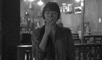
they could have used this photo for any Criterion release, Bergman, Cassavetes, whatever...
I would have been happy. :oops: :oops:
Thanks so much for this photo...

at least I'm glad that I Married A Witch is at last release on blu-ray...
User avatar
colinr0380
Joined: Mon Nov 08, 2004 8:30 pm
Location: Chapel-en-le-Frith, Derbyshire, UK

Re: Criterion & Eclipse Cover Art & Packaging Babble-on Vol.

#407 Post by colinr0380 »

I much prefer the minimalist cover to The Uninvited in comparison to its original poster, and that really looks like the standout cover of the month.

Sadly I have to agree with warren oates on La Notte - that's just going to irritate my OCD obsession with lining up the cover images properly! Hopefully that one will look better (and I'll be able to cope with it!) once it is in my hands.

I also quite like the I Married A Witch cover (I get it: Veronica Lake is smokin' hot!) but do agree with zedz that it looks a little too 'digital'.
User avatar
HistoryProf
Joined: Mon Mar 13, 2006 7:48 am
Location: KCK

Re: Criterion & Eclipse Cover Art & Packaging Babble-on Vol.

#408 Post by HistoryProf »

movielocke wrote:That I Married a Witch artwork makes me think that Sullivan's travels upgrade got bumped last minute--look at how similar the art is--I bet we see Sullivan's Travels and maybe the Lady Eve in November or december.


ImageImage

Like many others, I saw the similarities instantly and thought "My, how incredibly boring and LAZY" - just pathetic really. La Notte is horrible as well. Really a bad couple of months.

Only salvation is that The Uninvited is sublime - one of the best covers they've ever done. Or maybe it just seems so compared to the crap surrounding it.
User avatar
Moe Dickstein
Joined: Sat Aug 25, 2012 3:19 am

Re: Criterion & Eclipse Cover Art & Packaging Babble-on Vol.

#409 Post by Moe Dickstein »

To be fair, Veronica Lake was usually represented in that way, it's not just Sullivan's Travels.

And really it's not like I Married A Witch is even in the same MS Paint league as Babette's Feast.
User avatar
Cinephrenic
Joined: Tue Nov 02, 2004 6:58 pm
Location: Paris, Texas

Re: Criterion & Eclipse Cover Art & Packaging Babble-on Vol.

#410 Post by Cinephrenic »

It's a template for everything Veronica Lake. She's on the take for Criterion cover art.
User avatar
Feego
Joined: Thu Aug 16, 2007 11:30 pm
Location: Texas

Re: Criterion & Eclipse Cover Art & Packaging Babble-on Vol.

#411 Post by Feego »

I like the idea behind the I Married a Witch cover, but the execution is just all wrong. As others have said, it looks too "digital," it doesn't have the, for lack of a better word, grace that a painted illustration would have had.

But then, why bother with artists' renditions at all when you have a puss like this?

Image
User avatar
zedz
Joined: Sun Nov 07, 2004 11:24 pm

Re: Criterion & Eclipse Cover Art & Packaging Babble-on Vol.

#412 Post by zedz »

I have to say, with publicity stills like that on hand, why bother with a contemporary illustration at all? Toss a coin: use one for the box cover and one for the booklet and everybody's happy, plus Criterion would probably sell about 20% more.

EDIT: And the hits keep on coming:
Image
Image
User avatar
domino harvey
Dot Com Dom
Joined: Wed Jan 11, 2006 6:42 pm

Re: Criterion & Eclipse Cover Art & Packaging Babble-on Vol.

#413 Post by domino harvey »

Damn zedz, love that last one, probably the best one yet
User avatar
zedz
Joined: Sun Nov 07, 2004 11:24 pm

Re: Criterion & Eclipse Cover Art & Packaging Babble-on Vol.

#414 Post by zedz »

Who in their right mind wouldn't buy that disc?
User avatar
domino harvey
Dot Com Dom
Joined: Wed Jan 11, 2006 6:42 pm

Re: Criterion & Eclipse Cover Art & Packaging Babble-on Vol.

#415 Post by domino harvey »

Image
User avatar
zedz
Joined: Sun Nov 07, 2004 11:24 pm

Re: Criterion & Eclipse Cover Art & Packaging Babble-on Vol.

#416 Post by zedz »

(sigh)
User avatar
knives
Joined: Sat Sep 06, 2008 10:49 pm

Re: Criterion & Eclipse Cover Art & Packaging Babble-on Vol.

#417 Post by knives »

Le sigh.
Image
User avatar
cdnchris
Site Admin
Joined: Tue Nov 02, 2004 6:45 pm
Location: Washington
Contact:

Re: Criterion & Eclipse Cover Art & Packaging Babble-on Vol.

#419 Post by cdnchris »

felipe
Joined: Thu May 06, 2010 3:06 am

Re: Criterion & Eclipse Cover Art & Packaging Babble-on Vol.

#420 Post by felipe »

About Shoah, is the digipack for the DVD edition very different from the blu-ray digipack? The former must house 6 discs, so is it bigger or did they just put one disc on top of the other?
User avatar
cdnchris
Site Admin
Joined: Tue Nov 02, 2004 6:45 pm
Location: Washington
Contact:

Re: Criterion & Eclipse Cover Art & Packaging Babble-on Vol.

#421 Post by cdnchris »

I haven't seen it but my understanding is that it's similar to Berlin Alexanderplatz using the figure-8 disc holders.
User avatar
mfunk9786
Under Chris' Protection
Joined: Fri May 16, 2008 8:43 pm
Location: Miami, FL

Re: Criterion & Eclipse Cover Art & Packaging Babble-on Vol.

#422 Post by mfunk9786 »

I'd forgotten how nice that Berlin Alexanderplatz packaging was. Damn.
User avatar
cdnchris
Site Admin
Joined: Tue Nov 02, 2004 6:45 pm
Location: Washington
Contact:

Re: Criterion & Eclipse Cover Art & Packaging Babble-on Vol.

#423 Post by cdnchris »

User avatar
warren oates
Joined: Fri Mar 02, 2012 4:16 pm

Re: Criterion & Eclipse Cover Art & Packaging Babble-on Vol.

#424 Post by warren oates »

Love the image underneath the disc, even though it breaks with the idea of the rest of the package design. Can't believe a fish-eye shot hasn't been used for this space before (has it?). Then again, there aren't too many films in the collection with such shots that are also so representative of the film as a whole.
User avatar
cdnchris
Site Admin
Joined: Tue Nov 02, 2004 6:45 pm
Location: Washington
Contact:

Re: Criterion & Eclipse Cover Art & Packaging Babble-on Vol.

#425 Post by cdnchris »

Locked