Criterion & Eclipse Cover Art & Packaging Babble-on Vol. 6
-
zedz

- Joined: Sun Nov 07, 2004 11:24 pm
Re: Criterion & Eclipse Cover Art & Packaging Babble-on Vol.
Great batch of covers this month, except for THE one for THE Fellini film.
-
domino harvey

- Dot Com Dom
- Joined: Wed Jan 11, 2006 6:42 pm
Re: Criterion & Eclipse Cover Art & Packaging Babble-on Vol.
[-X It obv takes place in Los Angeleszedz wrote:Great batch of covers this month, except for THE one for THE Fellini film.
-
CSM126

- Joined: Thu Nov 04, 2004 12:22 pm
- Location: The Room
- Contact:
Re: Criterion & Eclipse Cover Art & Packaging Babble-on Vol.
pzadvance wrote: Wait is there really some kind of hidden image here that I'm missing?
Yes, and it's one of those things that'll make you shit bricks when you see it.
-
The Narrator Returns

- Joined: Tue Nov 15, 2011 10:35 pm
Re: Criterion & Eclipse Cover Art & Packaging Babble-on Vol.
It's a schooner, for the record.
-
pzadvance

- Joined: Mon Nov 21, 2011 11:24 pm
- Location: Vienna, Austria
Re: Criterion & Eclipse Cover Art & Packaging Babble-on Vol.
Well I've tried it all and I'm still left scratching my head. I can see that the gradient of the dots might be taking some kind of shape but for the life of me I can't see what it is...Askew wrote:Try looking at the thumbnails of the cover on Criterion's site.pzadvance wrote:Wait is there really some kind of hidden image here that I'm missing?
-
CSM126
- Joined: Thu Nov 04, 2004 12:22 pm
- Location: The Room
- Contact:
Re: Criterion & Eclipse Cover Art & Packaging Babble-on Vol.
pzadvance wrote:Well I've tried it all and I'm still left scratching my head. I can see that the gradient of the dots might be taking some kind of shape but for the life of me I can't see what it is...Askew wrote:Try looking at the thumbnails of the cover on Criterion's site.pzadvance wrote:Wait is there really some kind of hidden image here that I'm missing?
Spoiler
It's a particularly disturbing portrait of the killer
-
rwiggum
- Joined: Mon Oct 01, 2012 2:11 am
Re: Criterion & Eclipse Cover Art & Packaging Babble-on Vol.
Does this help?pzadvance wrote:Well I've tried it all and I'm still left scratching my head. I can see that the gradient of the dots might be taking some kind of shape but for the life of me I can't see what it is...Askew wrote:Try looking at the thumbnails of the cover on Criterion's site.pzadvance wrote:Wait is there really some kind of hidden image here that I'm missing?

-
mfunk9786

- Under Chris' Protection
- Joined: Fri May 16, 2008 8:43 pm
- Location: Miami, FL
Re: Criterion & Eclipse Cover Art & Packaging Babble-on Vol.
No, it's not.CSM126 wrote:Spoiler
It's a particularly disturbing portrait of the killer
Spoiler
It's the victim
-
Musashi219

- Joined: Wed Dec 07, 2005 12:19 am
- Location: Chicago, IL
Re: Criterion & Eclipse Cover Art & Packaging Babble-on Vol.
THERE IS NO EASTER BUNNY!The Narrator Returns wrote:It's a schooner, for the record.
-
Minkin

- Joined: Fri Aug 07, 2009 3:13 am
Re: Criterion & Eclipse Cover Art & Packaging Babble-on Vol.
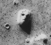
Glad the Mars face is making a comeback for the Vanishing cover:
Beautiful covers on everything else though! Only complaint is, I wish the house would've been the representation for Mon Oncle.
Beautiful covers on everything else though! Only complaint is, I wish the house would've been the representation for Mon Oncle.
-
Moe Dickstein

- Joined: Sat Aug 25, 2012 3:19 am
Re: Criterion & Eclipse Cover Art & Packaging Babble-on Vol.
The whole Tati set is maybe the most perfect thing they've ever done art wise. Beautiful.
-
pzadvance
- Joined: Mon Nov 21, 2011 11:24 pm
- Location: Vienna, Austria
Re: Criterion & Eclipse Cover Art & Packaging Babble-on Vol.
Hi-ho! I'm on board. Thanks for your indulgence.rwiggum wrote:Does this help?
-
jbeall

- Joined: Sat Aug 12, 2006 1:22 pm
- Location: Atlanta-ish
Re: Criterion & Eclipse Cover Art & Packaging Babble-on Vol.
Okay, the Tati covers and the Vanishing are some of the best work Criterion's artists have ever done. Really stunning stuff.
-
aox

- Joined: Fri Jun 20, 2008 4:02 pm
- Location: nYc
Re: Criterion & Eclipse Cover Art & Packaging Babble-on Vol.
This is easily the best month for me in years. Might be the best CC month for me ever.
-
movielocke

- Joined: Fri Jan 18, 2008 4:44 am
Re: Criterion & Eclipse Cover Art & Packaging Babble-on Vol.
Wow. The stunning and gorgeous Tati covers makes the ugly Demy covers seem even more grotesque and terrible. Pretty much a perfect month on all counts.
-
George Kaplan

- Joined: Mon Jan 31, 2005 11:42 pm
Re: Criterion & Eclipse Cover Art & Packaging Babble-on Vol.
LA DOLCE VITA's font is disastrously awful, yes; and THE VANISHING is a "bad trip" from the 80's so, perhaps, it is somebody's idea of amusing to revive the awful optical art of the era (inescapable at the time if you visited any shopping mall, and notorious as something you only attempted to "see" upon leaving, unless you welcomed a headache); BUT, as someone who sat out the whole VIRIDIANA debacle with amusement, and who remembers the name swimminghorses with genuine fondness, there is simply no excuse for CC to allow that MY DARLING CLEMENTINE cover to market! It is easily fixable, after firing the intern that was allowed to have a go at it. (They simply cannot have actually paid someone actual money for that!) To impose upon such a beautiful image, a second geometry that forces your eye up between those two posts and fixes it there, deforming all around it, is nothing short of psychotic.
Last edited by George Kaplan on Wed Jul 16, 2014 2:26 am, edited 1 time in total.
-
domino harvey
- Dot Com Dom
- Joined: Wed Jan 11, 2006 6:42 pm
We had a good run of positivity there for a bit at least
Speaking of nothing short of psychotic
-
HistoryProf

- Joined: Mon Mar 13, 2006 7:48 am
- Location: KCK
Re: Criterion & Eclipse Cover Art & Packaging Babble-on Vol.
watGeorge Kaplan wrote:LA DOLCE VITA's font is disastrously awful, yes; and THE VANISHING is a "bad trip" from the 80's so, perhaps, it is somebody's idea of amusing to revive the awful optical art of the era (inescapable at the time if you visited any shopping mall, and notorious as something you attempted to "see" upon leaving unless you welcomed a headache); BUT, as someone who sat out the whole VIRIDIANA debacle with amusement, and who remembers the name swimminghorses with genuine fondness, there is simply no excuse for CC to allow that MY DARLING CLEMENTINE cover to market! It is easily fixable, after firing the intern that was allowed to have a go at it. (They simply cannot have actually paid someone actual money for that!) To impose upon such a beautiful image, a second geometry that forces your eye up between those two posts and fixes it there, deforming all around it, is nothing short of psychotic.
-
HistoryProf
- Joined: Mon Mar 13, 2006 7:48 am
- Location: KCK
Re: Criterion & Eclipse Cover Art & Packaging Babble-on Vol.
This is truly a ridiculously generous month. 100% buys for me. ouch on the wallet!
-
George Kaplan
- Joined: Mon Jan 31, 2005 11:42 pm
Re: Criterion & Eclipse Cover Art & Packaging Babble-on Vol.
You guys can't actually look at that MY DARLING CLEMENTINE cover and not be appalled.
-
The Narrator Returns
- Joined: Tue Nov 15, 2011 10:35 pm
Re: Criterion & Eclipse Cover Art & Packaging Babble-on Vol.
Did Peter Becker personally piss in your coffee this morning?
-
HistoryProf
- Joined: Mon Mar 13, 2006 7:48 am
- Location: KCK
Re: Criterion & Eclipse Cover Art & Packaging Babble-on Vol.
Yes, i find the gorgeous black and white image and simplicity of the cover absolutely appalling. I will every time I look at it and when I buy it and when I take it off the shelf to watch it. Damn them!!!!
-
George Kaplan
- Joined: Mon Jan 31, 2005 11:42 pm
Re: Criterion & Eclipse Cover Art & Packaging Babble-on Vol.
I always forget how strictly enforced Poe's Law is on this forum.
-
Gregory

- Joined: Tue Nov 02, 2004 8:07 pm
Re: Criterion & Eclipse Cover Art & Packaging Babble-on Vol.
Poe's Law by definition is not something that's enforced but rather a failed... oh wait, are you being facetious again?
-
criterion10
Re: Criterion & Eclipse Cover Art & Packaging Babble-on Vol.
Guys, just remember, it's never too early for a Richard Cranium award contender!