Criterion & Eclipse Cover Art & Packaging Babble-on Vol. 6

News on Criterion and Janus Films
Locked
Message
Author
User avatar
tenia
Ask Me About My Bassoon
Joined: Wed Apr 29, 2009 3:13 pm

Re: Criterion & Eclipse Cover Art & Packaging Babble-on Vol.

#1951 Post by tenia »

And it seems that the cover has been very slightly tweaked in its top part, near the roof of the house, a little on the right of the Wacky C.

ImageImage

Seems a bit silly to me to amend such a small thing like this.
User avatar
cdnchris
Site Admin
Joined: Tue Nov 02, 2004 6:45 pm
Location: Washington
Contact:

Re: Criterion & Eclipse Cover Art & Packaging Babble-on Vol.

#1952 Post by cdnchris »

User avatar
cdnchris
Site Admin
Joined: Tue Nov 02, 2004 6:45 pm
Location: Washington
Contact:

Re: Criterion & Eclipse Cover Art & Packaging Babble-on Vol.

#1953 Post by cdnchris »

Limelight (Comes with a booklet)
The Rose
User avatar
TheGodfather
Joined: Sun Sep 17, 2006 8:39 pm
Location: The Netherlands

Re: Criterion & Eclipse Cover Art & Packaging Babble-on Vol.

#1954 Post by TheGodfather »

Too bad about the Wacky C on Limelight. Other than that, this looks like another excellent release.
User avatar
Minkin
Joined: Fri Aug 07, 2009 3:13 am

Re: Criterion & Eclipse Cover Art & Packaging Babble-on Vol.

#1956 Post by Minkin »

Criterion Designs - Les Blank: Always for Pleasure

I think they went with the best cover (although I like the dancing old guy on the beach). Also glad they didn't choose for the title: The World Accordin' to Les Blank.

@Tenia - the changes on The Big Chill cover seem odd. Guess they did some pruning on that tree in the background (is that window an important plot development?).
User avatar
swo17
Bloodthirsty Butcher
Joined: Tue Apr 15, 2008 2:25 pm
Location: SLC, UT

Re: Criterion & Eclipse Cover Art & Packaging Babble-on Vol.

#1957 Post by swo17 »

Image Image Image Image Image Image Image Image
User avatar
domino harvey
Dot Com Dom
Joined: Wed Jan 11, 2006 6:42 pm

Re: Criterion & Eclipse Cover Art & Packaging Babble-on Vol.

#1958 Post by domino harvey »

Day for Night cover is great, too bad I don't like the film. French Lt's Woman is fitting for the film's playful attempts at capturing the self-aware nature of the source text. Dressed to Kill is hilariously awful, a legit swimminghorses cover
User avatar
mfunk9786
Under Chris' Protection
Joined: Fri May 16, 2008 8:43 pm
Location: Miami, FL

Re: Criterion & Eclipse Cover Art & Packaging Babble-on Vol.

#1959 Post by mfunk9786 »

Varda set might be my favorite Eclipse color scheme to date. Almost excessively pleasant. A shame this stuff isn't Blu though.
User avatar
mfunk9786
Under Chris' Protection
Joined: Fri May 16, 2008 8:43 pm
Location: Miami, FL

Re: Criterion & Eclipse Cover Art & Packaging Babble-on Vol.

#1960 Post by mfunk9786 »

Image
criterion10

Re: Criterion & Eclipse Cover Art & Packaging Babble-on Vol.

#1961 Post by criterion10 »

The Varda Eclipse is beautiful, Night and the City quite good too, and while I don't think Day for Night suits the film well, the cover works on its own terms. The others all look like the work of a freshman-year college student who just figured out the basics of Photoshop.
User avatar
Cinephrenic
Joined: Tue Nov 02, 2004 6:58 pm
Location: Paris, Texas

Re: Criterion & Eclipse Cover Art & Packaging Babble-on Vol.

#1962 Post by Cinephrenic »

Dressed to Kill is horrible.
User avatar
cdnchris
Site Admin
Joined: Tue Nov 02, 2004 6:45 pm
Location: Washington
Contact:

Re: Criterion & Eclipse Cover Art & Packaging Babble-on Vol.

#1963 Post by cdnchris »

I like that they used a poster for Dressed to Kill, but that filter ain't helping it.
Werewolf by Night

Re: Criterion & Eclipse Cover Art & Packaging Babble-on Vol.

#1964 Post by Werewolf by Night »

cdnchris wrote:I like that they used a poster for Dressed to Kill, but that filter ain't helping it.
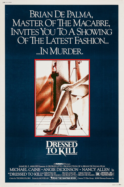
Here's an original poster that uses the same effect. Which doesn't make it good, though.
User avatar
PfR73
Joined: Sun Mar 27, 2005 10:07 pm

Re: Criterion & Eclipse Cover Art & Packaging Babble-on Vol.

#1965 Post by PfR73 »

And they are interviewing the poster artist on the release. Probably wouldn't do to go mucking around with it.
User avatar
domino harvey
Dot Com Dom
Joined: Wed Jan 11, 2006 6:42 pm

Re: Criterion & Eclipse Cover Art & Packaging Babble-on Vol.

#1966 Post by domino harvey »

PfR73 wrote:And they are interviewing the poster artist on the release. Probably wouldn't do to go mucking around with it.
"First question: Get out."
User avatar
Saturnome
Joined: Sun Aug 12, 2007 9:22 pm

Re: Criterion & Eclipse Cover Art & Packaging Babble-on Vol.

#1967 Post by Saturnome »

Day for Night looks like something by Roman Muradov, I like it.

Edit: they just added the info that it is by Roman Muradov. Nice.
User avatar
cdnchris
Site Admin
Joined: Tue Nov 02, 2004 6:45 pm
Location: Washington
Contact:

Re: Criterion & Eclipse Cover Art & Packaging Babble-on Vol.

#1968 Post by cdnchris »

I guess Dressed to Kill doesn't bother me as much as it obviously does others. My dad had it on VHS and it used the same image so I guess I'm used to it. The filter is, as domino mentions, something swimminghorses would have done.
User avatar
Minkin
Joined: Fri Aug 07, 2009 3:13 am

Re: Criterion & Eclipse Cover Art & Packaging Babble-on Vol.

#1969 Post by Minkin »

My first reaction to the Night and the City cover was: Wait, Tor Johnson was in that movie? then I remembered the Grecian wrestler guy, and it all made sense. Add me to the list of "not impressed" with the Dressed to Kill cover - it just wasn't a very good original poster to begin with (and MGM already did the non-filter image for their blu, so that was out). I think Day for Night is one of the best covers for the year (and of course my S/O will immediately want to see it now, because it has a cat on the cover). Night and the City (Tor and all) is a huge improvement over the old edition's cover.
User avatar
Feego
Joined: Thu Aug 16, 2007 11:30 pm
Location: Texas

Re: Criterion & Eclipse Cover Art & Packaging Babble-on Vol.

#1970 Post by Feego »

To be fair, Criterion didn't add that filter on Dressed to Kill, it was on the original poster. But yeah, it looks terrible, and is easily bested by the MGM Blu-ray cover and significantly by Arrow's creative razor design.
rwaits
Joined: Tue Dec 21, 2004 4:24 pm

Re: Criterion & Eclipse Cover Art & Packaging Babble-on Vol.

#1971 Post by rwaits »

Dressed to kill couldn't be lazier.
User avatar
Jeff
Joined: Wed Nov 03, 2004 1:49 am
Location: Denver, CO

Re: Criterion & Eclipse Cover Art & Packaging Babble-on Vol.

#1972 Post by Jeff »

cdnchris wrote:I guess Dressed to Kill doesn't bother me as much as it obviously does others. My dad had it on VHS and it used the same image so I guess I'm used to it. The filter is, as domino mentions, something swimminghorses would have done.
Since that art was created in 1979 or 1980, we can assume it's not a "filter" though, right? Not that it necessarily makes it any more appealing, but surely that's an original illustration of some kind (pointillism?). Like Chris, after living with that art for decades, it just seems like part of the film.
User avatar
Michael Kerpan
Spelling Bee Champeen
Joined: Wed Nov 03, 2004 5:20 pm
Location: New England
Contact:

Re: Criterion & Eclipse Cover Art & Packaging Babble-on Vol.

#1973 Post by Michael Kerpan »

Jeff wrote:it just seems like part of the film.
I didn't even see the movie -- but I remember this movie poster. Seems a bit weird to complain about something so closely linked to the film's history.
User avatar
domino harvey
Dot Com Dom
Joined: Wed Jan 11, 2006 6:42 pm

Re: Criterion & Eclipse Cover Art & Packaging Babble-on Vol.

#1974 Post by domino harvey »

Ugly then is still ugly now
User avatar
Gregory
Joined: Tue Nov 02, 2004 8:07 pm

Re: Criterion & Eclipse Cover Art & Packaging Babble-on Vol.

#1975 Post by Gregory »

It's too bad that Criterion probably wouldn't want to be seen as mimicking another label because if they adopted Arrow's custom of reversible covers, they'd make so many more people happy.
Locked