Criterion & Eclipse Cover Art & Packaging Babble-on Vol. 6
-
carmilla mircalla
- Joined: Tue Jul 14, 2015 1:47 am
Re: Criterion & Eclipse Cover Art & Packaging Babble-on Vol.
Great cover art all round. Is Don't Look Back b+w? If so November only holds one release that is in color. Has Criterion ever had a release month of all b+w films?
-
Newsnayr

- Joined: Wed Apr 01, 2015 4:54 am
Re: Criterion & Eclipse Cover Art & Packaging Babble-on Vol.
Props to Criterion on actually spelling Dont Look Back right
-
Drucker
- Your Future our Drucker
- Joined: Wed May 18, 2011 1:37 pm
Re: Criterion & Eclipse Cover Art & Packaging Babble-on Vol.
Yes the film's in black and white.carmilla mircalla wrote:Great cover art all round. Is Don't Look Back b+w? If so November only holds one release that is in color. Has Criterion ever had a release month of all b+w films?
-
carmilla mircalla
- Joined: Tue Jul 14, 2015 1:47 am
Re: Criterion & Eclipse Cover Art & Packaging Babble-on Vol.
Oh, duh it says it on the page. My mistake.
-
criterion10
Re: Criterion & Eclipse Cover Art & Packaging Babble-on Vol.
A really, really great month for cover art. Even something as simple as the Ikiru reissue looks great (and Code Unknown may be one of my new favorites).
I'll take the lack of complaining (thus far) as a similar approval.
I'll take the lack of complaining (thus far) as a similar approval.
-
Shrew

- The Untamed One
- Joined: Tue Feb 27, 2007 6:22 am
Re: Criterion & Eclipse Cover Art & Packaging Babble-on Vol.
Yeah, the Ikiru re-issue took the the good parts of the old design (the central image, the font, and the composition), and fixed the dated elements (the weird fuzzy grid in bottom, the random puff of smoke behind the title, the swing ropes that stretch off into infinity). Looks good.
-
ryannichols7

- Joined: Mon Jul 16, 2012 6:26 pm
Re: Criterion & Eclipse Cover Art & Packaging Babble-on Vol.
have Criterion ever had a bad Kurosawa cover? I mean maybe not counting some of the originals (yojimbo/sanjuro, high and low come to mind). he's the director that comes to mind for me with most consistent/great covers.
-
chatterjees

- Joined: Tue Apr 02, 2013 10:08 pm
- Location: Pittsburgh, PA
Re: Criterion & Eclipse Cover Art & Packaging Babble-on Vol.
You won't believe me, but that house right behind Apu on the Aparajito cover is in my neighborhood, actually 2 minutes walk from our house in Kolkata 
-
George Drooly
- Joined: Wed Apr 16, 2014 12:09 am
Re: Criterion & Eclipse Cover Art & Packaging Babble-on Vol.
I wasn't aware he filmed that in Pittsburgh.chatterjees wrote:You won't believe me, but that house right behind Apu on the Aparajito cover is in my neighborhood, actually 2 minutes walk from our house in Kolkata
-
chatterjees
- Joined: Tue Apr 02, 2013 10:08 pm
- Location: Pittsburgh, PA
Re: Criterion & Eclipse Cover Art & Packaging Babble-on Vol.
So, you didn't read my entire post, but you checked out my location! Yes, I live in Pittsburgh, and that's my address for last 7 years.George Drooly wrote:I wasn't aware he filmed that in Pittsburgh.chatterjees wrote:You won't believe me, but that house right behind Apu on the Aparajito cover is in my neighborhood, actually 2 minutes walk from our house in Kolkata
-
EricJ
- Joined: Thu Aug 27, 2015 3:32 pm
Re: Criterion & Eclipse Cover Art & Packaging Babble-on Vol.
I know it's late to the Brood cover discussion, but is ANYONE comparing the choices to the "virtual cover" we were getting early on HuluPlus, where they went with just the iconic shot of the little bloody hands on the stair railing?DrunkenFatherFigure wrote:And I actually like the Brood cover they went with more than the one Domino posted. Criterion's cover is more quietly unsettling, while the other one seems too overt.
Forget the "Artsy unsettling motherhood" malarkey, that was Cronenberg's movie. :)
-
cdnchris

- Site Admin
- Joined: Tue Nov 02, 2004 6:45 pm
- Location: Washington
- Contact:
-
cdnchris
- Site Admin
- Joined: Tue Nov 02, 2004 6:45 pm
- Location: Washington
- Contact:
Re: Criterion & Eclipse Cover Art & Packaging Babble-on Vol.
Moonrise Kingdom is a digi. Also, that title at the top that most everyone hates, is actually a removeable sticker. I'll get photos up when I can.
Edit: it will be a while before I can get photos up, but I took some on my phone and posted to Facebook so you can see (no account should be required) here.
I think it's a nice looking set.
Edit: it will be a while before I can get photos up, but I took some on my phone and posted to Facebook so you can see (no account should be required) here.
I think it's a nice looking set.
-
Jeff

- Joined: Wed Nov 03, 2004 1:49 am
- Location: Denver, CO
-
cdnchris
- Site Admin
- Joined: Tue Nov 02, 2004 6:45 pm
- Location: Washington
- Contact:
-
Luke M
- Joined: Fri Jul 13, 2007 1:21 am
Re: Criterion & Eclipse Cover Art & Packaging Babble-on Vol.
Loving the Moonrise Kingdom digipack.
-
TheGodfather

- Joined: Sun Sep 17, 2006 8:39 pm
- Location: The Netherlands
Re: Criterion & Eclipse Cover Art & Packaging Babble-on Vol.
Yup it looks amazing. Just ordered it
-
Gregory

- Joined: Tue Nov 02, 2004 8:07 pm
Re: Criterion & Eclipse Cover Art & Packaging Babble-on Vol.
Great choice by Criterion to use the Moonrise Kingdom title sticker on the outer plastic, leaving just the title on the beach. Can't wait to get this.
Is this the first time anyone has seen the larger map showing the geography of the islands with St. Jack Wood Island? I've seen the film and just remembered a smaller map showing New Penzance. I think I would've remembered seeing that wrecked-looking Nantucket as St. Jack Wood. I wonder why they didn't just make up a new island from scratch instead of using that weirdly modified version of Nantucket. Just looking at the map in that last image, I get the strange feeling of a cataclysmic event having happened in a small place that I love.
Is this the first time anyone has seen the larger map showing the geography of the islands with St. Jack Wood Island? I've seen the film and just remembered a smaller map showing New Penzance. I think I would've remembered seeing that wrecked-looking Nantucket as St. Jack Wood. I wonder why they didn't just make up a new island from scratch instead of using that weirdly modified version of Nantucket. Just looking at the map in that last image, I get the strange feeling of a cataclysmic event having happened in a small place that I love.
-
swo17

- Bloodthirsty Butcher
- Joined: Tue Apr 15, 2008 2:25 pm
- Location: SLC, UT


-
domino harvey

- Dot Com Dom
- Joined: Wed Jan 11, 2006 6:42 pm
Re: Criterion & Eclipse Cover Art & Packaging Babble-on Vol.
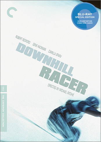
I cannot believe Criterion had another opportunity to use the original poster art for the Downhill Racer upgrade and instead stuck with that monstrosity
-
sir_luke

- Joined: Mon Nov 04, 2013 1:55 am
Re: Criterion & Eclipse Cover Art & Packaging Babble-on Vol.
Speedy's nice, though!
-
criterion10
Re: Criterion & Eclipse Cover Art & Packaging Babble-on Vol.
Speedy looks great, and Burroughs is fine. That's about it.
-
cdnchris
- Site Admin
- Joined: Tue Nov 02, 2004 6:45 pm
- Location: Washington
- Contact:
Re: Criterion & Eclipse Cover Art & Packaging Babble-on Vol.
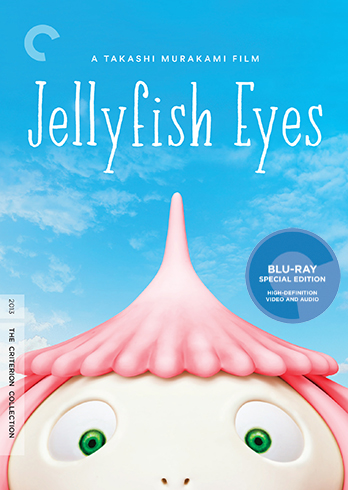
I still like the Jellyfish one, so ha ha
-
domino harvey
- Dot Com Dom
- Joined: Wed Jan 11, 2006 6:42 pm
Re: Criterion & Eclipse Cover Art & Packaging Babble-on Vol.
Petition to remove Chris from his own website
-
swo17
- Bloodthirsty Butcher
- Joined: Tue Apr 15, 2008 2:25 pm
- Location: SLC, UT
Re: Criterion & Eclipse Cover Art & Packaging Babble-on Vol.
Y'know, if Criterion were really so ashamed of Jellyfish Eyes, they could have easily had one of those clouds be passing over the wacky C...