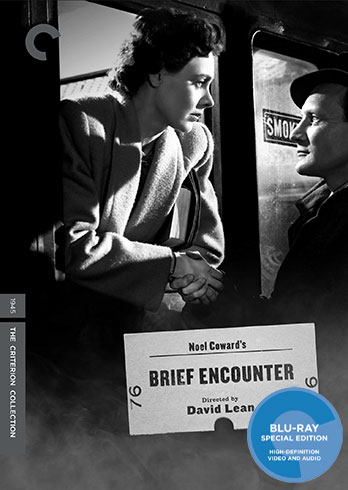
Ribs wrote:The titling on the cover for Brief Encounter's been changed:
a really nice update. The ticket stub is clever, with the visible steam reflecting the short time the lovers have before the train departs. subtle and very effective.
mfunk9786 wrote:The ticket stub is definitely clever, but it comes off looking half-assed and nothing like an actual ticket stub. That'd be my major bone to pick.
Given that they couldn't afford to clutter it up with too much verbiage, I think it's close enough to the real thing:
I guess it also differentiates the stand alone release from the one inside the Coward/Lean boxset, which all have similar title treatments. And I guess the ticket stub (maybe a ticket stub as much for the movie theatre as for the train?) gives the chance for Criterion to put the "76" spine number directly on the front cover too!
Is The Player the most credits-congested cover Criterion has ever released? I don't know if that's due to contractual obligations or if it's supposed to be meta-.
zedz wrote:Is The Player the most credits-congested cover Criterion has ever released? I don't know if that's due to contractual obligations or if it's supposed to be meta-.
I'm sure the large names of the main cast are contractual, but I can't imagine why they put the MPAA billing block at the bottom. Even the studios never put it on the covers, and it's not on Warner's own DVD or Blu-ray release of The Player.
domino harvey wrote:In a LONELY Place is yet another awful Sony cover. Remarkable the consistency there
Not as bad as their Capra cover but their choices of fonts are puzzling. Why use a font that'd be more appropriate for a costume drama than a noir?
Typically they have some logic to their art decisions (see Criterion Designs), so I'm trying to figure out what it might be with the font here. It sort of looks like the kind of font you'd see on certain apartment complexes (or perhaps a nightclub). Might it match with any font found in the film?
The Player works better with the credit block / overuse of actors - as I like the notion of it presenting as a movie poster (it would be a bit dull without it).
I like the artwork this month except for In A Lonely Place, which seems a bit lazy. It's cool having Bogart on a Criterion cover but they could've been a little more creative.
Love the fact that they're releasing In A Lonely Place but that cover is aweful!
Love The Naked Island and The Player cover, the Road trilogy set looks like a great release