Criterion & Eclipse Cover Art & Packaging Babble-on Vol. 6
-
ShellOilJunior

- Joined: Tue Apr 28, 2009 11:17 am
Re: Criterion & Eclipse Cover Art & Packaging Babble-on Vol.
I was expecting something better. The floating heads ruin it for me.
-
Minkin

- Joined: Fri Aug 07, 2009 3:13 am
Re: Criterion & Eclipse Cover Art & Packaging Babble-on Vol.
I'm sure it was contractual that the leads get their name + visage on the cover. That taken into account, I really like what they came up with. I'm assuming the cover went through several different drafts, thus the delay in announcing it. Would be nice to see the alternate designs.ShellOilJunior wrote:The floating heads ruin it for me.
-
ShellOilJunior
- Joined: Tue Apr 28, 2009 11:17 am
Re: Criterion & Eclipse Cover Art & Packaging Babble-on Vol.
Aside from the heads the cover is good. I do think the artist's Phoenix cover is excellent.Minkin wrote:I'm sure it was contractual that the leads get their name + visage on the cover. That taken into account, I really like what they came up with. I'm assuming the cover went through several different drafts, thus the delay in announcing it. Would be nice to see the alternate designs.ShellOilJunior wrote:The floating heads ruin it for me.
-
Jeff

- Joined: Wed Nov 03, 2004 1:49 am
- Location: Denver, CO
Re: Criterion & Eclipse Cover Art & Packaging Babble-on Vol.
Code Unknown too. Something's definitely a little off with Y tu mamá también, but his other covers are some of my favorites.domino harvey wrote:Same designer as Phoenix
-
Alphonse Tram

- Joined: Tue Nov 25, 2014 3:32 pm
Re: Criterion & Eclipse Cover Art & Packaging Babble-on Vol.
Further proof that Swimming Horses did indeed get a job at Criterion. Horrific!
-
FakeBonanza

- Joined: Mon Dec 03, 2012 2:35 am
Re: Criterion & Eclipse Cover Art & Packaging Babble-on Vol.
MUBI has revealed the Janus posters for the two King Hu films and boy do they look nice. I'm expecting these will be retained as the Criterion covers.


-
swo17

- Bloodthirsty Butcher
- Joined: Tue Apr 15, 2008 2:25 pm
- Location: SLC, UT
Re: Criterion & Eclipse Cover Art & Packaging Babble-on Vol.
Botox goes East
-
feihong

- Joined: Thu Nov 04, 2004 4:20 pm
Re: Criterion & Eclipse Cover Art & Packaging Babble-on Vol.
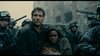
Neither of those posters feels very right to me. The reds and yellows in the Dragon Inn poster seem really over the top. The way the lapel of Hsu Feng's robe becomes the battlements of the old fort seems kind of gauche. And the little flying figures dancing in the air like leaves at the bottom of the TOZ poster just seem at odds with the rest of the image. The different scales of figures don't balance in that image. I think they were trying to use the sense of contrast to make a point of some kind, but I don't think the point has been made. The Dragon Inn poster seems to imply a constant criss-cross of action, but none of it feels true to the sense of the film. It looks chaotic, where the film's action is precise and formal. Giving the head of the East Chamber the same clothing as the other characters seems a little disingenuous.
I don't hate the idea of these images, but the execution of each seems full of details that don't ring true to the concepts they're meant to cover. They seem like illustrations for another pair of films––they're alienating themselves from the essence of each film, when they should be delivering a kind of "aw, yeah!" moment. And I feel as if slightly different layouts would have really helped, at least with TOZ. On that cover the bamboo leaves receding into the distance are a very nice touch, and they're executed elegantly. Hsu Feng's face there is nice, bulging lips aside. The stray hair falling on her face looks very true to the film. Those elements, in a different layout, might have been quite nice. Instead, I feel as if both posters are heavy, and overdone.
I don't hate the idea of these images, but the execution of each seems full of details that don't ring true to the concepts they're meant to cover. They seem like illustrations for another pair of films––they're alienating themselves from the essence of each film, when they should be delivering a kind of "aw, yeah!" moment. And I feel as if slightly different layouts would have really helped, at least with TOZ. On that cover the bamboo leaves receding into the distance are a very nice touch, and they're executed elegantly. Hsu Feng's face there is nice, bulging lips aside. The stray hair falling on her face looks very true to the film. Those elements, in a different layout, might have been quite nice. Instead, I feel as if both posters are heavy, and overdone.
-
dwk

- Joined: Sat Jun 12, 2010 10:10 pm
Re: Criterion & Eclipse Cover Art & Packaging Babble-on Vol.
More WIP from Greg Ruth for the A Touch of Zen Blu-ray release:

-
swo17
- Bloodthirsty Butcher
- Joined: Tue Apr 15, 2008 2:25 pm
- Location: SLC, UT


-
FrauBlucher

- Joined: Tue Jul 16, 2013 12:28 am
- Location: Greenwich Village
Criterion & Eclipse Cover Art & Packaging Babble-on Vol. 6
That's awesome! (Carnival of Souls)
-
Gregory

- Joined: Tue Nov 02, 2004 8:07 pm
Re: Criterion & Eclipse Cover Art & Packaging Babble-on Vol.
I guess the Carnival of Souls cover settles any question of what Candace Hilligoss's most unflattering angle was. Or is that her stunt double?
-
domino harvey

- Dot Com Dom
- Joined: Wed Jan 11, 2006 6:42 pm
Re: Criterion & Eclipse Cover Art & Packaging Babble-on Vol.
Seriously, what the hell compelled anyone to draw anyone from that vantage? Vom to the maxGregory wrote:I guess the Carnival of Souls cover settles any question of what Candace Hilligoss's most unflattering angle was.
-
criterion10
Re: Criterion & Eclipse Cover Art & Packaging Babble-on Vol.
These all actually look pretty nice (although Night and Fog is a bit bland, though perhaps that's the point).
-
lacritfan

- Life is one big kevyip
- Joined: Wed Dec 05, 2007 10:39 pm
- Location: Los Angeles
Re: Criterion & Eclipse Cover Art & Packaging Babble-on Vol.
I like the new Night and Fog over the old cover, prefer the old Carnival of Souls. Don't mind the subject matter/composition of The New World, but the style...would've preferred a screen cap of one of Lubezki’s shots.
-
domino harvey
- Dot Com Dom
- Joined: Wed Jan 11, 2006 6:42 pm
Re: Criterion & Eclipse Cover Art & Packaging Babble-on Vol.
I like how the New World looks like it came out of a history book for kids in the 60s
-
pzadvance

- Joined: Mon Nov 21, 2011 11:24 pm
- Location: Vienna, Austria
Re: Criterion & Eclipse Cover Art & Packaging Babble-on Vol.
What's with the weird text cropping on The New World title?
-
jbeall

- Joined: Sat Aug 12, 2006 1:22 pm
- Location: Atlanta-ish
Re: Criterion & Eclipse Cover Art & Packaging Babble-on Vol.
I quite like the Carnival of Souls cover, the Muriel cover is okay (but not as good as MoC's), and I really dislike the New World cover. (I agree with domino that it looks like a 60s history book cover.) The rest are "meh."
-
domino harvey
- Dot Com Dom
- Joined: Wed Jan 11, 2006 6:42 pm
Re: Criterion & Eclipse Cover Art & Packaging Babble-on Vol.
Except my comment was a compliment!
-
TheGodfather

- Joined: Sun Sep 17, 2006 8:39 pm
- Location: The Netherlands
Re: Criterion & Eclipse Cover Art & Packaging Babble-on Vol.
My first thought as well. Could've made something much better out of that. Great that it's going to be released though!pzadvance wrote:What's with the weird text cropping on The New World title?
-
Manny Karp

- Joined: Sat Jan 02, 2016 9:22 am
Re: Criterion & Eclipse Cover Art & Packaging Babble-on Vol.
The New Oldpzadvance wrote:What's with the weird text cropping on The New World title?
-
Feego

- Joined: Thu Aug 16, 2007 11:30 pm
- Location: Texas
Re: Criterion & Eclipse Cover Art & Packaging Babble-on Vol.
Gross. The concept is great, but note to Criterion, do not let Edward Kinsella draw human beings ever again.swo17 wrote:
-
Luke M
- Joined: Fri Jul 13, 2007 1:21 am
Re: Criterion & Eclipse Cover Art & Packaging Babble-on Vol.
I think The New World cover is one of my favorites released this year. It's beautiful and complements an incredible package.
-
Drucker
- Your Future our Drucker
- Joined: Wed May 18, 2011 1:37 pm
Re: Criterion & Eclipse Cover Art & Packaging Babble-on Vol.
I rarely comment or care about covet designs but Carnival of Souls is awful. Original cover was better and more in spirit with the film.
-
Saturnome

- Joined: Sun Aug 12, 2007 9:22 pm
Re: Criterion & Eclipse Cover Art & Packaging Babble-on Vol.
I like it a lot. The old one was a mess (though I think it was the original poster, right?), enough that it made me avoid the movie for a while.
They're all great! A Touch of Zen being my favorite.
They're all great! A Touch of Zen being my favorite.