Criterion & Eclipse Cover Art & Packaging Babble-on Vol. 6
-
TheGodfather

- Joined: Sun Sep 17, 2006 8:39 pm
- Location: The Netherlands
-
swo17

- Bloodthirsty Butcher
- Joined: Tue Apr 15, 2008 2:25 pm
- Location: SLC, UT


-
Luke M
- Joined: Fri Jul 13, 2007 1:21 am
Criterion & Eclipse Cover Art & Packaging Babble-on Vol. 6
I like McCabe & Mrs. Miller and the old Woman in the Dunes but the rest are meh.
Also, the Ingrid Bergman film with the b&w photo background and big yellow lettering seems like a lazy attempt at matching their Rossellini set. It's infuriating.
Also, the Ingrid Bergman film with the b&w photo background and big yellow lettering seems like a lazy attempt at matching their Rossellini set. It's infuriating.
Last edited by Luke M on Mon May 16, 2016 10:25 pm, edited 1 time in total.
-
jindianajonz

- Jindiana Jonz Abrams
- Joined: Thu Oct 13, 2011 12:11 am
Re: Criterion & Eclipse Cover Art & Packaging Babble-on Vol.
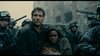
What's with the "Y" in Beatty being in front of his shoulders but behind his head?
-
domino harvey

- Dot Com Dom
- Joined: Wed Jan 11, 2006 6:42 pm
Re: Criterion & Eclipse Cover Art & Packaging Babble-on Vol.
McCabe cover is hideous, rest are okay
-
Randall Maysin

- Joined: Tue Apr 02, 2013 4:26 pm
Re: Criterion & Eclipse Cover Art & Packaging Babble-on Vol.
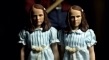
A Taste of Honey is confused and dithering and really pretty pitiful. What a mess, fingerprints and, what the hell, a lightbulb. That makes loads of sense. Oh I get it, it's kitchen-sink realism. Shockingly obvious.
Last edited by Randall Maysin on Mon May 16, 2016 10:36 pm, edited 1 time in total.
-
Ashirg

- Joined: Wed Nov 03, 2004 1:10 pm
- Location: Atlanta
Re: Criterion & Eclipse Cover Art & Packaging Babble-on Vol.
My first question on McCabe cover - where's Mrs. Miller?
-
lacritfan

- Life is one big kevyip
- Joined: Wed Dec 05, 2007 10:39 pm
- Location: Los Angeles
Re: Criterion & Eclipse Cover Art & Packaging Babble-on Vol.
Hurry up and take the picture so I can throw this heavy coat and credits off of me.
-
FakeBonanza

- Joined: Mon Dec 03, 2012 2:35 am
Re: Criterion & Eclipse Cover Art & Packaging Babble-on Vol.
Immortal Story could've done without the border.
I really dig the Ingrid Bergman cover, but I can't quite explain why.
I really dig the Ingrid Bergman cover, but I can't quite explain why.
Last edited by FakeBonanza on Mon May 16, 2016 10:37 pm, edited 2 times in total.
-
carmilla mircalla
- Joined: Tue Jul 14, 2015 1:47 am
Re: Criterion & Eclipse Cover Art & Packaging Babble-on Vol.
welp.... those covers are all huge piles of shit.
-
criterion10
Re: Criterion & Eclipse Cover Art & Packaging Babble-on Vol.
I think it's an okay cover that just doesn't accurately suit the film.domino harvey wrote:McCabe cover is hideous, rest are okay
Minus The Immortal Story, which feels like something is off, I actually like most of these, even if none are spectacular. I can certainly live with this compared with much of what we were getting last year!
-
knives

- Joined: Sat Sep 06, 2008 10:49 pm
Re: Criterion & Eclipse Cover Art & Packaging Babble-on Vol.
The lightbulb is actually a reoccurring image in the movie.Randall Maysin wrote:A Taste of Honey is confused and dithering and really pretty pitiful. What a mess, fingerprints and, what the hell, a lightbulb. That makes loads of sense. Oh I get it, it's kitchen-sink realism. Shockingly obvious.
-
Saturnome

- Joined: Sun Aug 12, 2007 9:22 pm
Re: Criterion & Eclipse Cover Art & Packaging Babble-on Vol.
... I like them all except the old Woman in the Dunes cover (which is just "okay"). It worked better as part of the box set, with the nice embossed cover.
More importantly, that's a great selection of titles this month!
More importantly, that's a great selection of titles this month!
-
MongooseCmr
- Joined: Sun Dec 16, 2012 3:50 am
Re: Criterion & Eclipse Cover Art & Packaging Babble-on Vol.
I really like both of the Welles, Taste of Honey is hideous
-
Jeff

- Joined: Wed Nov 03, 2004 1:49 am
- Location: Denver, CO
Re: Criterion & Eclipse Cover Art & Packaging Babble-on Vol.
domino harvey wrote:McCabe cover is hideous, rest are okay

-
Zot!
- Joined: Wed Jan 20, 2010 4:09 am
Re: Criterion & Eclipse Cover Art & Packaging Babble-on Vol.
McCabe and The Amazing Bearskin Dreamcoat. Why didn't they just dispose of the formalities, and just put the entire credits list on the cover.
-
swo17
- Bloodthirsty Butcher
- Joined: Tue Apr 15, 2008 2:25 pm
- Location: SLC, UT
Re: Criterion & Eclipse Cover Art & Packaging Babble-on Vol.
Hiding under the coat, holding tightly to McCabe's torso. Altman's starting to freak out wondering where his lead actress is and she can't stop giggling about it.Ashirg wrote:My first question on McCabe cover - where's Mrs. Miller?
-
Feego

- Joined: Thu Aug 16, 2007 11:30 pm
- Location: Texas
Re: Criterion & Eclipse Cover Art & Packaging Babble-on Vol.
I actually hate that McCabe cover, and I'm surprised there were no contractual obligations to feature both Beatty and Christie's faces. For a movie that features so many striking images, it seems incredibly lazy to choose what looks like a wardrobe test for the cover.
-
Werewolf by Night
Re: Criterion & Eclipse Cover Art & Packaging Babble-on Vol.
To paraphrase domino harvey from six years ago, HOW DO YOU NOT PUT JULIE CHRISTIE ON THE COVER?Ashirg wrote:My first question on McCabe cover - where's Mrs. Miller?
-
tenia

- Ask Me About My Bassoon
- Joined: Wed Apr 29, 2009 3:13 pm
Re: Criterion & Eclipse Cover Art & Packaging Babble-on Vol.
My god, this is an awful month.
Woman in the Dunes is OK, and I guess the Bergman one isn't too bad (following the Bergman / Rossellini design), but the 2 Welles are awful (especially Immortal Story), feeling like they were made 40 years ago for a cheap VHS, A Taste of Honey feels like something done in 5 seconds, and the Altman is so overbloated I'm wondering why they didn't simply just put the text (since it's enough already to fill the whole cover).
Woman in the Dunes is OK, and I guess the Bergman one isn't too bad (following the Bergman / Rossellini design), but the 2 Welles are awful (especially Immortal Story), feeling like they were made 40 years ago for a cheap VHS, A Taste of Honey feels like something done in 5 seconds, and the Altman is so overbloated I'm wondering why they didn't simply just put the text (since it's enough already to fill the whole cover).
-
thatobscurecharm

- Joined: Tue Aug 24, 2010 5:19 pm
- Location: Northern California
Re: Criterion & Eclipse Cover Art & Packaging Babble-on Vol.

I think the image from this one could've nicely translated into a dvd cover for McCabe. #Justice4JulieChristie
Edit: looks like someone had the same idea:

Last edited by thatobscurecharm on Tue May 17, 2016 6:44 am, edited 1 time in total.
-
feihong

- Joined: Thu Nov 04, 2004 4:20 pm
Re: Criterion & Eclipse Cover Art & Packaging Babble-on Vol.
I'm buying four of these right away; can't recall the last time I've bought that many Criterions at once.
I like the Taste of Honey image fine, and the visual concepts behind the Welles covers as well. I wish those covers boasted a little more tone––more color in the case of Immortal Story, more range of greyscale on the Chimes at Midnight cover. The type on Chimes at Midnight could be a little better.
McCabe & Mrs. Miller needs a different concept. I think the photo in the back just doesn't convey the mood or feeling of the film. It's striking as a behind-the-scenes photo (I think it appears in Kathryn Altman's book, if I recall right), because it seems so out of step with the tone of the film. There's an interesting idea behind the type––the kind of hand-made ornate type, like poorly-made signs carved after better examples in fancier towns. But it overwhelms in a very loud way. I'm not sure I've ever seen poster art for McCabe & Mrs. Miller that I've ever been excited about, but this cover really isn't right. I do like that image on the Cohen LP, though. I'm in it for the 4k scan and the 1080p, either way.
-
flyonthewall2983

- Joined: Mon Jun 27, 2005 7:31 pm
- Location: Indiana
- Contact:
Re: Criterion & Eclipse Cover Art & Packaging Babble-on Vol.
Maybe on the back?Ashirg wrote:My first question on McCabe cover - where's Mrs. Miller?
-
FrauBlucher

- Joined: Tue Jul 16, 2013 12:28 am
- Location: Greenwich Village
Re: Criterion & Eclipse Cover Art & Packaging Babble-on Vol.
The McCabe cover....

-
Brian C

- I hate to be That Pedantic Guy but...
- Joined: Wed Sep 16, 2009 3:58 pm
- Location: Northwest US
Re: Criterion & Eclipse Cover Art & Packaging Babble-on Vol.
If you let your eyes go a little out of focus, the Immortal Story cover looks like an ultrasound.