That's really boring.swo17 wrote:
Criterion & Eclipse Cover Art & Packaging Babble-on Vol. 6
-
knives

- Joined: Sat Sep 06, 2008 10:49 pm
Re: Criterion & Eclipse Cover Art & Packaging Babble-on Vol.
-
domino harvey

- Dot Com Dom
- Joined: Wed Jan 11, 2006 6:42 pm
Re: Criterion & Eclipse Cover Art & Packaging Babble-on Vol.
The Dolls covers are okay, everything else is just boringswo17 wrote: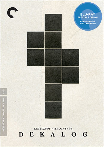


-
DarkImbecile

- Ask me about my visible cat breasts
- Joined: Mon Dec 09, 2013 10:24 pm
- Location: Albuquerque, NM
Re: Criterion & Eclipse Cover Art & Packaging Babble-on Vol.
Love Blood Simple, and I really like the simple but iconic Dekalog...
-
Newsnayr

- Joined: Wed Apr 01, 2015 4:54 am
Re: Criterion & Eclipse Cover Art & Packaging Babble-on Vol.
Love the simplicity of Dekalog's, don't care for the overly neon Blood Simple cover.
-
Werewolf by Night
Re: Criterion & Eclipse Cover Art & Packaging Babble-on Vol.
Dekalog is great, one of their simplest and best covers. It appears to be a collage by Anthony Gerace, but could easily be a Sol Lewitt drawing.
-
djproject

- Joined: Sat Oct 09, 2010 7:41 pm
- Location: Framingham, MA
- Contact:
Re: Criterion & Eclipse Cover Art & Packaging Babble-on Vol.
I find the Dekalog cover to be very appropriate for the subject matter and the almost minimalist vibe.
I am really curious how the Zatiochi package will look since it is going separate formats now.
I am really curious how the Zatiochi package will look since it is going separate formats now.
-
zedz

- Joined: Sun Nov 07, 2004 11:24 pm
Re: Criterion & Eclipse Cover Art & Packaging Babble-on Vol.
I have to admire the ingenuity and subtlety of the Dekalog cover, and the avoidance of including a big face from every episode in each 'window'. It manages to encompasses a lot of thematic material from the series (cross, tower block, windows, ten interconnected but separate components) while still remaining abstract. And it's so austere that it marks the release as the major event that it is.Werewolf by Night wrote:Dekalog is great, one of their simplest and best covers. It appears to be a collage by Anthony Gerace, but could easily be a Sol Lewitt drawing.
-
zedz
- Joined: Sun Nov 07, 2004 11:24 pm
Re: Criterion & Eclipse Cover Art & Packaging Babble-on Vol.
Does anybody else feel the temptation to yell "It's behind you!" to the couple on the Last Chrysanthemum cover? A 1930s Japanese precursor to Day of the Triffids sounds like a great idea for a Criterion release.
-
ALLCAPSAREBASTARDS
- Joined: Wed Nov 11, 2015 3:50 pm
Re: Criterion & Eclipse Cover Art & Packaging Babble-on Vol.
"Dekalog" is great, both "Dolls" and "Blood Simple" are good. Not too excited about "Cat People" or "Chrysanthemum", though. The former is plain ugly while the latter is too busy.
-
Zot!
- Joined: Wed Jan 20, 2010 4:09 am
Re: Criterion & Eclipse Cover Art & Packaging Babble-on Vol.
It's a little bit too abstract to me. I think the idea of using the symbol of a soviet panel house is good, but this looks more like the space needle to me.zedz wrote:I have to admire the ingenuity and subtlety of the Dekalog cover, and the avoidance of including a big face from every episode in each 'window'. It manages to encompasses a lot of thematic material from the series (cross, tower block, windows, ten interconnected but separate components) while still remaining abstract. And it's so austere that it marks the release as the major event that it is.Werewolf by Night wrote:Dekalog is great, one of their simplest and best covers. It appears to be a collage by Anthony Gerace, but could easily be a Sol Lewitt drawing.
-
ShellOilJunior

- Joined: Tue Apr 28, 2009 11:17 am
Re: Criterion & Eclipse Cover Art & Packaging Babble-on Vol.
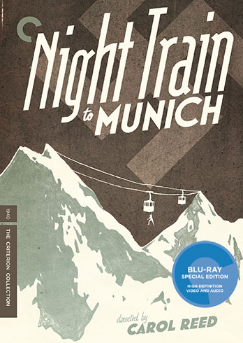
Night Train to Munich and Zatoichi are terrific. Dekalog doesn't knock me out but I admire its simplicity and minimalist approach. Blood Simple is quite good, too. I think it's going to attract a lot of blind purchases.
-
Feego

- Joined: Thu Aug 16, 2007 11:30 pm
- Location: Texas
Re: Criterion & Eclipse Cover Art & Packaging Babble-on Vol.
I think both Dolls covers are hideous. I will never, ever understand this 2-dimensional comic book style that Criterion seems to be so enamored with (see the awful Fuller re-issues for further examples). Why couldn't they just go with this lovely publicity shot instead? Both of Fox's original DVD covers were better.
-
Gregory

- Joined: Tue Nov 02, 2004 8:07 pm
Re: Criterion & Eclipse Cover Art & Packaging Babble-on Vol.
Which is just as two-dimensional, so I wonder if you're just objecting to illustrated covers vs. photo-based ones. Just because something is drawn rather than based on a photo source doesn't make it a "comic book" style, and "two-dimensional" illustrated images have of course been part of movie poster imagery all along. If they'd used the image you linked to, it would've been the most predictable thing: "OK, they're playing it very safe and using the same exact image as the soundtrack album for some reason."Feego wrote:I think both Dolls covers are hideous. I will never, ever understand this 2-dimensional comic book style that Criterion seems to be so enamored with (see the awful Fuller re-issues for further examples). Why couldn't they just go with this lovely publicity shot instead?
-
Feego
- Joined: Thu Aug 16, 2007 11:30 pm
- Location: Texas
Re: Criterion & Eclipse Cover Art & Packaging Babble-on Vol.
By 2-dimensional, I am referring to a lack of perception of depth in the image, as opposed to, say, the covers for Magnificent Obsession or even Sweet Smell of Success, which through shading and perspective do convey a sense of 3-dimension. This cover is rendered in a very flat style that makes the actresses look unattractive. I'm not saying that the still photo would have been the ideal cover, but preferable to this particular rendering.
-
Gregory
- Joined: Tue Nov 02, 2004 8:07 pm
Re: Criterion & Eclipse Cover Art & Packaging Babble-on Vol.
Okay, I just didn't know what you meant. Taking the illustration's style of inking and coloring for what it is, which is not to everyone's taste for sure, I find a convincing element of depth for example in the foreshortening of Sharon Tate's arm/hand, closely following the original set photos.
I'm not crazy about the Valley of the Dolls cover, but I prefer it to most other designs for the film and novel cover both, which just sort of scatter a handful of pill shapes. "IT'S ABOUT DRUGS, BUY THIS!"
I'm not crazy about the Valley of the Dolls cover, but I prefer it to most other designs for the film and novel cover both, which just sort of scatter a handful of pill shapes. "IT'S ABOUT DRUGS, BUY THIS!"
-
Feego
- Joined: Thu Aug 16, 2007 11:30 pm
- Location: Texas
Re: Criterion & Eclipse Cover Art & Packaging Babble-on Vol.
Yes, "comic book" was the wrong choice of phrase as comic books are a diverse medium that can have very beautiful artwork. It is, as you say, a style that's not for everyone.
Of course, Criterion still managed to sneak in those pill shapes in the background!Gregory wrote:but I prefer it to most other designs for the film and novel cover both, which just sort of scatter a handful of pill shapes. "IT'S ABOUT DRUGS, BUY THIS!"
-
Gregory
- Joined: Tue Nov 02, 2004 8:07 pm
Re: Criterion & Eclipse Cover Art & Packaging Babble-on Vol.
I don't know how I was ignoring that (extremely two-dimensional!) pill element when I wrote that part of my above comment. The graphic pill overdose is as unsubtle as ever, and I guess they were trying to pay very close homage to all the familiar graphics with this one, even down to the Pistilli Roman typeface of the book cover.
-
criterion10
Re: Criterion & Eclipse Cover Art & Packaging Babble-on Vol.
Dekalog and Cat People are both excellent and amongst the year's best. Blood Simple is very good. The Dolls covers are okay (not crazy about the color palette on the Meyer, nor its cluttered nature).
-
colinr0380

- Joined: Mon Nov 08, 2004 8:30 pm
- Location: Chapel-en-le-Frith, Derbyshire, UK
Re: Criterion & Eclipse Cover Art & Packaging Babble-on Vol.
I love the Dekalog cover though whoever's playing that game of Tetris is in danger of letting the blocks pile up too much!
-
George Kaplan
- Joined: Mon Jan 31, 2005 11:42 pm
Re: Criterion & Eclipse Cover Art & Packaging Babble-on Vol.
The CAT PEOPLE cover makes Simone Simon appear to be either Kirsten Dunst or Constance Talmadge or just about anybody but Simone Simon.
-
TheGodfather

- Joined: Sun Sep 17, 2006 8:39 pm
- Location: The Netherlands
Re: Criterion & Eclipse Cover Art & Packaging Babble-on Vol.
Cat People and Blood Simple covers are excellent! Like the Dekalog cover. Will be an expensive month!
-
cdnchris

- Site Admin
- Joined: Tue Nov 02, 2004 6:45 pm
- Location: Washington
- Contact:
-
Graphist

- Joined: Thu Jul 23, 2015 6:18 am
- Location: New York City
Re: Criterion & Eclipse Cover Art & Packaging Babble-on Vol.
I agree. I feel it is a missed opportunity for such a major release. The artist, Anthony Gerace, has a great body of work otherwise: http://instagram.com/anthonywgerace" onclick="window.open(this.href);return false;knives wrote:That's really boring.swo17 wrote:
-
swo17

- Bloodthirsty Butcher
- Joined: Tue Apr 15, 2008 2:25 pm
- Location: SLC, UT
-
big ticket
- Joined: Thu Jul 09, 2015 10:00 pm
Re: Criterion & Eclipse Cover Art & Packaging Babble-on Vol.
I think Maude Lebowski would be quite fond of that cover.