The Magic Flute
The Kid Brother
Wanda
Detour
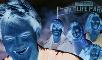
I Wanna Hold Your Hand
Japón
Criterion & Eclipse Cover Art & Packaging Babble-on Vol. 7
-
cdnchris

- Site Admin
- Joined: Tue Nov 02, 2004 6:45 pm
- Location: Washington
- Contact:
-
Gregory

- Joined: Tue Nov 02, 2004 8:07 pm
Re: Criterion & Eclipse Cover Art & Packaging Babble-on Vol. 7
Thank you, Chris. One pic of Japón and one of I Wanna got mixed up.
-
cdnchris
- Site Admin
- Joined: Tue Nov 02, 2004 6:45 pm
- Location: Washington
- Contact:
Re: Criterion & Eclipse Cover Art & Packaging Babble-on Vol. 7
Just noticed, thanks!
-
Boosmahn

- Joined: Tue Sep 05, 2017 2:08 am
Re: Criterion & Eclipse Cover Art & Packaging Babble-on Vol. 7
Detour appears to have a booklet, which is a nice surprise. I retract my complaints about the cover -- it looks better to me now. (And thank you for these packaging shots. I just noticed the camera reflection in the case... it looks like you have a nice professional setup there!)
-
cdnchris
- Site Admin
- Joined: Tue Nov 02, 2004 6:45 pm
- Location: Washington
- Contact:
Re: Criterion & Eclipse Cover Art & Packaging Babble-on Vol. 7
Other than I keep getting the reflection in the photos!Boosmahn wrote:I just noticed the camera reflection in the case... it looks like you have a nice professional setup there!
Japon also has a booklet. The rest are inserts.
-
Feego

- Joined: Thu Aug 16, 2007 11:30 pm
- Location: Texas
Re: Criterion & Eclipse Cover Art & Packaging Babble-on Vol. 7
The Magic Flute looks lovely. Too bad most of us aren't going to own the single release!
-
FrauBlucher

- Joined: Tue Jul 16, 2013 12:28 am
- Location: Greenwich Village
Re: Criterion & Eclipse Cover Art & Packaging Babble-on Vol. 7
I love the interior of the Detour package.
-
dustybooks
- Joined: Thu Mar 15, 2007 2:52 pm
- Location: Wilmington, NC
Re: Criterion & Eclipse Cover Art & Packaging Babble-on Vol. 7
The disc design for I Wanna Hold Your Hand is definitely after my heart.
-
swo17

- Bloodthirsty Butcher
- Joined: Tue Apr 15, 2008 2:25 pm
- Location: SLC, UT


-
domino harvey

- Dot Com Dom
- Joined: Wed Jan 11, 2006 6:42 pm
Re: Criterion & Eclipse Cover Art & Packaging Babble-on Vol. 7
That Swing Time cover is new front runner for worst of the year
-
FrauBlucher
- Joined: Tue Jul 16, 2013 12:28 am
- Location: Greenwich Village
Re: Criterion & Eclipse Cover Art & Packaging Babble-on Vol. 7
Yeah, a little disappointed with that one.
-
pzadvance

- Joined: Mon Nov 21, 2011 11:24 pm
- Location: Vienna, Austria
Re: Criterion & Eclipse Cover Art & Packaging Babble-on Vol. 7
wow, love that l'humanité cover.
-
knives

- Joined: Sat Sep 06, 2008 10:49 pm
Re: Criterion & Eclipse Cover Art & Packaging Babble-on Vol. 7
And yet it's the best of the month.domino harvey wrote: Fri Mar 15, 2019 7:04 pm That Swing Time cover is new front runner for worst of the year
-
KJones77
- Joined: Thu Aug 24, 2017 3:35 am
Re: Criterion & Eclipse Cover Art & Packaging Babble-on Vol. 7
Underwhelming art all around, except for War and Peace which is excellent.
-
MongooseCmr
- Joined: Sun Dec 16, 2012 3:50 am
Re: Criterion & Eclipse Cover Art & Packaging Babble-on Vol. 7
I really liked Swingtime until seeing the squiggles in the letters... as usual I don’t notice bad font work until you guys make me look for it
-
domino harvey
- Dot Com Dom
- Joined: Wed Jan 11, 2006 6:42 pm
Re: Criterion & Eclipse Cover Art & Packaging Babble-on Vol. 7
Strong disagree, knives. War and Peace is beautiful and I quite like the Dumonts. No strong feelings one way or the other in Hedwig, but it’s apt and of a piece with the covers for their other similar titles
-
Brian C

- I hate to be That Pedantic Guy but...
- Joined: Wed Sep 16, 2009 3:58 pm
- Location: Northwest US
Re: Criterion & Eclipse Cover Art & Packaging Babble-on Vol. 7
Yeah, I don't know what's going on with that Swing Time cover. It looks like placeholder art. But at least they've correctly identified it as a movie with Ginger Rogers and Fred Astaire in it, even if it does that annoying thing where the credits do not match the person underneath them.
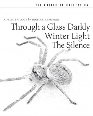
Also the Bergman set has been wacky C'd:

Also the Bergman set has been wacky C'd:
-
knives
- Joined: Sat Sep 06, 2008 10:49 pm
Re: Criterion & Eclipse Cover Art & Packaging Babble-on Vol. 7
I can buy that argument for Hedwig, though I'd prefer something based on this. For the other three though I feel like they are overly splotchy ala the Burroughs Queer cover in a way I personally don't like.domino harvey wrote: Fri Mar 15, 2019 7:17 pm Strong disagree, knives. War and Peace is beautiful and I quite like the Dumonts. No strong feelings one way or the other in Hedwig, but it’s apt and of a piece with the covers for their other similar titles
-
NABOB OF NOWHERE

- Joined: Thu Sep 01, 2005 4:30 pm
- Location: Brandywine River
Re: Criterion & Eclipse Cover Art & Packaging Babble-on Vol. 7
Well I think the Dumonts are phenomenal and right on the button
-
yoloswegmaster

- Joined: Tue Nov 01, 2016 7:57 pm
Re: Criterion & Eclipse Cover Art & Packaging Babble-on Vol. 7
Dude, what are you doing? Don't you know that you're only allowed to dislike the covers around here?NABOB OF NOWHERE wrote: Fri Mar 15, 2019 7:27 pm Well I think the Dumonts are phenomenal and right on the button
-
NABOB OF NOWHERE
- Joined: Thu Sep 01, 2005 4:30 pm
- Location: Brandywine River
Re: Criterion & Eclipse Cover Art & Packaging Babble-on Vol. 7
Sorry I thought I was on the bluray.com siteyoloswegmaster wrote: Fri Mar 15, 2019 7:30 pmDude, what are you doing? Don't you know that you're only allowed to dislike the covers around here?NABOB OF NOWHERE wrote: Fri Mar 15, 2019 7:27 pm Well I think the Dumonts are phenomenal and right on the button
-
Feego
- Joined: Thu Aug 16, 2007 11:30 pm
- Location: Texas
Re: Criterion & Eclipse Cover Art & Packaging Babble-on Vol. 7
I love the War and Peace and L'humanite covers. The rest are whatever. Swing Time is par for the course in Criterion's ongoing campaign to make golden age Hollywood classics look unremarkable. The title font on that one is adapted from this poster, for what it's worth.

-
soundchaser

- Leave Her to Beaver
- Joined: Sun Aug 28, 2016 4:32 am
Re: Criterion & Eclipse Cover Art & Packaging Babble-on Vol. 7
I wish they'd have updated that poster instead.
-
colinr0380

- Joined: Mon Nov 08, 2004 8:30 pm
- Location: Chapel-en-le-Frith, Derbyshire, UK
Re: Criterion & Eclipse Cover Art & Packaging Babble-on Vol. 7
Thirded on the L'humanité cover. Its from the key opening shot of the film but the way it has been painted ties it in with the theme of transcendent art versus earthy tangibility too. Love all the other covers too.
Also try to avoid the screenshots from the film on the Criterion page for L'humanité, as one contains a (kind of?) spoiler:
Spoiler
the shot of Pharaon wearing the handcuffs himself post-interrogation
Last edited by colinr0380 on Fri Mar 15, 2019 8:18 pm, edited 1 time in total.
-
FrauBlucher
- Joined: Tue Jul 16, 2013 12:28 am
- Location: Greenwich Village
Re: Criterion & Eclipse Cover Art & Packaging Babble-on Vol. 7
That poster definitely would’ve been a better choice.