Criterion & Eclipse Cover Art & Packaging Babble-on Vol. 7
-
NABOB OF NOWHERE

- Joined: Thu Sep 01, 2005 4:30 pm
- Location: Brandywine River
Re: Criterion & Eclipse Cover Art & Packaging Babble-on Vol. 7
So it be. Strangely it is not on the book cover. Wonder if there is theoretical thinking behind the decision or just a quirk of design.
-
Boosmahn

- Joined: Tue Sep 05, 2017 2:08 am
Re: Criterion & Eclipse Cover Art & Packaging Babble-on Vol. 7
Svet uploaded some packaging shots for A Face in the Crowd and it looks like one of Criterion's best packages in a while
-
cdnchris

- Site Admin
- Joined: Tue Nov 02, 2004 6:45 pm
- Location: Washington
- Contact:
-
yoloswegmaster

- Joined: Tue Nov 01, 2016 7:57 pm
Re: Criterion & Eclipse Cover Art & Packaging Babble-on Vol. 7
That's great and all Chris but when are you going to give what the FANS want and start reviewing the Bergman boxset?
-
cdnchris
- Site Admin
- Joined: Tue Nov 02, 2004 6:45 pm
- Location: Washington
- Contact:
Re: Criterion & Eclipse Cover Art & Packaging Babble-on Vol. 7
Oh shit, I forgot about that. It was never sent out to me so I had ordered it when it was between print runs to get the half-off price. It doesn't appear to have been sent out so now I have to call BN and ask them what's up! Ha, thanks for the reminder.
-
Yaanu

- Joined: Sat Aug 10, 2013 4:18 am
Re: Criterion & Eclipse Cover Art & Packaging Babble-on Vol. 7
Previously:
Now:
- 984 - Europa Europa
- 985 - The Baker's Wife
- 986 - 1984
- 987 - Klute
- 984 - 1984
- 985 - Europa Europa
- 986 - The Baker's Wife
- 987 - Klute
-
dustybooks

- Joined: Thu Mar 15, 2007 2:52 pm
- Location: Wilmington, NC
Re: Criterion & Eclipse Cover Art & Packaging Babble-on Vol. 7
Our long national nightmare is over
-
swo17

- Bloodthirsty Butcher
- Joined: Tue Apr 15, 2008 2:25 pm
- Location: SLC, UT
Re: Criterion & Eclipse Cover Art & Packaging Babble-on Vol. 7
Counterpoint: Nothing means anything anymore
-
FrauBlucher

- Joined: Tue Jul 16, 2013 12:28 am
- Location: Greenwich Village
Re: Criterion & Eclipse Cover Art & Packaging Babble-on Vol. 7
A production still used for the inside artwork. Is this a first?
-
Boosmahn
- Joined: Tue Sep 05, 2017 2:08 am
Re: Criterion & Eclipse Cover Art & Packaging Babble-on Vol. 7
Ghost World had some production polaroids as its inner print.
-
sabbath
- Joined: Fri Apr 25, 2014 10:29 am
Re: Criterion & Eclipse Cover Art & Packaging Babble-on Vol. 7
A new cost-cutting experiment? A sideways slipcover for Police Story / Police Story 2.
So that's why there are two spines on the digipak.

So that's why there are two spines on the digipak.
-
domino harvey

- Dot Com Dom
- Joined: Wed Jan 11, 2006 6:42 pm
Re: Criterion & Eclipse Cover Art & Packaging Babble-on Vol. 7
You really have to click that link to even decipher what that means, as the above picture is just confusing. It's basically like the old Mr Show season sets with the slipcover's openings on the sides instead of the top and bottom
-
tenia

- Ask Me About My Bassoon
- Joined: Wed Apr 29, 2009 3:13 pm
Re: Criterion & Eclipse Cover Art & Packaging Babble-on Vol. 7
Pretty much, but I don't think it's common at all to have both sides open, while top/bottom open slips are very common (see, for instance, the older Criterion BD digipacks). That's actually quite practical, since Criterion digis have always been printed "backwards" to me. This way, I could have the front facing the same way than their Scanavo releases.
I don't think a single moment it's a cost-cutting experiment, but rather a way to let people play with the way they want to display it in combination with the 2 inner artworks.
I don't think a single moment it's a cost-cutting experiment, but rather a way to let people play with the way they want to display it in combination with the 2 inner artworks.
-
cdnchris
- Site Admin
- Joined: Tue Nov 02, 2004 6:45 pm
- Location: Washington
- Contact:
-
cdnchris
- Site Admin
- Joined: Tue Nov 02, 2004 6:45 pm
- Location: Washington
- Contact:
Re: Criterion & Eclipse Cover Art & Packaging Babble-on Vol. 7
Blue Velvet - though mild, I'd say it's NSFW
One Sings, the Other Doesn't
Blue Velvet's front cover uses a metallic ink for the blacks so there's a cool little effect when you shift it in the light.
One Sings, the Other Doesn't
Blue Velvet's front cover uses a metallic ink for the blacks so there's a cool little effect when you shift it in the light.
-
domino harvey
- Dot Com Dom
- Joined: Wed Jan 11, 2006 6:42 pm
Re: Criterion & Eclipse Cover Art & Packaging Babble-on Vol. 7
And CocoRosie enters the collection
-
swo17
- Bloodthirsty Butcher
- Joined: Tue Apr 15, 2008 2:25 pm
- Location: SLC, UT

-
Boosmahn
- Joined: Tue Sep 05, 2017 2:08 am
Re: Criterion & Eclipse Cover Art & Packaging Babble-on Vol. 7
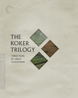
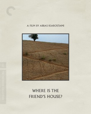
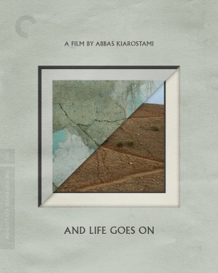
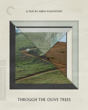
I like them all, especially the Ozu.
Edit: and the Koker Trilogy!
Edit: and the Koker Trilogy!
-
cdnchris
- Site Admin
- Joined: Tue Nov 02, 2004 6:45 pm
- Location: Washington
- Contact:
Re: Criterion & Eclipse Cover Art & Packaging Babble-on Vol. 7
Oooh, I love the Koker covers! Good concept and I think they pulled it off.
-
mteller

- Joined: Tue Nov 02, 2004 7:23 pm
Re: Criterion & Eclipse Cover Art & Packaging Babble-on Vol. 7
Boy do I like the Koker trilogy, even if the thing with the frames is maybe a little too on the nose.
-
ng4996

- the Wizard of Ozu
- Joined: Mon May 02, 2016 3:01 am
- Location: Missoula, MT
Re: Criterion & Eclipse Cover Art & Packaging Babble-on Vol. 7
I love the Ozu cover. I much prefer these types of covers to the collages of Late Spring and Tokyo Story.
-
HinkyDinkyTruesmith

- Joined: Tue Aug 08, 2017 2:21 am
Re: Criterion & Eclipse Cover Art & Packaging Babble-on Vol. 7
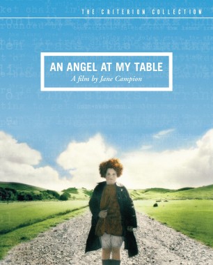
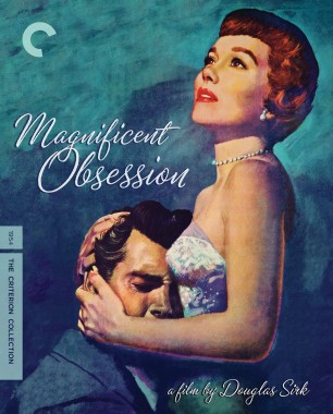
I like the Ozu cover, although I find the title find a bit too bland and neutral. The color choices also are a bit odd for me, as I didn't get a sense of warmth from this film (or most black&white Ozus). Although, the use of space is quite great.
The Koker Trilogy's also very clean and elegant in a way most new Criterion covers haven't been lately, I think.
And the Magnificent Obsession cover is just one of the most beautiful covers Criterion's ever done, in my opinion.
The Koker Trilogy's also very clean and elegant in a way most new Criterion covers haven't been lately, I think.
And the Magnificent Obsession cover is just one of the most beautiful covers Criterion's ever done, in my opinion.
-
domino harvey
- Dot Com Dom
- Joined: Wed Jan 11, 2006 6:42 pm
Re: Criterion & Eclipse Cover Art & Packaging Babble-on Vol. 7
The art for MO is from the poster, but the shadow font is a bad choice... though I think I still voted for it as cover of the year when the DVD was released!
-
HinkyDinkyTruesmith
- Joined: Tue Aug 08, 2017 2:21 am
Re: Criterion & Eclipse Cover Art & Packaging Babble-on Vol. 7
Well, that explains a lot! A case of the Marlboro man, I suppose.
-
TheGodfather

- Joined: Sun Sep 17, 2006 8:39 pm
- Location: The Netherlands
Re: Criterion & Eclipse Cover Art & Packaging Babble-on Vol. 7
Great month! Koker trilogy (always great to have more Kiarostami), MO on blu and another Ozu!