Heart-Wrenching: The Cluny Brown Cover Story
-
Michael Kerpan

- Spelling Bee Champeen
- Joined: Wed Nov 03, 2004 5:20 pm
- Location: New England
- Contact:
Re: Criterion & Eclipse Cover Art & Packaging Babble-on Vol. 7
The Cluny Brown cover makes me think of Clutch Cargo.
-
criterionoop
- Joined: Mon Sep 20, 2010 11:46 am
Heart-Wrenching: the Cluny Brown Cover Story
Criterion updates the CLUNY BROWN cover...it’s a relative improvement, but that artwork is still terrible.
-
soundchaser

- Leave Her to Beaver
- Joined: Sun Aug 28, 2016 4:32 am
Re: Criterion & Eclipse Cover Art & Packaging Babble-on Vol. 7
They don’t seem to understand those dead eyes are going to look dead no matter the background.
-
domino harvey

- Dot Com Dom
- Joined: Wed Jan 11, 2006 6:42 pm
Re: Criterion & Eclipse Cover Art & Packaging Babble-on Vol. 7

They... they made it worse?! The background contrast to the main image was the only thing going for this cover, now it’s all monochrome. Wow. I’m speechless. It’s like they’re intentionally fucking with us
-
BigMack3000
- Joined: Sat Jun 27, 2009 9:27 pm
Re: Criterion & Eclipse Cover Art & Packaging Babble-on Vol. 7
Is the film a nightmarish parody of Looney Tunes? Because then it's spot on.
-
KJones77
- Joined: Thu Aug 24, 2017 3:35 am
Re: Criterion & Eclipse Cover Art & Packaging Babble-on Vol. 7
What the hell. Yeah, the red was the only good part before.
Criterion, the problem is how Jennifer Jones is drawn, not the rest of the cover. Centering her and making it monochrome does not make it better.
The sad part is, now this great title will likely be doomed with this horrible drawing on the cover. If they changed it once, I doubt they'll change it twice.
-
domino harvey
- Dot Com Dom
- Joined: Wed Jan 11, 2006 6:42 pm
Re: Criterion & Eclipse Cover Art & Packaging Babble-on Vol. 7
I wonder if the reason they won’t have the artist draw it again is because Criterion already okayed the art, thus her contracted work has already been finalized? Since they don’t want to pay her again to do it over, they’re just rearranging deck chairs on the Titanic instead
-
Brian C

- I hate to be That Pedantic Guy but...
- Joined: Wed Sep 16, 2009 3:58 pm
- Location: Northwest US
Re: Criterion & Eclipse Cover Art & Packaging Babble-on Vol. 7
It’s better now because at least it doesn’t look like a movie about a 50-foot Rosie the Riveter robot on the rampage. Jones now still looks robotic, but not as menacingly so.
But the Looney Toons motif is a bunch of weirdness on its own. Still, at least it actually looks like a comedy now.
But the Looney Toons motif is a bunch of weirdness on its own. Still, at least it actually looks like a comedy now.
-
DRW.mov

- Joined: Thu Sep 15, 2016 6:43 pm
- Location: Los Angeles, CA
Re: Criterion & Eclipse Cover Art & Packaging Babble-on Vol. 7
I think it’s a marked improvement. To me the contrast between the red wallpaper and monochrome Jennifer Jones was the most jarring element.
And yes, Domino is correct that Caitlin’s commission is contractually completed. Commissioning any additional work from her would be an added fee but I feel that with her long history with Criterion and their approval of this execution that this is a design that they stand behind. I don’t think it’s nearly as bad as people are making it out to be. Like I said I think it’s much more appealing to the eye in its current form, but at the end of the day I’m just over the moon in general it’s a title that’s finally being released.
And yes, Domino is correct that Caitlin’s commission is contractually completed. Commissioning any additional work from her would be an added fee but I feel that with her long history with Criterion and their approval of this execution that this is a design that they stand behind. I don’t think it’s nearly as bad as people are making it out to be. Like I said I think it’s much more appealing to the eye in its current form, but at the end of the day I’m just over the moon in general it’s a title that’s finally being released.
-
Malickite

- Joined: Wed Dec 28, 2016 9:47 pm
- Location: United States
-
Finch

- Joined: Mon Jul 07, 2008 9:09 pm
- Location: United States
Re: Criterion & Eclipse Cover Art & Packaging Babble-on Vol. 7
Other artists have published their alternative covers, like Fred Davis (correct name? not sure) did for FWWM and Mulholland Drive. Maybe they should make all these Cluny Brown covers public and let a majority vote decide.
-
Shrew

- The Untamed One
- Joined: Tue Feb 27, 2007 6:22 am
Re: Criterion & Eclipse Cover Art & Packaging Babble-on Vol. 7
They updated Seth's artwork for City Lights to make Chaplin look more like Chaplin, but I don't know if that was
a) The artist being more accommodating
b) An in-house illustrator/designer being able to more easily make edits to the cartoonish art, and Seth signing off on that/not complaining
c) Criterion forking over some extra money for what was expected to be a big seller (City Lights) vs. a good film that's not likely to fly off shelves (Cluny Brown)
-
FrauBlucher

- Joined: Tue Jul 16, 2013 12:28 am
- Location: Greenwich Village
Re: Criterion & Eclipse Cover Art & Packaging Babble-on Vol. 7
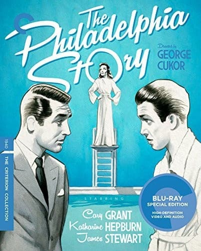
Didn’t they do the same with The Philadelphia Story? They had a weird blue and red thing going if I remember correctly and switched it to monochrome for the better.
-
swo17

- Bloodthirsty Butcher
- Joined: Tue Apr 15, 2008 2:25 pm
- Location: SLC, UT
Re: Criterion & Eclipse Cover Art & Packaging Babble-on Vol. 7
Just blue but yes
-
CSM126

- Joined: Thu Nov 04, 2004 12:22 pm
- Location: The Room
- Contact:
Re: Criterion & Eclipse Cover Art & Packaging Babble-on Vol. 7
Maybe next time they’ll let the artist see a picture of the person they’re drawing.
-
HinkyDinkyTruesmith
- Joined: Tue Aug 08, 2017 2:21 am
Re: Criterion & Eclipse Cover Art & Packaging Babble-on Vol. 7
I think that this might be the absolute worst modern Criterion cover I've ever seen––but, this is one of my very favorite movies of all-time, so, frankly, even the absolute travesty that is that cover font can't diminish my enthusiasm.
-
swo17
- Bloodthirsty Butcher
- Joined: Tue Apr 15, 2008 2:25 pm
- Location: SLC, UT
Re: Criterion & Eclipse Cover Art & Packaging Babble-on Vol. 7
It doesn't look as bad when it's tiny?

-
FrauBlucher
- Joined: Tue Jul 16, 2013 12:28 am
- Location: Greenwich Village
Re: Criterion & Eclipse Cover Art & Packaging Babble-on Vol. 7
It just looks like an ad from the 1950s. Maybe Cluny Brown was a soap used after using a wrench and other tools.
-
criterionoop
- Joined: Mon Sep 20, 2010 11:46 am
Re: Criterion & Eclipse Cover Art & Packaging Babble-on Vol. 7
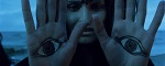
I just really can't get over the fact that her hand is a cup and she is dead behind the eyes.
-
KJones77
- Joined: Thu Aug 24, 2017 3:35 am
Re: Criterion & Eclipse Cover Art & Packaging Babble-on Vol. 7
I only just noticed that the circle makes it seem like she has just one arm. This cover is so bad.
-
swo17
- Bloodthirsty Butcher
- Joined: Tue Apr 15, 2008 2:25 pm
- Location: SLC, UT
Re: Criterion & Eclipse Cover Art & Packaging Babble-on Vol. 7
The wrench is her other arm. Haven't you seen the movie?
-
domino harvey
- Dot Com Dom
- Joined: Wed Jan 11, 2006 6:42 pm
Re: Criterion & Eclipse Cover Art & Packaging Babble-on Vol. 7
Not to spoil one of Lubitsch's most prescient jokes, but Charles Boyer's aristocratic interstellar commander calls Jennifer Jones' character X-1F344-32-G44C3 "Cluny" because that's the sound her robot joints make when she's cleaning up under the sink of his rocketship
-
Feego

- Joined: Thu Aug 16, 2007 11:30 pm
- Location: Texas
Re: Heart-Wrenching: the Cluny Brown Cover Story
The flare of light on the wrench (not present on the original cover) truly is the icing on the cake, suggesting a weapon and that RoboCluny is coming for you. To be honest, I don't think this is nearly as ugly as the "upgraded" covers for Sullivan's Travels and My Man Godfrey, but those had their fans. I would argue that Veronica Lake is still the bigger victim when it comes to cartoonish representations on Criterion covers. This whole saga is just hilarious to me, though, and it makes me wish Criterion would adopt Arrow, Shout Factory and sometimes Kino's practice of providing original poster artwork on the reverse side.
-
black&huge
- Joined: Tue Dec 26, 2017 9:35 am
Re: Heart-Wrenching: the Cluny Brown Cover Story
The new cover is just as bad as the first. Not anymore or less.... just mindboggling.
-
ballmouse
- Joined: Sat Mar 04, 2017 12:32 am
Re: Heart-Wrenching: the Cluny Brown Cover Story
I was curious what the original poster from 1946 looked like. It actually has a similar alien, robotic touch.
