> But who decided to give her a red nose
How often have you stood on the top of a hill/mountain in the sun for any length of time (assuming you have a fair complexion -- as does the film's heroine).
;~}
Criterion Cover Art & Packaging Babble-on Vol.2
-
Michael Kerpan

- Spelling Bee Champeen
- Joined: Wed Nov 03, 2004 5:20 pm
- Location: New England
- Contact:
-
Cinephrenic

- Joined: Tue Nov 02, 2004 6:58 pm
- Location: Paris, Texas
-
oldsheperd

- Joined: Thu Nov 11, 2004 9:18 pm
- Location: Rio Rancho/Albuquerque
-
Donald Trampoline

- Joined: Fri Feb 11, 2005 7:39 pm
- Location: Los Angeles, CA
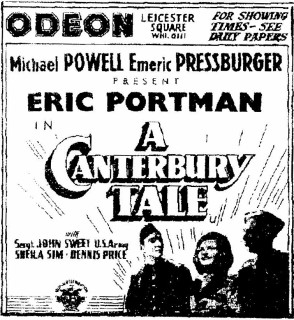
Jeff wrote:I shall now forever think of A Canterbury Tale as Nancy Drew and the Case of the Glue Man.
For those who have seen the film this comment is (A) hilarious and (B) exactly sums up all that is (still) wrong with the cover, (since all the unnecessary logo circle-jerking is no longer part of the discussion.) And actually, if they changed the title of the film to this, then I would no longer have a problem with the cover and would consider the whole affair quite funny!
As I said up somewhere earlier, this cover does not evoke the themes, images, moods, emotions or anything much really from this film which is very rich in a broad range of themes, history, scenery and fine images.
Spoiler
Who's for an alternate "Glue Man" in the act of "gluing" someone cover instead in the style of a sensationalistic pulp dime novel cover!?!
-
oldsheperd
- Joined: Thu Nov 11, 2004 9:18 pm
- Location: Rio Rancho/Albuquerque
-
LightBulbFilm

- Joined: Wed Nov 16, 2005 9:11 pm
- Location: Florida
- Contact:

-
LightBulbFilm
- Joined: Wed Nov 16, 2005 9:11 pm
- Location: Florida
- Contact:
Is this going to be on of those things in the history of the criterionforum that everyone refers back to at some point... or will it possibly keep going, as in the next time a crappy cover is released someone fixes that one up then put this one under whoever's arm is there...?The only thing that could improve that would be to find a way to work in the talking gorilla.
-
Matt

- Joined: Tue Nov 02, 2004 4:58 pm
-
denti alligator

- Joined: Thu Nov 04, 2004 1:36 am
- Location: "born in heaven, raised in hell"
-
Noir of the Night
- Joined: Tue Nov 29, 2005 12:57 am
-
Cinesimilitude
- Joined: Tue Jul 09, 2013 4:43 am
I'll go as far as you guys request me too...LightBulbFilm wrote:Is this going to be on of those things in the history of the criterionforum that everyone refers back to at some point... or will it possibly keep going, as in the next time a crappy cover is released someone fixes that one up then put this one under whoever's arm is there...?
-
pzman84

- Joined: Mon Dec 20, 2004 8:05 pm


-
hammock

- Joined: Wed Nov 03, 2004 5:52 pm
- Location: www.criteriondungeon.com
- Contact:
Thanks PZMan84! Would have loved to see the cover based on this one.
-
bjeggert82

- Joined: Fri Nov 05, 2004 1:36 am
- Location: www.deepfocusreview.com
- Contact:
-
godardslave

- Joined: Tue Nov 02, 2004 8:44 pm
- Location: Confusing and open ended = high art.


-
Matt
- Joined: Tue Nov 02, 2004 4:58 pm
Ah, so it wasn't the inept painter who chopped off her hands - it was in a different still originally. Well, apologies to the inept painter, then.Ashirg wrote:I don't like this Anne of Green Gables cover one bit. They must have taken the idea from this U.K. cover (I'm not sure what it's for), but even the dress pattern is different in the film and looks like they cut off her hands...
-
Gordon

- Joined: Thu Nov 11, 2004 12:03 pm
Could you add a cigarette to her mouth? Uncle Hulot style, at an angle.SncDthMnky wrote:I'll go as far as you guys request me too...
I don't know what to make of that cover. 'Twee' is the only word that comes to mind and the film isn't twee at all. The film is teeming with exquisite shots that could be used as the basis for the cover. An odd one, indeed, but nothing could stop me from acquiring this.
-
zedz

- Joined: Sun Nov 07, 2004 11:24 pm
Hey, I go away for a few days and it's Viridiana all over again. I don't think we should forget how ugly and lazy that original Viridiana cover was, but this monstrosity is about as bad. It's appallingly ugly, not to mention grossly misrepresenting the film. It makes me wonder if one of the unannounced extras with the set is the paint-by-numbers set they used. (Or maybe there's going to be a colouring-in competition for kids? Yay!)
-
Derek Estes

- Joined: Wed Nov 03, 2004 12:00 am
- Location: Portland Oregon