Criterion & Eclipse Cover Art & Packaging Babble-on Vol. 7
-
ng4996

- the Wizard of Ozu
- Joined: Mon May 02, 2016 3:01 am
- Location: Missoula, MT
Re: Criterion & Eclipse Cover Art & Packaging Babble-on Vol. 7
I have to agree with domino, I expected they might go all out with GBH and make something really gorgeous. This feels a bit busy and drab. I still think Fantastic Mr Fox is the best of the Anderson titles, lookswise.
-
keylime_5
- Joined: Thu Nov 16, 2017 3:06 pm
Re: Criterion & Eclipse Cover Art & Packaging Babble-on Vol. 7
I found a bigger version of that image here by the way
-
bainbridgezu

- Joined: Wed Jan 19, 2011 2:54 am
Re: Criterion & Eclipse Cover Art & Packaging Babble-on Vol. 7
I was hoping for something like their Princess Bride book -- same gold and purple color scheme, but with a a velvet finish. Need to see this one in person. Could be great, especially with pop-up/pull-out elements.
Edit: Now that I've seen the larger version, I'm not so sure. Doubt this is what they were going for, but it looks like Peter Greenaway dashed off a coloring book for a child he hates.
Edit: Now that I've seen the larger version, I'm not so sure. Doubt this is what they were going for, but it looks like Peter Greenaway dashed off a coloring book for a child he hates.
Last edited by bainbridgezu on Wed Jan 15, 2020 9:15 pm, edited 1 time in total.
-
movielocke

- Joined: Fri Jan 18, 2008 4:44 am
Re: Criterion & Eclipse Cover Art & Packaging Babble-on Vol. 7
Bressonaire leak strikes again with the Cluny-est Brown-iest cover of 2020
-
mteller

- Joined: Tue Nov 02, 2004 7:23 pm
Re: Criterion & Eclipse Cover Art & Packaging Babble-on Vol. 7
Where are you folks finding these covers?
-
bainbridgezu
- Joined: Wed Jan 19, 2011 2:54 am
Re: Criterion & Eclipse Cover Art & Packaging Babble-on Vol. 7
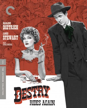
Hard to judge Stewart and Dietrich from the thumbnail, but I love the background sketches. They'd be at home on a great-looking old paperback.
-
domino harvey

- Dot Com Dom
- Joined: Wed Jan 11, 2006 6:42 pm
Re: Criterion & Eclipse Cover Art & Packaging Babble-on Vol. 7
Those drawings both look like the stars, no Cluny Browning detected, movielocke
-
Glowingwabbit
- Joined: Wed May 01, 2013 5:27 pm
Re: Criterion & Eclipse Cover Art & Packaging Babble-on Vol. 7
The color of her dress needs to change. You can't have the background the same color as what someone is wearing like that.domino harvey wrote: Wed Jan 15, 2020 9:18 pm Those drawings both look like the stars, no Cluny Browning detected, movielocke
-
movielocke
- Joined: Fri Jan 18, 2008 4:44 am
Re: Criterion & Eclipse Cover Art & Packaging Babble-on Vol. 7
I thought that the background was fancy old fashioned wallpaper and dietrich was drawn as though she were emerging from the wallpaper, or made her clothes from it.domino harvey wrote: Wed Jan 15, 2020 9:18 pm Those drawings both look like the stars, no Cluny Browning detected, movielocke
-
swo17

- Bloodthirsty Butcher
- Joined: Tue Apr 15, 2008 2:25 pm
- Location: SLC, UT


-
domino harvey
- Dot Com Dom
- Joined: Wed Jan 11, 2006 6:42 pm
Re: Criterion & Eclipse Cover Art & Packaging Babble-on Vol. 7
So that’s what the mystery doodle cover was
-
domino harvey
- Dot Com Dom
- Joined: Wed Jan 11, 2006 6:42 pm
Re: Criterion & Eclipse Cover Art & Packaging Babble-on Vol. 7
That complaint I can get on board with, but it’d be an easy fixGlowingwabbit wrote: Wed Jan 15, 2020 9:20 pmThe color of her dress needs to change. You can't have the background the same color as what someone is wearing like that.domino harvey wrote: Wed Jan 15, 2020 9:18 pm Those drawings both look like the stars, no Cluny Browning detected, movielocke
-
mfunk9786

- Under Chris' Protection
- Joined: Fri May 16, 2008 8:43 pm
- Location: Miami, FL
Re: Criterion & Eclipse Cover Art & Packaging Babble-on Vol. 7
Grand Budapest Hotel cover is excellent and that's all I've got for today, the rest are awful
-
Feego

- Joined: Thu Aug 16, 2007 11:30 pm
- Location: Texas
Re: Criterion & Eclipse Cover Art & Packaging Babble-on Vol. 7
I like the Destry Rides Again cover, and I'm just gonna put this out there: I wish that is what they had done for McCabe & Mrs. Miller.
-
Brian C

- I hate to be That Pedantic Guy but...
- Joined: Wed Sep 16, 2009 3:58 pm
- Location: Northwest US
Re: Criterion & Eclipse Cover Art & Packaging Babble-on Vol. 7
I like Grand Budapest ... sure, it’s a little busy, but that’s hardly out of step with the film itself.
But I think mostly I’m just glad it’s finally coming out.
But I think mostly I’m just glad it’s finally coming out.
-
Oedipax

- Joined: Wed Nov 03, 2004 12:48 pm
- Location: Atlanta
Re: Criterion & Eclipse Cover Art & Packaging Babble-on Vol. 7
I guess my memory is going because I would've sworn Army of Shadows was already re-issued on blu-ray years ago.
Edit: To make this post thread-appropriate, I'll just add that the Grand Budapest artwork is not to my liking and I wish the colors were warm/pink tones not blue.
Edit 2: I see now that Army is back in print, and my memory is not quite as terrible as I thought.
Edit: To make this post thread-appropriate, I'll just add that the Grand Budapest artwork is not to my liking and I wish the colors were warm/pink tones not blue.
Edit 2: I see now that Army is back in print, and my memory is not quite as terrible as I thought.
-
Matt

- Joined: Tue Nov 02, 2004 4:58 pm
Re: Criterion & Eclipse Cover Art & Packaging Babble-on Vol. 7
Why not? It's clearly a deliberate choice. I think the cover is a nice nod to the pulp Western origins of the movie, like a limited-color splash page or ad in the interior of a pulp magazine.Glowingwabbit wrote: Wed Jan 15, 2020 9:20 pmYou can't have the background the same color as what someone is wearing like that.
-
domino harvey
- Dot Com Dom
- Joined: Wed Jan 11, 2006 6:42 pm
Re: Criterion & Eclipse Cover Art & Packaging Babble-on Vol. 7
It reminds me of children’s book art of the fifties and sixties. I don’t mind the mono color bleed, but I think a different shade of red, even the same red, would look better
-
therewillbeblus

- Joined: Tue Dec 22, 2015 7:40 pm
Re: Criterion & Eclipse Cover Art & Packaging Babble-on Vol. 7
I really expected the Miranda July cover to be the most divisive - pretty surprised to see the lack of strong opinions on that one (so far)
-
CSM126

- Joined: Thu Nov 04, 2004 12:22 pm
- Location: The Room
- Contact:
Re: Criterion & Eclipse Cover Art & Packaging Babble-on Vol. 7
Me and You is gorgeous, as is Budapest. No real opinion on the others (well, I suppose a new Army of Shadows cover might have been refreshing but it’s not bad as is).
-
artfilmfan
- Joined: Thu Nov 04, 2004 1:11 am
Re: Criterion & Eclipse Cover Art & Packaging Babble-on Vol. 7
They went for something that would get an oof out of domino. It did. Mission accomplished!ng4996 wrote: Wed Jan 15, 2020 9:08 pm I have to agree with domino, I expected they might go all out with GBH and make something really gorgeous. This feels a bit busy and drab. I still think Fantastic Mr Fox is the best of the Anderson titles, lookswise.
-
domino harvey
- Dot Com Dom
- Joined: Wed Jan 11, 2006 6:42 pm
Re: Criterion & Eclipse Cover Art & Packaging Babble-on Vol. 7
I mean, if that's true, they can def take a bow
-
TheGodfather

- Joined: Sun Sep 17, 2006 8:39 pm
- Location: The Netherlands
Re: Criterion & Eclipse Cover Art & Packaging Babble-on Vol. 7
GBH cover doesn’t look that good,let’s hope it’ll be better inperson and that it’ll be a nice a digipack. Loved the film, great to see more Anderson in the collection!
-
britcom68
Re: Criterion & Eclipse Cover Art & Packaging Babble-on Vol. 7
My sole complaint about Grand B. Hotel's cover art is just that the blues are hardly indicative of the film's pallets. I would agree with others who would have preferred reds, yellow-orange or perhaps even pastels to echo the courtesan au chocolat. Shades of blue are used in the film, but hardly to such a degree it begged to be the cover art. Frankly this is one tremendous chance for the packaging itself to be opulent, in keeping in with the spirit of the film itself. If it is learned that Anderson himself approved this cover as-is then I would be shocked at his miscalculation from so meticulous an auteur.
-
tenia

- Ask Me About My Bassoon
- Joined: Wed Apr 29, 2009 3:13 pm
Re: Criterion & Eclipse Cover Art & Packaging Babble-on Vol. 7
I'm myself surprised people are seemingly pleased (or at least not displeased) with this awful Paint collage that definitely gives me a Déjà vu from the swimminghorses thread.therewillbeblus wrote: Wed Jan 15, 2020 11:39 pm I really expected the Miranda July cover to be the most divisive - pretty surprised to see the lack of strong opinions on that one (so far)