I'm having issues uploading images at the moment, but here is the Bruce Lee set for now. I'll get pics of the other July titles when I can (The Marriage Story one is kinda clever)
Bruce Lee: His Greatest Hits
Criterion & Eclipse Cover Art & Packaging Babble-on Vol. 7
-
cdnchris

- Site Admin
- Joined: Tue Nov 02, 2004 6:45 pm
- Location: Washington
- Contact:
-
cdnchris
- Site Admin
- Joined: Tue Nov 02, 2004 6:45 pm
- Location: Washington
- Contact:
-
mfunk9786

- Under Chris' Protection
- Joined: Fri May 16, 2008 8:43 pm
- Location: Miami, FL
Re: Criterion & Eclipse Cover Art & Packaging Babble-on Vol. 7
Gotta admit, I'm enchanted by that Marriage Story packaging.
-
kcota17
- Joined: Sat Mar 01, 2014 1:05 am
Re: Criterion & Eclipse Cover Art & Packaging Babble-on Vol. 7
Wow, actually including both of their handwritten letters is such a great inclusion. Very excited for this release
-
domino harvey

- Dot Com Dom
- Joined: Wed Jan 11, 2006 6:42 pm


-
domino harvey
- Dot Com Dom
- Joined: Wed Jan 11, 2006 6:42 pm
Re: Criterion & Eclipse Cover Art & Packaging Babble-on Vol. 7
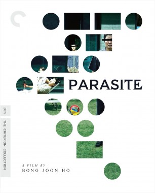
That Parasite cover is the worst cover of the year. HOLY FUCK what did they do. The rest are great though!
-
knives

- Joined: Sat Sep 06, 2008 10:49 pm
Re: Criterion & Eclipse Cover Art & Packaging Babble-on Vol. 7
Is that supposed to be James Earl Jones?
-
soundchaser

- Leave Her to Beaver
- Joined: Sun Aug 28, 2016 4:32 am
Re: Criterion & Eclipse Cover Art & Packaging Babble-on Vol. 7
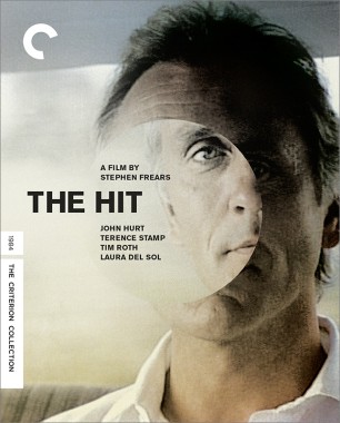
I assume the Parasite cover is a slide 'em out-style digipack? Weird that they felt the need to change Pierrot le fou's cover but not, say the one for Army of Shadows.
-
dustybooks
- Joined: Thu Mar 15, 2007 2:52 pm
- Location: Wilmington, NC
Re: Criterion & Eclipse Cover Art & Packaging Babble-on Vol. 7
Parasite took me a minute but once I figured it out I was on board, though I'd rather the message were something more interesting than the film's title..
-
domino harvey
- Dot Com Dom
- Joined: Wed Jan 11, 2006 6:42 pm
Re: Criterion & Eclipse Cover Art & Packaging Babble-on Vol. 7
Yes, I get it, it's the morse code overlayed on top of the existing movie poster art. That is the start of an idea, not an actual implementation and finalized product
-
therewillbeblus

- Joined: Tue Dec 22, 2015 7:40 pm
Re: Criterion & Eclipse Cover Art & Packaging Babble-on Vol. 7
Yeah I was laughing at it before I understood the morse code, but it's still not good. Love The Gunfighter's use of color, very inspired for those who have seen the film. Pierrot le Fou's original cover was great already, but I like this one too so no complaining there.
-
swo17

- Bloodthirsty Butcher
- Joined: Tue Apr 15, 2008 2:25 pm
- Location: SLC, UT
Re: Criterion & Eclipse Cover Art & Packaging Babble-on Vol. 7
What is the morse code message? Also, Gunfighter looks like a bad Arrow Academy cover
-
Ribs

- Joined: Fri Jun 13, 2014 5:14 pm
Re: Criterion & Eclipse Cover Art & Packaging Babble-on Vol. 7
I expect because it’s an actual upgrade and a new disc Criterion felt the need to do new art so there’s no confusion in the market about which release is which. Which is understandable!
-
HinkyDinkyTruesmith
- Joined: Tue Aug 08, 2017 2:21 am
Re: Criterion & Eclipse Cover Art & Packaging Babble-on Vol. 7
While I'm very excited about THE GUNFIGHTER coming to Criterion, I wish Peck's face wasn't so white. Makes it feel much more cartoonish than the design is.
As for PARASITE, one of the key issues with the cover is that it's taking an existing design (the original poster with eyes barred) and overlaying a second one on top, and I think that heavily takes away from both. Aside from the fact that the weight of the image does not go well with the movement of the overlay.
As for PARASITE, one of the key issues with the cover is that it's taking an existing design (the original poster with eyes barred) and overlaying a second one on top, and I think that heavily takes away from both. Aside from the fact that the weight of the image does not go well with the movement of the overlay.
-
therewillbeblus
- Joined: Tue Dec 22, 2015 7:40 pm
Re: Criterion & Eclipse Cover Art & Packaging Babble-on Vol. 7
The film's title, if you google morse code it corresponds to a letter each line
-
domino harvey
- Dot Com Dom
- Joined: Wed Jan 11, 2006 6:42 pm
Re: Criterion & Eclipse Cover Art & Packaging Babble-on Vol. 7
I do want to give a shout out to the Gunfigher using a variation on Fox's instantly recognizable house style credits font for the cover font! I actually don't think any DVD/Blu-ray designer has ever done that for one of their films, even though you'd think someone would have before now!
-
mteller

- Joined: Tue Nov 02, 2004 7:23 pm
Re: Criterion & Eclipse Cover Art & Packaging Babble-on Vol. 7
A pretty accurate representation of how he looks in the film, actually
-
Never Cursed

- Such is life on board the Redoutable
- Joined: Sun Aug 14, 2016 4:22 am
Re: Criterion & Eclipse Cover Art & Packaging Babble-on Vol. 7
Parasite is not just the worst cover of the year, it’s the worst cover since Mulholland Dr., good god
-
mfunk9786
- Under Chris' Protection
- Joined: Fri May 16, 2008 8:43 pm
- Location: Miami, FL
Re: Criterion & Eclipse Cover Art & Packaging Babble-on Vol. 7
Between that and the fact that this is going to be a digi slip with the full poster image behind it, I can't imagine getting too up in arms about what is sort of a creative if unremarkable cover idea.therewillbeblus wrote: Wed Jul 15, 2020 4:49 pmThe film's title, if you google morse code it corresponds to a letter each line
Changing Pierrot to something so bland for a release that isn't even a full upgrade seems like the far bigger sin to me.
The Gunfighter is stunning.
-
FrauBlucher

- Joined: Tue Jul 16, 2013 12:28 am
- Location: Greenwich Village
Re: Criterion & Eclipse Cover Art & Packaging Babble-on Vol. 7
The Gunfighter cover is iconic
I love the placement of Henry King
I love the placement of Henry King
-
Glowingwabbit
- Joined: Wed May 01, 2013 5:27 pm
Re: Criterion & Eclipse Cover Art & Packaging Babble-on Vol. 7
I'm seeing some people speculating that the Parasite cover could be a slip. I know they've rarely ever done slips but its not out of the question.
-
soundchaser
- Leave Her to Beaver
- Joined: Sun Aug 28, 2016 4:32 am
Re: Criterion & Eclipse Cover Art & Packaging Babble-on Vol. 7
My gut says not a traditional slip so much as a Koker Trilogy style die-cut sleeve.
-
CSM126

- Joined: Thu Nov 04, 2004 12:22 pm
- Location: The Room
- Contact:
Re: Criterion & Eclipse Cover Art & Packaging Babble-on Vol. 7
I’m going with the idea that Parasite will be a fancy digi. A smart design with a good budget could do a great layering effect where each successive part of the package takes you deeper into the house until the disc hub itself is… you know where.
-
Brian C

- I hate to be That Pedantic Guy but...
- Joined: Wed Sep 16, 2009 3:58 pm
- Location: Northwest US
Re: Criterion & Eclipse Cover Art & Packaging Babble-on Vol. 7
I think Parasite looks fine but it’s just unnecessary. The poster art underneath was already iconic, so the Morse code thing is just adding something for the sake of adding something.
If Pierrot was new to the collection, I’d probably say that’s a fine cover. It at least has a strong Godard feel to it. But it’s a big step down from the original so it’s hard not to be disappointed.
If Pierrot was new to the collection, I’d probably say that’s a fine cover. It at least has a strong Godard feel to it. But it’s a big step down from the original so it’s hard not to be disappointed.
-
movielocke

- Joined: Fri Jan 18, 2008 4:44 am
Re: Criterion & Eclipse Cover Art & Packaging Babble-on Vol. 7
Love the Parasite idea, I'm assuming it's going to be cutouts of a slipcover like Dazed and Confused?