Criterion & Eclipse Cover Art & Packaging Babble-on Vol. 7
-
andyli

- Joined: Thu Sep 24, 2009 8:46 pm
Re: Criterion & Eclipse Cover Art & Packaging Babble-on Vol. 7
Got my WA Archive set. It’s a classy design overall. Very nice to hold in hand. The “booklets” are glued to each case and average at about 14 pages. One tiny misstep though: they made each case so that the front cover and the disc holder are back to back, so if you place the cases front side up, the discs are liable to fall from the holder (one disc did fall off because of a loose holder). I’ve turned all of them back side up since they’re gonna stay for a long time in the box for storage.
-
cdnchris

- Site Admin
- Joined: Tue Nov 02, 2004 6:45 pm
- Location: Washington
- Contact:
Re: Criterion & Eclipse Cover Art & Packaging Babble-on Vol. 7
Burden of Dreams [4K] (Booklet)
The Breakfast Club [4K] (Booklet)
Hell's Angels [4K]
El [4K] (Booklet)
Eyes Wide Shut [4K] (Booklet)
Eclipse 47: Abbas Kiarostami—Early Shorts and Features (Booklet)
The Breakfast Club [4K] (Booklet)
Hell's Angels [4K]
El [4K] (Booklet)
Eyes Wide Shut [4K] (Booklet)
Eclipse 47: Abbas Kiarostami—Early Shorts and Features (Booklet)
-
criterionsnob

- Joined: Wed Nov 03, 2004 5:23 am
- Location: Canada
Re: Criterion & Eclipse Cover Art & Packaging Babble-on Vol. 7
So Eclipse still has the slipcover with cut-out top and bottom by the looks of it?
-
cdnchris
- Site Admin
- Joined: Tue Nov 02, 2004 6:45 pm
- Location: Washington
- Contact:
Re: Criterion & Eclipse Cover Art & Packaging Babble-on Vol. 7
Yes, same idea.
-
Finch

- Joined: Mon Jul 07, 2008 9:09 pm
- Location: United States
Re: Criterion & Eclipse Cover Art & Packaging Babble-on Vol. 7
Eyes Wide Shut looks great! Even Hell's Angels looks better in those photos.
-
Finch
- Joined: Mon Jul 07, 2008 9:09 pm
- Location: United States
-
Beloved Aunt

- Joined: Tue Dec 14, 2021 7:28 pm
Re: Criterion & Eclipse Cover Art & Packaging Babble-on Vol. 7
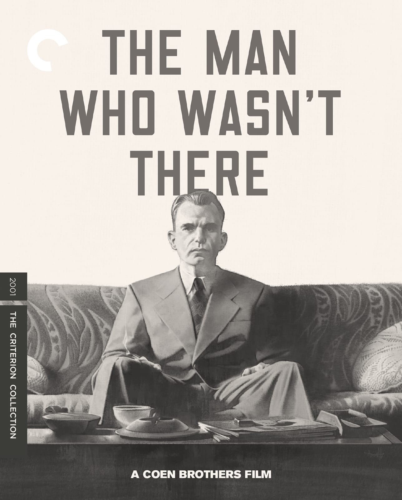
Those are okay. But why not use some variation on this lovely thing for Network?: 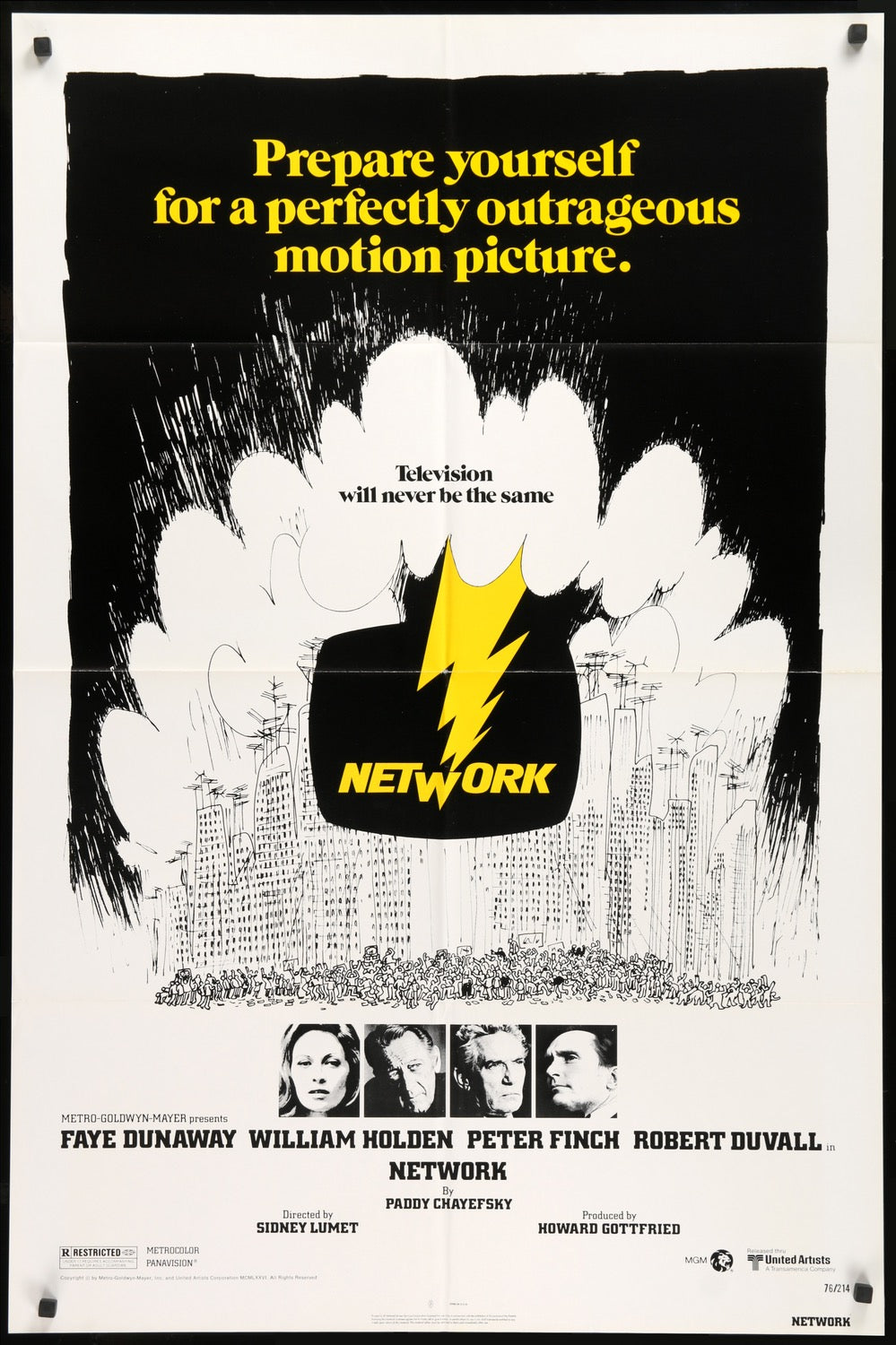
-
Beloved Aunt
- Joined: Tue Dec 14, 2021 7:28 pm
Re: Criterion & Eclipse Cover Art & Packaging Babble-on Vol. 7
TMWWT cover doesn't really evoke the film, or noir neither.
-
DRW.mov

- Joined: Thu Sep 15, 2016 6:43 pm
- Location: Los Angeles, CA
Re: Criterion & Eclipse Cover Art & Packaging Babble-on Vol. 7
Both are stunners. The TMWWT cover locks into the film's mid century aesthetics and ennui beautifully. Important to note that despite the B&W colorgrade and noir plot elements, Deakins and the Coens have said many times that the visual language of the movie was never inspired by film noir, but instead by 40s and 50s sci-fi films with much less contrast and more pronounced midtones. I think this cover nails that.
-
domino harvey

- Dot Com Dom
- Joined: Wed Jan 11, 2006 6:42 pm
Re: Criterion & Eclipse Cover Art & Packaging Babble-on Vol. 7
The font reminds me of like 00s default indie album design (as does the art style)… not a good look, but I don’t care about the movie so I hope the fans love it anywaysBeloved Aunt wrote: Mon Nov 17, 2025 7:05 pm TMWWT cover doesn't really evoke the film, or noir neither.
-
ryannichols7
- Joined: Mon Jul 16, 2012 6:26 pm
Re: Criterion & Eclipse Cover Art & Packaging Babble-on Vol. 7
Network is fine but I agree the original poster is best. really not a fan of the Coen cover, not at all what I picture for that movie
-
therewillbeblus

- Joined: Tue Dec 22, 2015 7:40 pm
Re: Criterion & Eclipse Cover Art & Packaging Babble-on Vol. 7
The Coen is fine - it’s as evocative as any other photo of a lone Billy Bob, which is what I’d assumed they’d go for, and it’s from one of the first stills of him describing himself as alienated. Makes sense. Also I think the font is from the film’s opening credits, or close to it
-
ryannichols7
- Joined: Mon Jul 16, 2012 6:26 pm
Re: Criterion & Eclipse Cover Art & Packaging Babble-on Vol. 7
that's fair, like dom I honestly couldn't remember as the movie didn't stick with me much. I just think of it being more noir-ish
also underrated thing of the month: the Playtime 4K seems to keep the original cover. while I loved the uniformity of the Tati box, I'm thrilled to have the original art back for this upgrade
also underrated thing of the month: the Playtime 4K seems to keep the original cover. while I loved the uniformity of the Tati box, I'm thrilled to have the original art back for this upgrade
-
Ribs

- Joined: Fri Jun 13, 2014 5:14 pm
Re: Criterion & Eclipse Cover Art & Packaging Babble-on Vol. 7
Surprised they didn’t repeat the house style used for all the Coen releases other than Blood Simple - painted cover inset with a border around the edges. Thought they were going for a consistent look.
-
Brian C

- I hate to be That Pedantic Guy but...
- Joined: Wed Sep 16, 2009 3:58 pm
- Location: Northwest US
Re: Criterion & Eclipse Cover Art & Packaging Babble-on Vol. 7
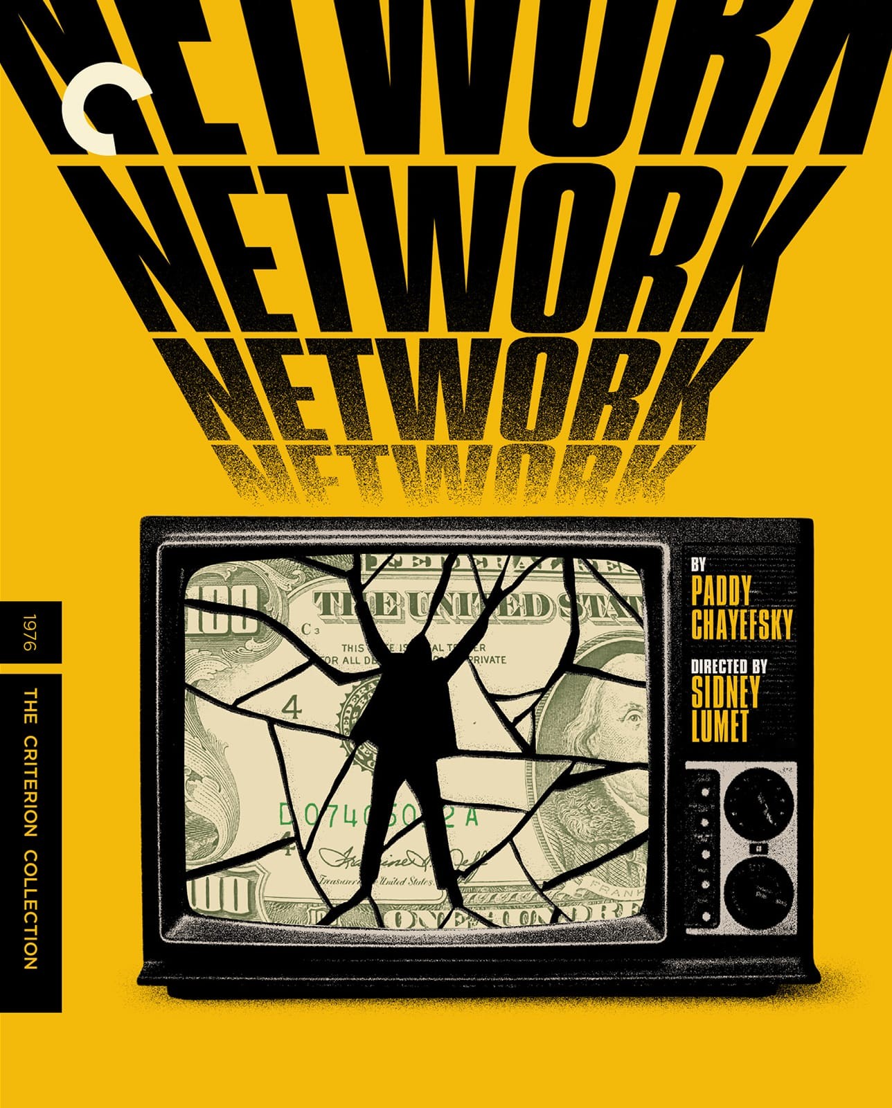
I might change my mind, but I don’t think I like the Network cover. Why is the title repeated 4 times? Is it intended to look like a credit crawl, maybe? Because it doesn’t really look like that, and if that’s the concept, maybe putting the actual Lumet/Chayefsky credits would have made more sense?
What’s the deal with the $100 bill in the TV? I suppose that it’s about the commercialization of TV, but it seems a bit on the nose, no? Just a tad bit hamfisted? It reminds me of “The Simpsons” joke about the AL IGHTY OLLAR.
And mostly, it’s just kinda ugly with all that yellow and black.
What’s the deal with the $100 bill in the TV? I suppose that it’s about the commercialization of TV, but it seems a bit on the nose, no? Just a tad bit hamfisted? It reminds me of “The Simpsons” joke about the AL IGHTY OLLAR.
And mostly, it’s just kinda ugly with all that yellow and black.
-
mteller
- Joined: Tue Nov 02, 2004 7:23 pm
Re: Criterion & Eclipse Cover Art & Packaging Babble-on Vol. 7
Billy Bob Malkovich
-
FrauBlucher

- Joined: Tue Jul 16, 2013 12:28 am
- Location: Greenwich Village
Re: Criterion & Eclipse Cover Art & Packaging Babble-on Vol. 7
I have changed my mind. I like it. A couple of things. The 4 Networks on the cover could be a reference to the 4 networks referred to in the film. The money in the TV (you suppose right) is all about that. Money is that driving force, even over truth. And all the yellow was the one I didn't get till now, yellow journalismBrian C wrote: Mon Nov 17, 2025 10:14 pm I might change my mind, but I don’t think I like the Network cover. Why is the title repeated 4 times? Is it intended to look like a credit crawl, maybe? Because it doesn’t really look like that, and if that’s the concept, maybe putting the actual Lumet/Chayefsky credits would have made more sense?
What’s the deal with the $100 bill in the TV? I suppose that it’s about the commercialization of TV, but it seems a bit on the nose, no? Just a tad bit hamfisted? It reminds me of “The Simpsons” joke about the AL IGHTY OLLAR.
And mostly, it’s just kinda ugly with all that yellow and black.
-
Brian C
- I hate to be That Pedantic Guy but...
- Joined: Wed Sep 16, 2009 3:58 pm
- Location: Northwest US
Re: Criterion & Eclipse Cover Art & Packaging Babble-on Vol. 7
Sorry but none of that helps me! Just makes it all even more on the nose. And it's still just ... well, sorta ugly.
-
WrathOfAguirre

- Joined: Sun Nov 02, 2025 6:27 pm
Re: Criterion & Eclipse Cover Art & Packaging Babble-on Vol. 7
To be fair, the film itself is very on-the-nose, so it’s not as though the cover art should be an exercise in subtlety.
-
cdnchris
- Site Admin
- Joined: Tue Nov 02, 2004 6:45 pm
- Location: Washington
- Contact:
-
Finch
- Joined: Mon Jul 07, 2008 9:09 pm
- Location: United States
Re: Criterion & Eclipse Cover Art & Packaging Babble-on Vol. 7
The Pee-Wee release looks amazing. Love it.
-
Mr.DarjeelingLimited

- Joined: Wed Dec 13, 2023 6:58 pm
Re: Criterion & Eclipse Cover Art & Packaging Babble-on Vol. 7
Salaam Bombay! Looks great.
-
Finch
- Joined: Mon Jul 07, 2008 9:09 pm
- Location: United States
-
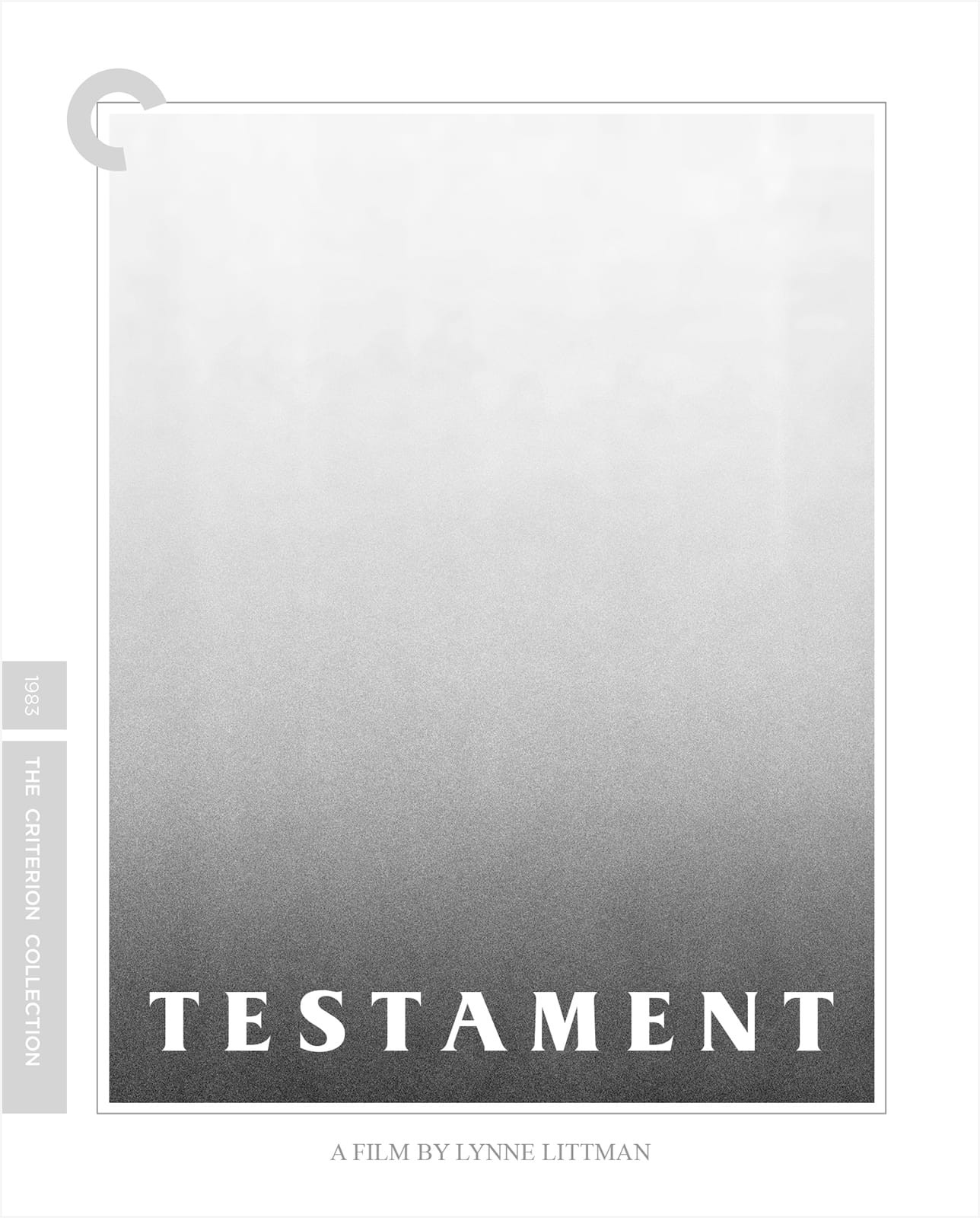
domino harvey
- Dot Com Dom
- Joined: Wed Jan 11, 2006 6:42 pm
Re: Criterion & Eclipse Cover Art & Packaging Babble-on Vol. 7
Love the Testament cover!
-
Finch
- Joined: Mon Jul 07, 2008 9:09 pm
- Location: United States
Re: Criterion & Eclipse Cover Art & Packaging Babble-on Vol. 7
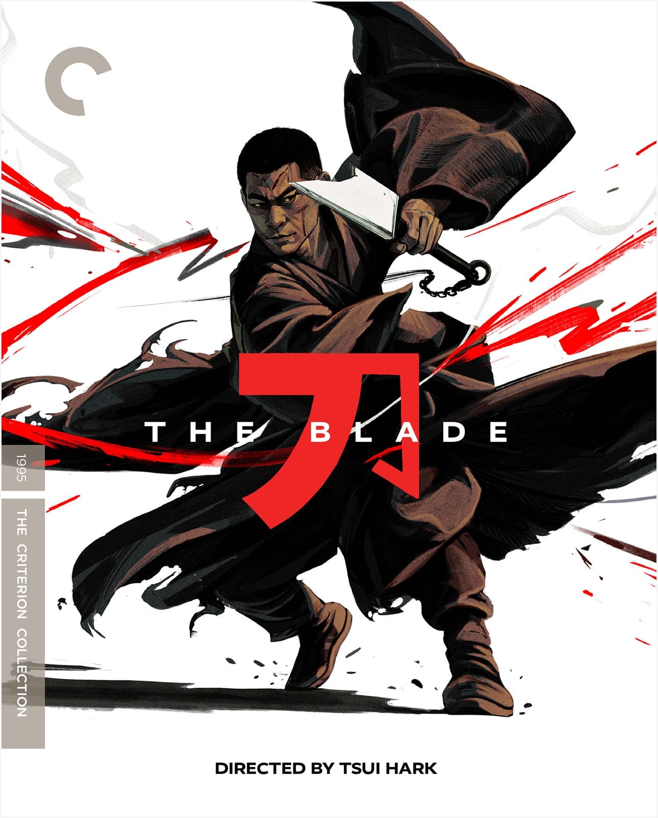
Honestly think it's a solid month all round, with The Blade being the least impressive one (though still fine).
EDIT: couldn't put my finger on it until now, but The Blade cover reminds me of the Kitano Zatoichi poster/artwork.
EDIT: couldn't put my finger on it until now, but The Blade cover reminds me of the Kitano Zatoichi poster/artwork.