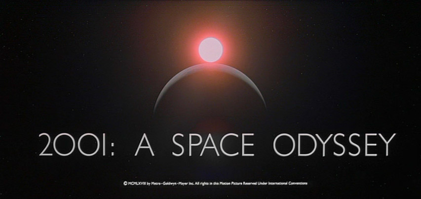
Aldo Novarese (1920-1995) and Alessandro Butti's Microgramma, created in 1952, later developed into Eurostile is a wonderful and enduring typeface. It was used for the original Star Trek series, Kubrick's, 2001 and Robert Wise's, The Andromeda Strain utilised it, as did many sci-fi films, as memory serves. Novarese's Stop was also used in many sci-fi films:

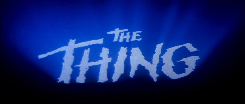
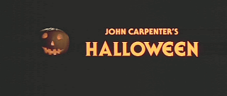
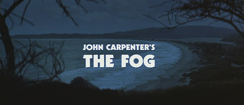
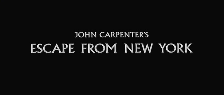
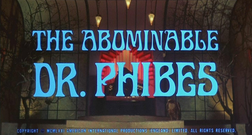
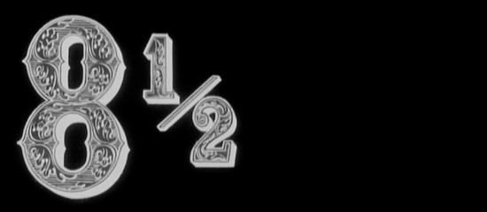
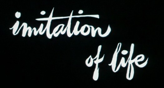
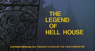
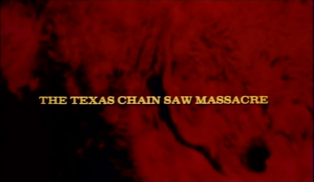
Sci-fi and horror films of the 60s through to the early 80s often have very beautiful titles - the opening credits to Alien are among my favourites, as is Close Encounters of the Third Kind.
Sense of Cinema article on retro titles in modern movies
Excellent article on anachronistic typefaces in movies
And another
Extensive study of movie fonts, 1955-1965 (skip to the conclusion for some fine insight by Emily King)
Sergio Leone's films, of course, have striking, highly memorable title designs; in The Good, the Bad and the Ugly, I love the way they 'blow' away to make for the next after the gunshots, with Morricone's immortal score twanging away on the soundtrack - a highpoint in title design, no question. The early James Bond titles were - and still are - extraordinary, but they soon became overdone. As for TV, Terry Gilliam's opening sequence to Monty Python's Flying Circus remain dear to hearts of millions
There is another interesting case: films which have no opening titles. Citizen Kane is the earliest example of a mainstream film to have no real credits (bar "A Mercury Production / By Orson Welles") just that bold CITIZEN KANE fillling the Academy frame - from the get-go, this is a film of supreme control and fastidious design. Later, The Godfather and Star Wars would begin in the same fashion and it is now not so striking for a film to commence in such a manner.
Lastly: Saul Bass (let the images do the talking)


