Criterion & Eclipse Cover Art & Packaging Babble-on Vol.5
-
perkizitore

- Joined: Thu Jul 10, 2008 7:29 pm
- Location: OOP is the only answer
Re: Criterion & Eclipse Cover Art & Packaging Babble-on Vol.
First the Three Colours Trilogy terrible cover art, now an ever more atrocious cover for Certified Copy; someone must really hate Juliette Binoche at Criterion HQ!
-
Brian C

- I hate to be That Pedantic Guy but...
- Joined: Wed Sep 16, 2009 3:58 pm
- Location: Northwest US
Re: Criterion & Eclipse Cover Art & Packaging Babble-on Vol.
I thought the CW had been revised on Three Colors and it was now considered good?
-
Murdoch

- Joined: Mon Apr 21, 2008 3:59 am
- Location: Upstate NY
Re: Criterion & Eclipse Cover Art & Packaging Babble-on Vol.
Those covers are slowly killing me
-
triodelover
- Joined: Sat Jan 27, 2007 6:11 pm
- Location: The hills of East Tennessee
Re: Criterion & Eclipse Cover Art & Packaging Babble-on Vol.
What the Hell, I'll try. Wouldn't want to disappoint. At least the two Bergman's use images from the film. The one of Harriet Andersson on the boat is a rather iconic one for Monica. Plus the covers actually represent what's in the case. They are consistent with the most of the rest of Criterion's mainline Bergman (particularly of recent vintage) and they are at least better than the Tartans. OK, that's all I got.tarpilot wrote:I'd admit that I'm really looking forward to the inevitable apologists, but I don't think that's going to be an issue this time
-
lacritfan
- Life is one big kevyip
- Joined: Wed Dec 05, 2007 10:39 pm
- Location: Los Angeles
Re: Criterion & Eclipse Cover Art & Packaging Babble-on Vol.
It's been awhile since I've seen BJM so I don't remember the body builder with the florescent white thong going through the portal. Also, if that's supposed to be a pupil, why is it jaundiced (unless they're anticipating our feelings toward the cover)?
-
bainbridgezu

- Joined: Wed Jan 19, 2011 2:54 am
Re: Criterion & Eclipse Cover Art & Packaging Babble-on Vol.
The Bergman covers are, by far, the least offensive of the bunch: anyone who could formulate a cohesive defense of the Malkovich atrocity would have to be some kind of evil genius.triodelover wrote:What the Hell, I'll try. Wouldn't want to disappoint. At least the two Bergman's use images from the film. The one of Harriet Andersson on the boat is a rather iconic one for Monica. Plus the covers actually represent what's in the case. They are consistent with the most of the rest of Criterion's mainline Bergman (particularly of recent vintage) and they are at least better than the Tartans. OK, that's all I got.tarpilot wrote:I'd admit that I'm really looking forward to the inevitable apologists, but I don't think that's going to be an issue this time
That's Malkovich going through the portal; though, as Certified Copy also demonstrates, fealty to the film doesn't make the cover any less a piece of shit.lacritfan wrote:It's been awhile since I've seen BJM so I don't remember the body builder with the florescent white thong going through the portal
Last edited by bainbridgezu on Thu Feb 16, 2012 11:40 pm, edited 1 time in total.
-
knives

- Joined: Sat Sep 06, 2008 10:49 pm
Re: Criterion & Eclipse Cover Art & Packaging Babble-on Vol.
It doesn't have pedophile John Cusack on the cover?
-
Feego

- Joined: Thu Aug 16, 2007 11:30 pm
- Location: Texas
-
bainbridgezu
- Joined: Wed Jan 19, 2011 2:54 am
Re: Criterion & Eclipse Cover Art & Packaging Babble-on Vol.
He's not beige enough! Hell, Malkvoich isn't there because his name is in the title, but by virtue of the color of his jacket.knives wrote:It doesn't have pedophile John Cusack on the cover?
-
arsonfilms

- Joined: Wed Nov 02, 2005 4:53 pm
- Location: Philadelphia, PA
Re: Criterion & Eclipse Cover Art & Packaging Babble-on Vol.
It's so funny to see this crop off new covers next to the La Haine upgrade, which has SUCH striking artwork. The more I look at Certified Copy the less I mind it (relatively speaking; it's still atrocious), but I feel like Malkovich is so bad it has to be a joke. Nobody could really be serious with that cover, could they?
-
lacritfan
- Life is one big kevyip
- Joined: Wed Dec 05, 2007 10:39 pm
- Location: Los Angeles
Re: Criterion & Eclipse Cover Art & Packaging Babble-on Vol.
I think I figured out the BJM cover. It's a toilet bowl without water. Guy takes a huge dump. Doesn't have TP so he uses the back of a gay sex ad. Then stands up and pisses all around the perimeter. Then realizes it doesn't flush. This happened a week ago.
-
CSM126

- Joined: Thu Nov 04, 2004 12:22 pm
- Location: The Room
- Contact:
Re: Criterion & Eclipse Cover Art & Packaging Babble-on Vol.
I was hoping/expecting BJM cover to be a sea of the many Malkovich heads, but I can live with the pupil, too. It's weird, but so is the movie.
-
tarpilot

- Joined: Thu Jan 20, 2011 2:48 pm
Re: Criterion & Eclipse Cover Art & Packaging Babble-on Vol.
The movie is also "good." If only they had chosen that adjective to mirror!
-
bainbridgezu
- Joined: Wed Jan 19, 2011 2:54 am
Re: Criterion & Eclipse Cover Art & Packaging Babble-on Vol.
This is ridiculous. What you've described would be infinitely more appealing than this cover: a week-old shit-and-piss cocktail would look like it had been composed by Antonioni at the peak of his abilities next to what we're actually getting.lacritfan wrote:I think I figured out the BJM cover. It's a toilet bowl without water. Guy takes a huge dump. Doesn't have TP so he uses the back of a gay sex ad. Then stands up and pisses all around the perimeter. Then realizes it doesn't flush. This happened a week ago.
-
felipe
- Joined: Thu May 06, 2010 3:06 am
Re: Criterion & Eclipse Cover Art & Packaging Babble-on Vol.
Those could never be considered good.Brian C wrote:I thought the CW had been revised on Three Colors and it was now considered good?
-
Matt

- Joined: Tue Nov 02, 2004 4:58 pm
Re: Criterion & Eclipse Cover Art & Packaging Babble-on Vol.
Ha, that Certified Copy cover is only the icing on Criterion's spectacular "fuck you" cupcake to people waiting for this release. Wait several months longer than any other company would normally take to release it, throw an interview and a licensed documentary on the disc, and then slap this cover on it that went from concept to execution in 5 minutes. I guess they figured everyone already bought the region-free Artificial Eye BD so why bother.
But that Being John Malkovich cover is the absolute worst thing I've ever seen them do. Far worse than the pink Viridiana or Pepe le moko. Embarrassing.
The Bergmans are just F. Ron Miller with his standard screen capture/all caps treatment. Fine, whatever. They actually manage to look pretty good next to the other two.
-
zedz

- Joined: Sun Nov 07, 2004 11:24 pm
Re: Criterion & Eclipse Cover Art & Packaging Babble-on Vol.
To be fair, the Certified Copy cover is neck and neck hideous with Artificial Eye's dayglo monstrosity, but how can coming up with a nice image for that particular film be so apparently debilitating for graphic designers?
-
bainbridgezu
- Joined: Wed Jan 19, 2011 2:54 am
Re: Criterion & Eclipse Cover Art & Packaging Babble-on Vol.
Exactly. This cover must be their design department's revenge for Viridiana: if only we'd been aware of the total eye-fuck that was coming for us six years down the line.Matt wrote:that Being John Malkovich cover is the absolute worst thing I've ever seen them do. Far worse than the pink Viridiana or Pepe le moko. Embarrassing.
-
perkizitore
- Joined: Thu Jul 10, 2008 7:29 pm
- Location: OOP is the only answer
Re: Criterion & Eclipse Cover Art & Packaging Babble-on Vol.
3 years ago Napier wrote:Swimminghorses might actually get the last laugh when, after learning of his banishment (from this forum I'm sure they love) Criterion offer him a job in their art department. So we all have to eternally look at his shitty covers on all their new releases. And REALLY have something to bitch about. Hmmmm...... something to ponder.
-
triodelover
- Joined: Sat Jan 27, 2007 6:11 pm
- Location: The hills of East Tennessee
Re: Criterion & Eclipse Cover Art & Packaging Babble-on Vol.
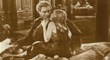
The only thing I'll say in defense of the AE cover (since I own it) is the image of Binoche is from the film and she looks just as garish in that scene as she does on the cover. Now that I think about it, I'm not really offering a defense, just a rather weak plea bargain.zedz wrote:To be fair, the Certified Copy cover is neck and neck hideous with Artificial Eye's dayglo monstrosity, but how can coming up with a nice image for that particular film be so apparently debilitating for graphic designers?
-
knives
- Joined: Sat Sep 06, 2008 10:49 pm
Re: Criterion & Eclipse Cover Art & Packaging Babble-on Vol.
At least the AE looks like it can be excused on account of laziness. The Crit actually looks like a lot of thought going into just as much meh.
-
The Narrator Returns
- Joined: Tue Nov 15, 2011 10:35 pm
Re: Criterion & Eclipse Cover Art & Packaging Babble-on Vol.
Agreed. How can you screw up a cover that badly? I would have been happier if the cover was stick figure drawings of the characters, or just Being John Malkovich stamped on a brown paper bag.Matt wrote:But that Being John Malkovich cover is the absolute worst thing I've ever seen them do. Far worse than the pink Viridiana or Pepe le moko. Embarrassing.
-
Matt
- Joined: Tue Nov 02, 2004 4:58 pm
Re: Criterion & Eclipse Cover Art & Packaging Babble-on Vol.
The sad thing is that the book in the film looks exactly like your run-of-the-mill European scholarly monograph. But Criterion's "copy" of it adds the wacky C and sidebar, gets the balanced placement of the text all wrong, and substitutes a bland picture of the two leads for the classical bust. Any one of these posters would have made a better cover, even the ones that look like posters for a Nora Ephron comedy.knives wrote:At least the AE looks like it can be excused on account of laziness. The Crit actually looks like a lot of thought going into just as much meh.
-
triodelover
- Joined: Sat Jan 27, 2007 6:11 pm
- Location: The hills of East Tennessee
Re: Criterion & Eclipse Cover Art & Packaging Babble-on Vol.
And one of those is the AE cover.Matt wrote:Any one of these posters would have made a better cover, even the ones that look like posters for a Nora Ephron comedy.
-
The Narrator Returns
- Joined: Tue Nov 15, 2011 10:35 pm
Re: Criterion & Eclipse Cover Art & Packaging Babble-on Vol.
Frankly, this day is making me sad. The two titles I want the most, Being John Malkovich and Certified Copy (I don't own the AE), are the ones they screw up. Those covers better be placeholders, because they look like they were designed by a fidgety seven-year-old who was told to experiment with Photoshop.
If you need me, I'll be in the bath having a good cry.
If you need me, I'll be in the bath having a good cry.