Criterion & Eclipse Cover Art & Packaging Babble-on Vol. 6
-
Jeff

- Joined: Wed Nov 03, 2004 1:49 am
- Location: Denver, CO
Re: Criterion & Eclipse Cover Art & Packaging Babble-on Vol.
I love all of the alternate designs. The one they went with is fine, but nothing more. The sparks and the Caan profile are my favorite. You can't blame Fred Davis, who clearly had some great ideas. He makes it clear that the one with the production still and original logo were insisted upon by Mann. I'd imagine the notes from Mann were the same ones he gives to his DPs and production designers -- "Shinier! More blue!"
-
captveg

- Joined: Wed Sep 02, 2009 11:28 pm
Re: Criterion & Eclipse Cover Art & Packaging Babble-on Vol.
It looks as though Mann dictated that they use the cover we got, though, so really not much the designer could do.
-
Anhedionisiac

- the Displeasure Principle
- Joined: Thu Feb 28, 2008 6:25 pm
Re: Criterion & Eclipse Cover Art & Packaging Babble-on Vol.
I agree with Jeff and matricschmatrix, the alternate designs are miles better. The sparks and the bottom right one definitely stand out. I feel bad for Fred Davis now. It baffles me that Mann would prefer that still to Fred's preliminary designs.
-
rwiggum
- Joined: Mon Oct 01, 2012 2:11 am
Re: Criterion & Eclipse Cover Art & Packaging Babble-on Vol.
Honestly, I think the alternate designs look like amateurish fan covers. While I like the motifs they're working in, the use of that much black negative space always screams "I'm using a horizontal image and didn't bother adding anything to make it work as a DVD cover."
-
FakeBonanza
- Joined: Mon Dec 03, 2012 2:35 am
Re: Criterion & Eclipse Cover Art & Packaging Babble-on Vol.
I thought that the Thief cover looked awful when I first saw it on my phone. I don't mind it as much now that I've seen it in higher resolution. I'm not a fan of any of those alternate covers anyway.
I've never seen It's a Mad, Mad, Mad, Mad World, and likely never will, but I'm still slightly disappointed that Criterion didn't at least go with the Saul Bass artwork for their cover. Then again, their choice of art might have something to do with my disinterest in the film--I am not the market they are appealing to with that cover; fans of the film are likely thrilled to have that poster artwork retained. It's also possible that the studio wanted that artwork used, and I wonder if this might also have something to do with the Criterion branding being so faint on that cover.
I've never seen It's a Mad, Mad, Mad, Mad World, and likely never will, but I'm still slightly disappointed that Criterion didn't at least go with the Saul Bass artwork for their cover. Then again, their choice of art might have something to do with my disinterest in the film--I am not the market they are appealing to with that cover; fans of the film are likely thrilled to have that poster artwork retained. It's also possible that the studio wanted that artwork used, and I wonder if this might also have something to do with the Criterion branding being so faint on that cover.
-
matrixschmatrix

- Joined: Wed May 26, 2010 3:26 am
Re: Criterion & Eclipse Cover Art & Packaging Babble-on Vol.
The movie itself is dominated by negative space, and the images are often swallowed in blackness- it's totally apropos.rwiggum wrote:Honestly, I think the alternate designs look like amateurish fan covers. While I like the motifs they're working in, the use of that much black negative space always screams "I'm using a horizontal image and didn't bother adding anything to make it work as a DVD cover."
-
rwiggum
- Joined: Mon Oct 01, 2012 2:11 am
Re: Criterion & Eclipse Cover Art & Packaging Babble-on Vol.
Yes, but I think there are better ways of pulling that off in a package design than a thin horizontal image on a portrait-oriented package. It's really more a pet peeve of mine.matrixschmatrix wrote:The movie itself is dominated by negative space, and the images are often swallowed in blackness- it's totally apropos.
-
Moe Dickstein

- Joined: Sat Aug 25, 2012 3:19 am
Re: Criterion & Eclipse Cover Art & Packaging Babble-on Vol.
Skillman tweeted the other Jack Davis art and said that this was one case where the Bass version was second best or words to that effect. The poster itself that is credited to Bass is not actually Bass but someone taking elements of his main title design and concocting a poster from it.FakeBonanza wrote:I've never seen It's a Mad, Mad, Mad, Mad World, and likely never will, but I'm still slightly disappointed that Criterion didn't at least go with the Saul Bass artwork for their cover.
-
Brian C

- I hate to be That Pedantic Guy but...
- Joined: Wed Sep 16, 2009 3:58 pm
- Location: Northwest US
Re: Criterion & Eclipse Cover Art & Packaging Babble-on Vol.
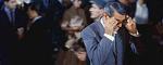
The Thief cover is reasonably attractive on its own terms, but its biggest virtue is that it screams "Michael Mann". You don't really even need to have his name on the cover. Not at all surprising that it's true to the "very specific ideas" that Mann had. It represents the film through and through.
The sparks and safe dial covers are like parodies of arty Criterion covers, not really relating to the movie in any specific way and just trying be evocative for their own sake. The profile one also is very nice and Mann-ish, but more like Heat Mann than Thief Mann.
The sparks and safe dial covers are like parodies of arty Criterion covers, not really relating to the movie in any specific way and just trying be evocative for their own sake. The profile one also is very nice and Mann-ish, but more like Heat Mann than Thief Mann.
-
HistoryProf

- Joined: Mon Mar 13, 2006 7:48 am
- Location: KCK
Re: Criterion & Eclipse Cover Art & Packaging Babble-on Vol.
utterly ecstatic to finally get Rififi on Blu...and utterly depressed that the cover is so blah. such an iconic film w/ such a high school design class cover is an insult.
Really like the Davies and Thief though.
Really like the Davies and Thief though.
-
Charles

- Joined: Fri Mar 04, 2011 9:06 pm
Re: Criterion & Eclipse Cover Art & Packaging Babble-on Vol.
More glaring is the star's name on the cover. I've looked at this several times since yesterday afternoon, and that still sticks out for me.Brian C wrote:The Thief cover is reasonably attractive on its own terms, but its biggest virtue is that it screams "Michael Mann". You don't really even need to have his name on the cover. Not at all surprising that it's true to the "very specific ideas" that Mann had. It represents the film through and through.
The sparks and safe dial covers are like parodies of arty Criterion covers, not really relating to the movie in any specific way and just trying be evocative for their own sake. The profile one also is very nice and Mann-ish, but more like Heat Mann than Thief Mann.
-
flyonthewall2983

- Joined: Mon Jun 27, 2005 7:31 pm
- Location: Indiana
- Contact:
Re: Criterion & Eclipse Cover Art & Packaging Babble-on Vol.
What I like about the Thief cover is that it is based off an original promotional image as opposed to making all new artwork for it. I don't know if it was an issue with Warner Bros. but the original poster for Badlands is pretty iconic and am otherwise baffled why they didn't use it for that release.
-
dwk

- Joined: Sat Jun 12, 2010 10:10 pm
Re: Criterion & Eclipse Cover Art & Packaging Babble-on Vol.
Criterion's Badlands cover is a painting that Malick wanted to use as the original poster.
-
zedz

- Joined: Sun Nov 07, 2004 11:24 pm
Re: Criterion & Eclipse Cover Art & Packaging Babble-on Vol.
It's the director's cut of the original poster!
-
Jeff
- Joined: Wed Nov 03, 2004 1:49 am
- Location: Denver, CO
Re: Criterion & Eclipse Cover Art & Packaging Babble-on Vol.
Almost certainly a contractual requirement.Charles wrote:More glaring is the star's name on the cover.
-
ShellOilJunior

- Joined: Tue Apr 28, 2009 11:17 am
Re: Criterion & Eclipse Cover Art & Packaging Babble-on Vol.
When I saw the Rififi cover it looked awfully familiar. The hand is back...

-
jbeall

- Joined: Sat Aug 12, 2006 1:22 pm
- Location: Atlanta-ish
Re: Criterion & Eclipse Cover Art & Packaging Babble-on Vol.
I'll definitely be upgrading to a blu of Rififi, but yeah, not a big fan of the cover. In tone, it reminds me of a comedic heist film such as Pink Panther or Charade. But Rififi is so much darker in tone and more serious in its endeavor that the cover actively misrepresents the film.
-
Moe Dickstein
- Joined: Sat Aug 25, 2012 3:19 am
Re: Criterion & Eclipse Cover Art & Packaging Babble-on Vol.
Rififi makes Pepe Le Moko look well designed.
-
swo17

- Bloodthirsty Butcher
- Joined: Tue Apr 15, 2008 2:25 pm
- Location: SLC, UT
Re: Criterion & Eclipse Cover Art & Packaging Babble-on Vol.
I like the idea behind the Rififi cover a little more than the execution, but on the whole, it will do. Mostly it'll be great to have this on Blu, because the PQ on the DVD was lacking.
-
Gregory

- Joined: Tue Nov 02, 2004 8:07 pm
Re: Criterion & Eclipse Cover Art & Packaging Babble-on Vol.
I'm really happy I bought the Arrow blu-ray of it for about £9, with vintage posters on the front and back cover (after reversing it).
-
cdnchris

- Site Admin
- Joined: Tue Nov 02, 2004 6:45 pm
- Location: Washington
- Contact:
-
Yaanu

- Joined: Sat Aug 10, 2013 4:18 am
Re: Criterion & Eclipse Cover Art & Packaging Babble-on Vol.
So it's only one spine number on "Shadows" despite also containing "A Constant Forge"?cdnchris wrote:John Cassavetes: Five Films
That's unexpected, at least to me.
Also, a shame about that little nick in the bottom corner of the case.
-
mfunk9786

- Under Chris' Protection
- Joined: Fri May 16, 2008 8:43 pm
- Location: Miami, FL
Re: Criterion & Eclipse Cover Art & Packaging Babble-on Vol.
I don't know what you have against photographing spines, Chris. 
-
zedz
- Joined: Sun Nov 07, 2004 11:24 pm
Re: Criterion & Eclipse Cover Art & Packaging Babble-on Vol.
Isn't the real question burning in everybody's mind: does this release conceal the words "Jimmy crack corn" anywhere on its person?
-
cdnchris
- Site Admin
- Joined: Tue Nov 02, 2004 6:45 pm
- Location: Washington
- Contact:
Re: Criterion & Eclipse Cover Art & Packaging Babble-on Vol.
I actually meant to but forgot, admittedly. And by the time I was at the computer uploading them I was so exhausted that the simple task of positioning a box and taking a picture seemed like too much. I'll get one up this evening.mfunk9786 wrote:I don't know what you have against photographing spines, Chris.
I didn't see it (I actually also meant to take a picture of the interior of the box as well.) I don't have the "Jimmy crack corn" printing of the DVD but as I understand it it was inside, correct?zedz wrote:Isn't the real question burning in everybody's mind: does this release conceal the words "Jimmy crack corn" anywhere on its person?